LG KM570 Cookie Gig review: Live at the arena
Live at the arena
Interface gets S-Classy
The LG KM570 Cookie Gig is dressed up in terms of software too. It borrows the user interface from the LG GD510 Pop – a Cookie interface at the core, with S-Class eye candy on top. It also comes with the proprietary Livesquare homescreen plus a handful of social networking apps.
The interface features a lot of nice animations and transition effects. However, it’s not the fastest we’ve seen – every action takes a while to complete. The Cookie Gig is not unresponsive, but it can be sluggish – it takes a second for the menu to appear, and even longer to get back to the homescreen.
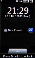
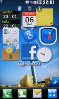
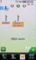
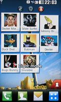
The lockscreen • the three homescreens
The KM570 Cookie Gig has three homescreens but not in the usual sense of one extended desktop. It has three kinds of homescreen, though you get only one at a time and they are non-scrollable.
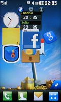
The first is the Widget-enabled screen that allows you to arrange several mini applications as you please.
A touch on the marker in the bottom right corner of the homescreen pulls out the Widget tray, which holds all of the currently unused widgets. You can choose the ones you want and drag them onto the screen or stash the ones you don't need back in the tray. There’s a “shake to auto align” feature, but you can use the padlock pictogram at the bottom left to lock the position of the widgets and prevent accidental rearrangements.

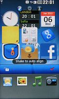
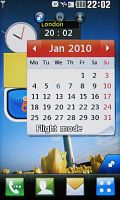
Widget homescreen • widgets are collapsible
The widgets available on the LG Cookie Gig include two clocks (analog and a dual time zone piece), a mini FM radio, a mini music player, a weather widget, notes app, image slideshow, a calendar, Pocket Apps, a Facebook widget and more.
There’s only one non-scrollable widget screen but the widgets have a way to deal with this – in their default state, they are quite small but if you tap them – they expand. For example, the calendar widget only shows the current date by default, but once you tap it, it expands to show the whole month.
The Pocket Apps widget is very nice and useful – it gets you access to several installed apps. We'll get to those in detail in the mobile applications chapter of this review.
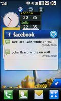
The Facebook widget shows status updates from your friends and serves as a shortcut to the full-blown Facebook application. It can be collapsed to just the Facebook icon which saves a lot of space. There are no widgets for other social networks – you’ll have to use their respective apps.
Unfortunately, new widgets cannot be added. That is the main disadvantage compared to the competing Samsung TouchWiz interface.
To get to the second homescreen you sweep your finger sideways across the screen. The screen turns over like you roll a cube – a throwback to the cube menu of the original S-Class UI.
The contact homescreen doesn't work with widgets, but lets you arrange up to eight favorite contact icons instead. You can arrange them free-hand or use the shake to auto-align feature. The screen could easily have fit one contact more but there’s no way to add more than eight.
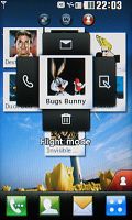
When you tap a contact it jumps front and center and four buttons appear to the sides of the contact’s photo – call, send an SMS, edit the contact and remove from speed dial (you can also drag it back to the dock, just as you would a widget).
Finally, there’s the Livesquare homescreen, which is in essence a log of all your recent communications. They are displayed on the screen with icons for each person you've made contact with - even ones that are not in your phonebook. By having them straight on the screen, you can easily call them back without opening the phonebook or the actual call log.
You can set the background as a Zoo, a Park or pick a custom image, populated by small human or animal figures, which will represent your contacts. You can pick from several different icons and randomize the color of their clothes for even greater variety.
When you tap on a contact, the icon at the bottom of the screen starts throbbing to attract your attention – you can call a contact, view the contact info or send them a message. You can click and drag to select multiple contacts – but then the send message option is only available.

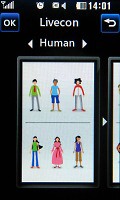
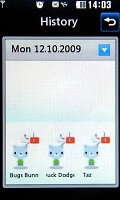
Selecting multiple contacts in Livesquare • Livesquare options
Livesquare enhances usability but its graphical implementation is really childish. While that was OK on the tween-happy LG GW520, the LG KM570 has more mature looks, despite its Cookie branding.
Speaking of icons at the bottom of the screen – there are four virtual soft keys that are there regardless of which homescreen you’re currently using. The first one takes you to the Dial pad to punch in a number, the second opens the Contact list, the third one takes you to Messaging, and the last one brings up the main menu.
The LG KM570 Cookie Gig main menu looks very similar to the S-Class launcher (LG Arena, Viewty Smart and Crystal) and is accessible via the dedicated shortcut on the home screen. There are three menu layouts available.
The first is the familiar four-row layout (called “Zigzag”) with each of the rows scrollable separately. If that’s not the thing for you, another layout puts all the icons on two pages – in essence the four rows scroll together. The final layout arranges the icons in one tall page which you scroll up and down.
If you turn the phone sideways, the menu items are all displayed with smaller icons fitting the screen perfectly with no need for scrolling (but with no text labels either).
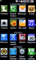
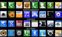
The main menu is S-Class styled
In the Zigzag layout, you can rearrange the icons from every row by tapping and holding the desirable icon and dragging it where you want it to appear. Strangely, that doesn’t work in the two-page layout.
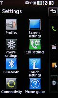
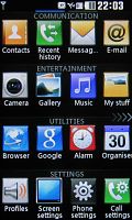
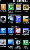
The three menu styles – scroll, page by page and Zigzag
The lockscreen prompts you to press-and-hold but you can also slide-up to unlock. Recent events like missed calls, new messages or emails are also displayed on the lockscreen.
The Cookie Gig makes use of a task manager allowing you to run several Java and native applications simultaneously and effortlessly switch between them.
The task manager on the LG Cookie Gig is pretty similar to the one found on the Renoir and the Cookie. It's complemented by a secondary "Favorite apps" tab that hosts a number of configurable shortcuts to various applications. It offers up to nine slots for shortcuts.
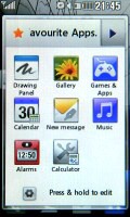
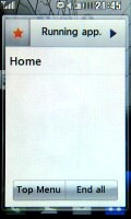
The task manager and the favorite apps shortcuts
Another thing the KM570 Cookie Gig shares with the other recent touch phones by LG is the Status screen - tapping on any of the icons on the status row on top (next to the clock) opens up a screen with signal, battery and memory stats, and allows you to quickly toggle the ringing profiles, music player and Bluetooth. It’s not quite as useful as the one on Android – but as close as possible for a feature phone.
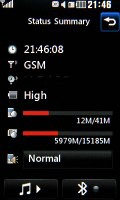
The status screen is accessed by pressing any of the icons at the top of the homescreen
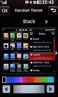
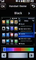
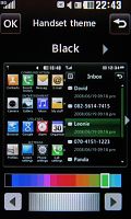
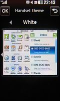
The LG KM570 Cookie Gig comes with two themes for the menu – Black and White. White is more cartoonish and goes well with the Lifesquare homescreen, but with Black you get both more serious looking menu and you get to choose the complementary color – you can make it red on black, blue on black, or almost anything else, there’s a full palette to choose from.
Reader comments
- Brayen
- 02 Apr 2013
- U{H
Blutooth file snd and cming very slow ????? Bt net sped super Sme apz nt scren size hmmm
- JcHnd
- 27 Jul 2011
- 8xf
I just like this review because you used a Britney Spears song... anyway... this seems like a great phone! :)
- MrsL.
- 02 Feb 2011
- snS
Great phone for great price, 4GB memory, fast web, nice programs, looks.....
