LG KM900 Arena review: A touch of class
A touch of class
Cube-spinning top-of-the-class interface
A well designed and smooth running user interface is among the most important features of a phone these days and the iPhone and its amazing market success is the quintessential example of this. LG have equipped the Arena with their spanking new S-Class UI and clearly have Apple's game-changing interface in their sights.
The capacitive touchscreen is quite sensitive and haptic feedback has always been on the LG feature list. The hardware graphic acceleration is essential: everything from homescreen to dropdown menus roll, sweep in, unfold and revolve extra smoothly.
The S-Class builds upon the previous UIs of the LG range and thus still feels familiar despite the enormous amount of upgrades.
This time around, there are four homescreens and they break down the homescreen UI into four easily manageable chunks: widgets, contacts, shortcuts and multimedia.
A new and eye catching addition to the interface is the Cube interface - the four homescreens are placed on the sides of a cube that you roll by finger sweeps. You can zoom out by pressing the center Home key and roll the cube to select a homescreen.
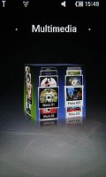
The sides of the cube are the homescreens
The Shortcut homescreen is well known from the LG Cookie and LG Prada2. The empty space can be populated by various shortcuts for different apps. But given the wonderful main menu, we are not sure this screen is entirely necessary.
The Widget homescreen offers a bunch of widgets we've seen before in previous LG or Samsung handsets - we have the analog clock, calendar, world time, WeatherBug, games shortcut, FM radio widget, memo, cellular info and a calculator.
The messaging one you see on the top of the widget screen is the new addition. It gives you quick access to the voice, text or email messages and your missed calls, as well as showing the number of new events in any of the mentioned sections.
The third Cube wall contains the Contact homescreen, where you can assign photos to various contacts for quick access to their numbers and SMS/call options. They are displayed on a rotating reel, similar to the way that the fourth multimedia homescreen is filled with pictures and songs. All those reels are touch-optimized and on some occasions are very useful and time saving. Most of all though, these 3D effects throughout the interface are just there for the sake of prettiness than for any practical purpose.
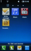
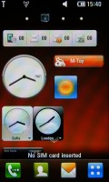
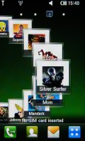
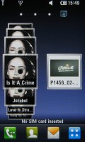
The four homescreens - Shortcuts, Widgets, Contacts and Multimedia
No matter which homescreen you choose, the UI never skimps on eye candy - smooth animations, reflections, 3D spatial effects, motion blurring - it's all there for your viewing pleasure. And better still - the 3" WVGA screen ensures that the image quality is exceptional.
It kind of reminded us of the day that the Apple iPhone arrived in our office and how amazed we felt back then. However, the iPhone has been out almost two years now and yet it's still the standard by which other UIs are judged. The LG S-class is the first UI that really grabs a nice bite of that Apple.
Welcome home
The LG Arena main menu is accessible via the dedicated shortcut on the home screen. The new thing about it is the layout. Instead of using four icons in a vertical column, LG now have opted for a layout of four rows of menu items that are scrollable horizontally. In this way almost all menu items are accessible simultaneously without jumping from tab to tab.
Even better, if you turn the phone sideways, the menu items are all visualized with smaller icons fitting the screen perfectly with no need for scrolling (but with no text labels either).
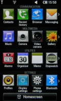
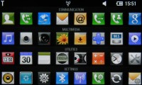
Main menu in portrait and landscape mode
Here's our quick video walkthrough of the amazing LG Arena S-class interface.
LG Arena - the four homescreens. Watch in HD
LG Arena again has a multitasking menu (a basic task manager), which is launched upon a press-and-hold of the center key. This is another way to access the most common features, not just switch between the active ones. The active apps are signified by the respective icon bouncing up and down in a smooth animation.
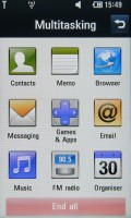
Pressing and holding the center key launches the multitasking menu
Multitasking is limited - only two applications can run at a time and Java apps interfere with other apps. For example, with a Java app running in the background you won't be able to turn the Radio on.
Tapping the Status bar at the top of the screen launches a semitransparent menu that can be used to toggle Wi-Fi and Bluetooth on and off, change profiles and view recent events.
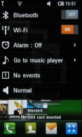
Easy access to common settings
Unfortunately, this connection manager menu is available only on the homescreen. It would have been handier if it was usable throughout the interface - the way it is in the Android OS.
LG Arena - gallery, music player, web browser. Watch in HD
By the way, to get a feel of the S-class interface by LG, you can also jump to the virtual emulator over at LG website.
Reader comments
- AnonD-212727
- 06 Dec 2013
- Ibx
I still have my arena it still works! It's way outdated but the MP3 player rocks the sound quality is amazing! Also love the 8GB storage specially for a none smart phone! The 5MP camera is actually a step down from the 8Mp powerful Renoir. However no...
- dragon
- 20 Apr 2012
- tet
- karansantal@gmail.co
- 26 Nov 2011
- tUd
can pls anyone tell me price of this handset