LG V10 review: Screen play
Screen play
Two-screen user interface
Interaction with the LG V10 starts before you even unlock the phone. The secondary screen - a 160 x 1,040px line of shortcuts and notifications in the top right - is always on. It shows time and date plus notifications, while quick toggles for Volume, Wi-Fi, Flashlight and Camera are a swipe away. This works thanks to the separate controller for this part of the screen, which keeps the capacitive touch sensor active.
Music controls work great too, a fast way to change tracks. The final option is to show a message, a "signature." This can be an inspirational message or just "Steve's phone." Several font options are available, which look better than the plain sans-serif font.
Unlocking the phone expands the second screen's functionality. It can show recent apps to aid multitasking (think clicking an icon in Windows' taskbar instead of alt-tabbing) and a selection of tools (including capture screenshot and annotate).
Note that using the second screen is exclusively a two hand affair - unless you are Shaquille O'Neal you can't possibly reach all the way up to the top of the screen with your thumb.
To unlock the phone you can use double tap or LG's more secure Knock Code. For those unfamiliar, it is essentially a secret knock shared between you and your phone.
The fingerprint reader is the more secure option. Since it's on the Power key, all you have to do is press it. The unlocking takes under a second (a secondary lock method like PIN is used as a failsafe). You index finger (on either hand) naturally rests on the Power button, making this ambidextrous and comfortable.
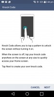
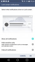
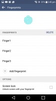
Knock Code • Fingerprint options
The notification are is LG's usual overcrowded affair. One row shows the time, the next one the quick toggles, then optionally a row of Qslide shortucts, then a row each for the brightness and volume sliders. With all that, you get about 1/3 of the screen left for notifications. Luckily, you can hide all that.
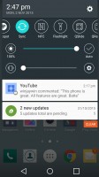
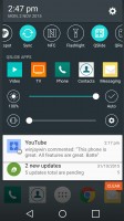
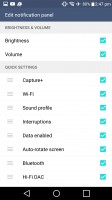
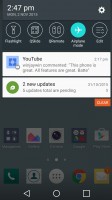
The notification area can be quite busy or very roomy
A cool change for incoming notifications leverages the second screen. New popup notifications that normally show up at the top row have been moved to the second screen, above the main UI. This way they don't cover up the app you're using.
Multitasking is handled in three ways. The first is the Recent apps list on the second screen. Then there are Qslide apps, a selection of floating, resizable apps that stay above the main app.
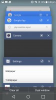
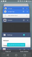
The app switcher has added buttons
The third is Dual window, which divides the screen between two apps. You can resize them, swap them, expand them to the full screen or close them. You can launch this mode from the Dual window button in the App switcher of by tapping the dedicated button on each app card in the switcher.
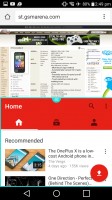
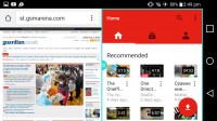
Dual window in portrait and landscape
Also here is a pin - a way for people who compulsively clear the running apps to keep the most important apps in memory. Neither the X button nor the Clear all button will close those.
The app switcher itself is the standard 3D rolodex of app screenshots.
The homescreen holds no surprises either. The Smart Bulletin on the leftmost pane should be familiar to Optimus UI users. It's a sort of mission control that gives you one look access to LG Health, your Calendar, the music player, QRemote, Smart tips and Smart settings.
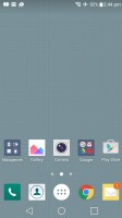
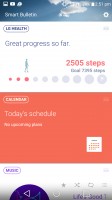
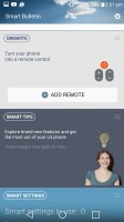
The familiar Optimus homescreen
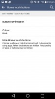
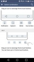
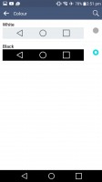
The on-screen Android buttons are customizable. It starts off with a good default - Back, Home, App switcher, drawn in white on a black background. You can add Notification, Capture+, Qslide or Dual Window buttons and invert the color combo.
Reader comments
- muhammad arshad
- 06 Apr 2022
- sUv
i have lg v10 and love this phone but it is suddenly off so tell me about this what to do
- YUKI93
- 18 Jan 2021
- KZK
Really cannot believe that this is the first ever flagship smartphone to have a dual wide/ultrawide front camera setup. It really is hard to believe that very few brands follow suit, especially when today's smartphone brands are more interested ...
