LinkedIn launches major redesign on the web
LinkedIn, that other social network, you know, the one that likes sending spam emails, is announcing a big redesign today. The Microsoft-owned service will be rolling out the new look to all of its users over the coming weeks. This apparently is the largest desktop redesign since LinkedIn's inception.
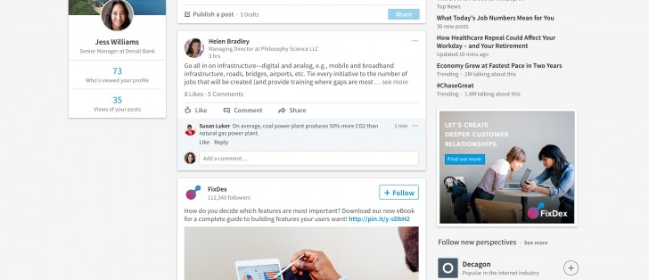
When you look at the new homepage, it may take you a second to realize how much it resembles Facebook, but once you see that, you can't unsee it. Which isn't to say it's a bad thing - LinkedIn's old design was a cluttered mess. This is cleaner, certainly.
LinkedIn uses words such as "intuitive", "faster", "seamless", "streamlined", "smarter", and "richer" to describe the new coat of paint. The bar navigation now has seven core areas, while everything else is tucked under a More icon. There's a new real-time messaging UI, which can be used from any part of the site. The feed you see when you log in is now fine tuned by a combination of algorithms and humans, to surface the most relevant content.
The search box is universal, and you can see who's reading and engaging with the content you share, including their company, job title, and location. Profile suggestions have been improved too.
Related


Reader comments
- AnonD-636031
- 21 Jan 2017
- X}@
i am loving it.
- AnonD-635488
- 20 Jan 2017
- X}F
Have had this design for a few weeks now, It looks quite refreshing and useful compared to the older clutter.


 Samsung
 Infinix
 Apple
Apple Apple
Apple Xiaomi