Meizu m1 note review: A major scale
A major scale
Flyme skins Android KitKat
The Meizu m1 note comes with the custom-made Flyme OS, now in its 4.2 installment. It's based on Android KitKat 4.4.4 and it takes after its Chinese siblings from MiUI and others and has a one-level interface with only homescreen and no app drawer, similarly to Apple's iOS.
We've highlighted some new or important features in orange throughout the text, so it's easier for you to spot them.
Here's a quick look at Flyme OS 4.2 on the Meizu m1 note.
The lockscreen on the Meizu m1 note is a pretty simple affair. You drag upwards to unlock and have the option of securing it with a passcode or an unlock pattern. There are no shortcuts on the lockscreen, but and you use left and right swipes to launch apps - the left gesture by default launches the camera. A swipe to the right can bring up a predefined app, a swipe down will bring down the notification area and a swipe upward will unlock the phone into the homescreen.
Gesture wake up is available - you can use pre-defined gestures to launch different apps while your phone is asleep - double tap to wake and swipe to unlock work by default, but you can also use swipe down, or other gestures such as Z, M, U, W, among others to launch apps of your choosing.
Holding down the home button will lock back the device.
You can also assign a number of functions to tapping the home button - you can set it go back in the UI, close an app or go back to the homescreen.

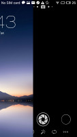
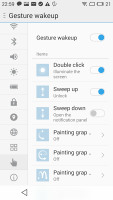
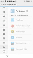
Lockscreen • Configuring gestures wakeup
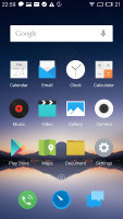
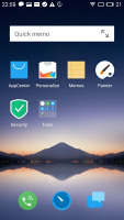
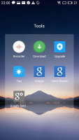
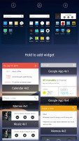
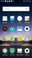
The homescreen is simpler still. You get two panes by default but you can add more later on. The homescreen gathers all of your app icons and you can add widgets into the mix.
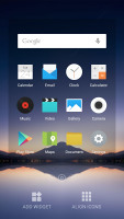
Aside from adding widgets you can also align the app icons to either the top or the bottom of the screen - a step up from the iOS homescreen, which has a mind of its own in this regard.
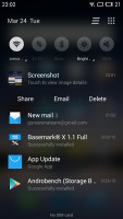
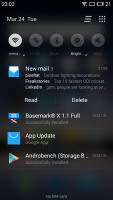
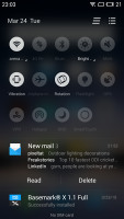
The notification area pulls down the whole way. You get a set of five circular toggles for various settings and you can expand them with a swipe down or with the dedicated virtual button in the top right.
The rest of the notification area is a basic list or expandable, actionable notifications.
Switching between tasks is done with a pull up menu from the bottom of the screen. It looks like iOS 6 in a way but works differently - you have to swipe apps up or down to dismiss them. There is also an option to pin an app (tap and hold) and it will stay always in recent apps at the state you closed it.
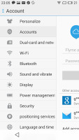
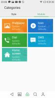
The settings menu on the Meizu m1 note is laid out in a tabbed interface, with the main categories on the left and the related options on the right. In the default view, the settings categories are just icons but a swipe will reveal their full names if you can't find what you're looking for.
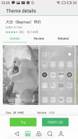
You can customize the UI with various themes. There are some preloaded but you can browse the App Center for more - some of them are paid but there are many free and a lot to choose from. There's also a variety of built in wallpapers.
There's a Do Not Disturb mode that will block notifications and calls and you can choose a white list of numbers that can get through. It can be scheduled to run at specific time intervals or be set manually.
There is one more option - Scheduled Power On and Off - you can setup your Meizu m1 note to shut down and boot up at a specific time on specific week days - just like alarms.
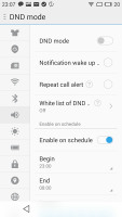
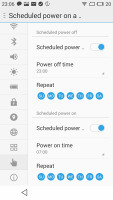
DND mode • Scheduled power on and power off
Flyme OS can be tough to get around at first but once you've gotten your bearings it becomes a treat to work with. Meizu is keeping things as simple as possible and everything works seamlessly without any hiccups.
Reader comments
- AnonD-623343
- 21 Dec 2016
- XMP
for camera & video capturing.....which one is better m2 or m1 note?
- aamir ch
- 09 Jan 2016
- X}$
3G not y?????
- PT .0000..
- 23 Sep 2015
- bJf
Meziu m1 note is nice . But its too hits while useing data. .. Charger also gives hitting problem.... ... This my 1st month useing meziu m1 note and my charger is not working proparly....
