Meizu MX review: Amaze U
Amaze U
User interface - Android is almost unrecognizable
Meizu have thoroughly modified the OS and they're even calling it "Flyme OS" rather than Android. It still has the Android Market and will run apps from there, but the skinning goes deeper than what Samsung and HTC have with their TouchWiz and Sense UI.
Here's a video that shows off some of the changes.
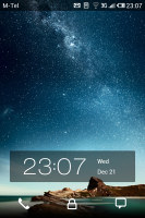
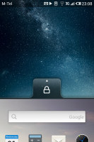
The lockscreen is the slide up to unlock type, but borrows the idea of launching different things depending on what you swipe. The padlock icon just unlocks the phone, but you also have Phone and Message icons for the dialer/inbox too. These shortcuts are non-customizable.
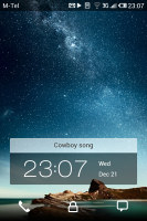
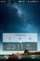
Also on the homescreen is a panel with the time and date, which is joined by a panel for the track name when there's a song playing. Pressing the Menu button expands it to include music and volume controls.
Beyond the lockscreen is a fairly standard Android homescreen with a twist. You can put shortcuts, folders and widgets on the homescreen and there are three docked shortcuts at the bottom - dialer, web browser and messaging - that are visible on all homescreens.
So far so good, but here's the twist - there's no app drawer. All installed applications have their shortcut on the homescreen instead. That's an odd decision as you can't hide shortcuts of rarely used apps, the usual gesture for removing icons (dragging them to the bottom of the screen) uninstalls the app.
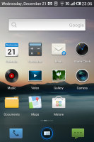
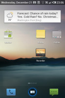
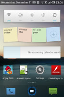
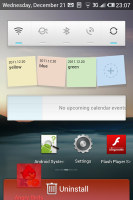
The homescreen doubles as the app drawer
You only get three homescreens at first (there's an indicator for the currently active one), but as they start to fill up, you can grab a shortcut or a widget and drag them to the side and a new homescreen will appear. There's no overview mode where you can easily add, delete or rearrange homescreen panes.
We mentioned widgets - the Meizu MX came with very few preinstalled. There's the Google search widget, the service widget that turns Wi-Fi/Bluetooth/GPS/etc. on and off, a notes widget, a calendar widget and the News & weather widget. That's it, there's not even a clock widget. If you want more, you'll have to get third party widgets off the market.
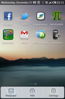
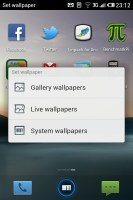

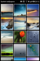
Adding things to the homescreen • Choosing a wallpaper
Note that each widget can be placed only once on the screen, even third party ones. So, the News & weather widget (which has News, Weather and News & weather modes) can be used only once - you can't have one for news and another for weather.
Anyway, you can set the homescreen wallpaper as usual and there are quite a few provided. Live wallpapers are enabled too, but there's only the Maps live wallpaper preinstalled.
The notification area is mostly unchanged except for one detail - it will only slide down as much as it needs to display the current notifications plus the Clear button on top.
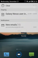
The notification area is only as big as needs to be
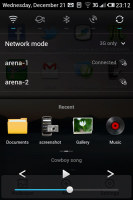
There's one more element of the general UI we need to cover - the task switcher. Actually, it's quite different from what you're used to in Android. For starters, it's launched by the Menu button, not the Home button. Also, it offers a lot more functionality than the vanilla switcher. Let's call it control panel, as "task switcher" is largely inaccurate.
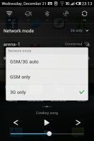
It's closer to the beefed up notification area of Sense UI. It offers toggles for Wi-Fi, mobile data, Bluetooth, GPS and syncing. Then there's the list of Wi-Fi networks plus a mobile network mode dropdown.
Only then we reach the task switching bit. It's paginated and fits a row of four of the most recent apps per page. The leftmost page is a special one with a "Close all applications" button (you can close apps individually by a tap and hold). The number of pages grows as you open more apps, so you get a longer list of recent apps than the usual 6 apps.
At the bottom of all this, are the music player controls (previous, play/pause, next and a volume slider).
There are a few more toggles available from the menu that pops up when you press and hold the Power/Lock key - they switch on and off the ringer, the vibration, airplane mode and GSM connectivity (those are two separate toggles) and the screen auto-rotate.
There's one more trick to the interface that eluded us at first - when you're scrolling through lists, you can tap the top right corner of the display (where the clock is) and the list will automatically scroll to the top. It's something that most people might miss, but can come in handy when dealing with very long lists.
That's about it for the general user interface. We just want to note that screen transitions - entering and leaving an app, moving between menu screens - have been directly lifted from iOS.
The software behaved well most of the time but it would occasionally act up and cause problems we don't like seeing on a platform as mature as Android. Whether it was a "missing application" error for an app we had just installed or connectivity problems with a computer, the heavily customized software is experiencing some growing pains that you'll have to live with at first, until Meizu get them fixed.
Synthetic benchmarks
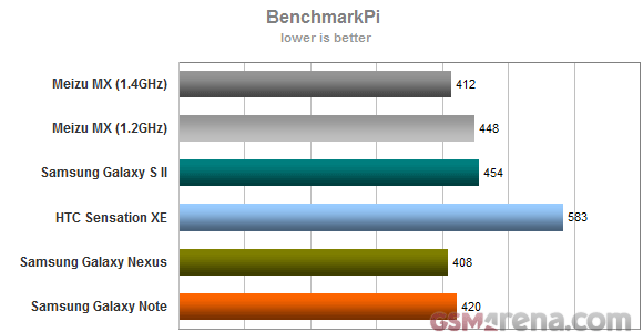
Update, December 30: We received the stock firmware image from Meizu and we re-ran the tests with the CPU clocked at 1.4GHz (it used to be 1.2GHz). We've left the old results in so you can see how much of a difference 200MHz make.
BenchmarkPi performance was already pretty good, but after the update the MX became one of the fastest droids in this test. It rivals both the Samsung Galaxy Note and the Galaxy Nexus, with the Galaxy S II following slightly behind.
Something went wrong with Linpack and it started reporting very low results after the update. Considering pre-update the Meizu MX was doing 92.3 MFLOPS, we expected it to match the Galaxy Note post-update (both use the same chipset at the same clock speeds). We've had an issue like that with Linpack before (after we updated LG Optimus 2X).
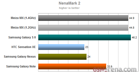
The Mali-400MP GPU did very well at the graphics benchmark, almost matching the Galaxy S II, which has about 40% fewer pixels on its screen. Android games will run buttery smooth on the Meizu MX. The update changed nothing - it was only the CPU clock speed that was reduced, it turns out the GPU was running at the final speed all along.
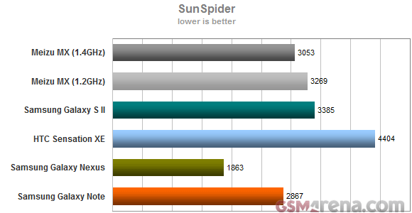
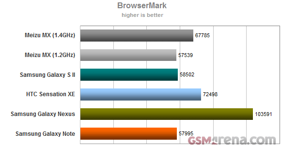
When it came to browser benchmarks, the Meizu MX overtook the Samsung Galaxy S II in Sun Spider and ended up slightly behind the Galaxy Note. The updated JavaScript engine in the ICS-running Galaxy Nexus is the leader here due to some amazing optimizations for the new OS on Google's part. In BrowserMark (which tests both JavaScript and HTML5 performance), the Meizu MX almost caught up to the HTC Sensation XE, which is still the best Gingerbread droid in this particular test (with ICS having an impressive lead again).
Reader comments
- AnonD-70387
- 07 Sep 2012
- rK1
GUYS PLEASE HELP ME !! does this phone really has a dual speakers, i mean stereo loudspeakers and if its, then where these two speakers located, and one thing if its really has a stereo speakers then how's the sound quality of the speakers and how ...
- xaio lee-ming ciaw
- 14 Jul 2012
- 3sE
Hi my meizu mx in south china came wwith the foll: Phone Charger Usb cable Stereo head set 2 extra sets of ear plugs Carry case Docking station Screen protector Sim eject tool Sim adapter(!) Ppc soft ware Manuel (!) Wha...
- AnonD-12395
- 28 Mar 2012
- 3VT
In all honesty, I go around a lot and have not seen it anywhere else... Europe or Asia.
