Microsoft Surface review: Ripples of change
Ripples of change
Windows RT is where tablet and laptop meet
Windows RT is Microsoft's ARM-based version of the platform and is designed to run on the much less capable mobile chipsets, instead of the x86 Intel and AMD processors.
Windows RT relies only on the Windows Store for apps and you can't install legacy software. None of your Windows Vista/7/8 apps will be available on Windows RT, unless their developers release a compatible version.
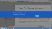
Apps won't install in Desktop mode
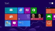
The user interface has been completely revamped to become more touch-friendly and you can easily feel the heavy Windows Phone influence. Once you've unlocked the Surface you're greeted by the Modern UI (or Start), previously called Metro.
Microsoft has put a lot of effort into optimizing Windows for touch navigation and the results are quite impressive. There is a wealth of gestures developed so that the UI can be browsed easily and intuitively. Once you get used to them you will appreciate the kind of difference they make.
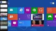
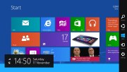
The Start menu is comprised of live tiles just like on Windows Phone. The difference is that the live tile grid is scrollable horizontally rather than vertically, which makes sense given the default orientation of the screen.
A pinch gesture on the screen shrinks the grid of tiles, which is particularly handy if you've got a lot of tiles and you are starting to get lost.
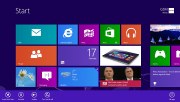
A swipe from the top or bottom of the main screen reveals the context menu. This gesture is enabled in every app, as well as in Start.
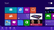
To select a tile you need to do a vertical swipe on it - mass selection for unpinning and uninstalling is also available. This works on all sorts of files in Start - pictures, documents, etc. Live tiles can be resized just like in Windows Phone. Some tiles are nothing more than static icons even after you make them bigger but others (like Calendar) help bring more information right on your homescreen.
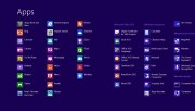
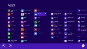
The context menu holds the All apps option, which works just as expected - it takes you to a list of all the apps you have installed on you Surface.
While in All apps mode, a pinch gesture reveals an alphabetical grid which lets you quickly search the list of apps.
Switching between apps is done by swiping from the left edge of the screen towards the center. There's an alternate way of doing this - a short swipe from the left edge of the screen and then quickly back displays a vertical thumbnail grid of the recent apps. If you're using a conventional keyboard with your Windows RT, a simple Alt+Tab gets the job done just like it has for ages now.
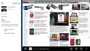
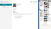
Windows RT offers a split screen mode too. If you drag another app into view from the left of the screen and hold it over your active app the two will enter split screen mode. The screen isn't divided equally though - one of the apps always gets three-quarters of the screen, leaving a only small portion for the second app. You are free to change which of the two apps gets the lion share.
You can also change apps in split screen view, in what's called Snap. Only the app in the bigger view can be changed, however, which is a bit odd. If you want to change the secondary app you have to upsize it first and then launch another app in its place.
Charms menu
The Charms menu is available across the OS. It's accessible via a swipe from the right edge of the screen and gives access to search, share, Start, devices and settings.
Devices detects every device in a Homegroup - if you're using one that is. You can send content to these devices through this menu. Share does the same, but using different apps to share depending on the type of content.
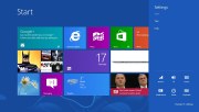
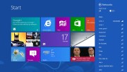
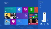
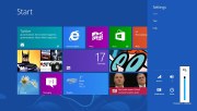
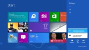
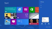
The settings menu gives you quick options for Wireless, sound, screen, notifications, power and keyboard.
There are sliders to adjust the brightness and volume of the device.
You can also select which keyboard to use and choose to restart, shut down or sleep using the quick toggles.
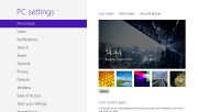
There's also a shortcut to the detailed settings menu here. From there you can personalize the look of Windows RT. You can choose a lockscreen wallpaper, select apps that can run in the background and show notifications or detailed statuses on the lockscreen - for instance the Calendar will display your upcoming events.
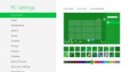
The next option is the Start screen. You can choose a color scheme and background. There are many options in every color you can think of but you can't use your own picture as a wallpaper - you have to select one of the preinstalled ones.
The last option available lets you change your account photo.
You can add multiple users on Windows RT, just like you can in Windows 8. Each user can have their own tile grid, apps, preferences, etc. If you have more than one Windows 8 or RT device you can enable settings sync between them.
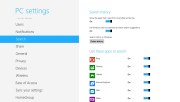
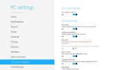
Notifications can be disabled on the lockscreen altogether and you can switch off the sounds. You can also configure which apps can push notifications to your lockscreen. However you cannot control the way notifications are presented, only switch them on and off.
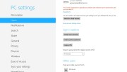
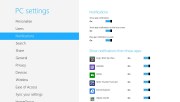
Users and notification settings
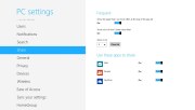
Users can choose which apps to use while searching. There's the handy option to delete the search history too. Sharing settings are very limited. Currently you can only share via Mail, People and SkyDrive.
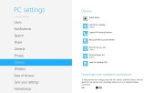
The general settings handle time, spelling, screen automatic brightness, language options, reinstall Windows, etc. Devices handles the PCs and devices in a Wi-Fi homegroup. You can add new and connect with existing ones.
Windows RT lets you choose which settings you wish to sync with SkyDrive or disable the feature. Your personalizations, passwords, app, browser settings and more can be synced between your PCs.
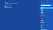
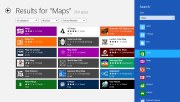
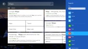
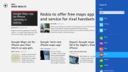
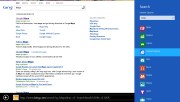
Search is universal and displays results from the entire UI, including apps. For instance if you search for "Maps" you can see results in the Windows Store, Bing Search, Internet Explorer and find the local Bing Maps app. We like the way Microsoft has integrated search into the OS - it's easily accessible throughout the OS thanks to the Charms menu.
If you're using a keyboard, you can initiate a search by simply typing on either the Tile screen or in Desktop mode.
Modern UI is really fluid and responsive. All UI transitions and animations are buttery-smooth and we didn't notice any lags even though the quad-core Tegra 3 SoC isn't the fastest around anymore.
The only part of the user experience that gets the old-gen chipset exposed is app loading times. Some apps take incredibly long to start and you have to spend quite some time watching that dreaded loading animation.
Reader comments
- narsh
- 11 Jan 2013
- vGn
It has Powerful processing and beautiful design unite on Surface but is it worth for that price.
- AnonD-10315
- 30 Dec 2012
- fXw
Thanks.... Hope you are not being sarcastic....:)
- vhh
- 29 Dec 2012
- kek
i bought this yesterday nice table faster than all other tablet.
