Moto G5 Plus preview: A closer look
A closer look
Design
Visually, the G5 Plus looks nearly identical to the G5. The front of the phone has sizable bezels, which are quite distracting, especially on the sides. They are particularly distracting on the gold colored model because the bezels have also been painted gold instead of just being left black.
Above the display is the earpiece that also serves as the loudspeaker, along with a front facing camera. Below the display is the fingerprint sensor, which is just a static capacitive surface and not a physical button.
On the right are the power and volume buttons. The buttons are well positioned and work well when you are using the phone but the power button falls exactly where you would normally grab the phone while picking it up and you end up pressing it unintentionally all the time. It doesn't help that the button is a bit soft and very easy to press.
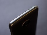
On the top is a SIM card tray that can hold two nano SIM cards as well as a microSD card, which means you don't have to choose between having a second SIM or a memory card.
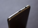
On the bottom is the now outdated microUSB connector, microphone and the headphone jack. We wish Motorola had gone for a USB-C connector here.
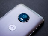
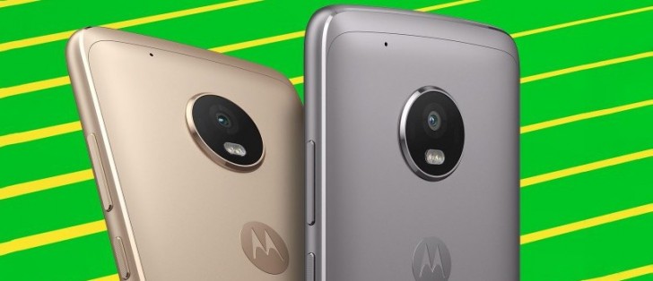
The back of the phone is the only place with metal on it, even if the plastic sides have been made to look like polished aluminum chamfered edges. Unlike the Moto G5, the G5 Plus does not have a removable back and the metal panel on the back is sealed. The camera module on the G5 Plus also sticks out a fair bit but honestly, we don't think it looks all that bad. Below it is a matte finished Motorola logo and near the bottom are the certification logos.
When it comes to build quality, the G5 Plus is leaps and bounds ahead of the G5. We complained about creaky build on the G5 but the G5 Plus feels rock solid. This is primarily due to not having a removable back cover, and having a sealed case improves the overall structural rigidity tremendously. Like the G5, the G5 Plus also has a water-repellent coating that's not quite the same thing as water resistance but should be enough to protect the phone against a light shower.
In terms of size, the G5 Plus is still on the larger size. This will be a concern for those who have smaller hands or just need a compact phone. The phone does not really make good use of the space on the front so even though the display is just 5.2-inch in size, the phone is as large as most 5.5-inch devices on the market.
Display
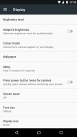
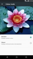
The Moto G5 has a 5.2-inch IPS LCD. The image quality of the display is very good. Out of the box the phone comes with slightly saturated colors that look good without being overwhelming. However, the phone has an option in the settings to switch to more natural colors, at which point it targets standard sRGB color values.
The display has a red color cast to it, which is noticeable when you see it side by side with more accurate displays but it's not something that you'd notice otherwise. The display also gets bright enough outdoors and dim enough when you are staring at it at night in a dark room. Overall, we think this is a really great display at this price point.
Reader comments
- Mario
- 08 Aug 2021
- nYC
This Moto G5 plus camera takes the worst pictures I've seen. Even my old Moto G3 did a better job. HDR sucks. I know this is because of the software, since the sensor is quite good and you can find online forums where people report excellent res...
- Anonymous
- 06 Jun 2021
- uv4
Moto G5 plus new android software when come
- fearlessleo
- 30 Jan 2021
- 8@L
Moto G5 Plus is the worst at game playing! Battery doesn't stay charged long either!


