Moto G (3rd gen) review: Good as gold
Good as gold

User interface
Motorola Moto G (3rd gen) boots stock Android 5.1.1 Lollipop. Motorola prefers vanilla Android UI with minor improvements, so it is able to provide timely firmware updates. Take a quick look at the device in action in the video below.
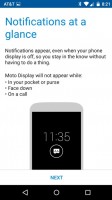
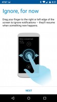
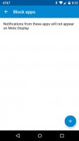
Motorola has a new cool way to display notifications without waking up the screen. The feature is called Notifications at a Glance and is very similar to Lumia's Glance screen but it's even cooler.
Whenever the phone registers you're taking it out of the pocket or picking it up from a table, it lights up a clock on the locked screen, flanked by icons for any missed notifications. Tapping and holding such an icon reveals more information and details. All this happens without waking up the phone.
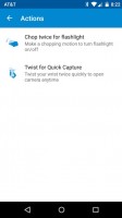
Other two exclusive Moto features include quickly twisting your wrist to activate the camera, chopping gesture to utilize the LED flash as a flashlight, and activating dedicated sound profiles at night or when you're in a meeting.
The homescreen is a usual Android affair - you change wallpapers, add/remove widgets, create shortcuts. The leftmost pane is reserved for Google Now. All the apps are stored into a comfy app drawer, sorted alphabetically. There is no option for custom order.
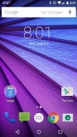
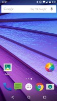
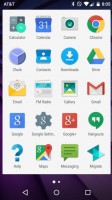

The homescreen • the app drawer
One finger swipe from the top of the homescreen will open the notification area, which features a clean look in Android Lollipop. Additional swipe reveals quick toggles that include Wi-Fi, Bluetooth, Airplane mode, screen auto-rotate, flashlight, location on/off, and the option to cast the screen. Of course, you can also adjust the brightness of the screen and go into the settings menu too.
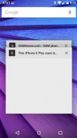
The app switcher has a neat card interface that allows you to select the app you need by swiping up or down. You can close apps by swiping left or right, or by hitting the dedicated button on the top right corner of each card. Each Chrome tab now appear as a card, too.
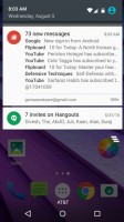
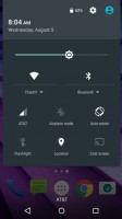
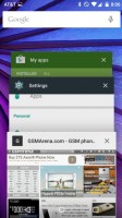
The notification area and the task switcher
Finally, Google Now is summoned by an upward swipe from the virtual Home key. It is also available as a homescreen - the leftmost one.
Web browser and other apps
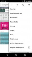
Google Chrome is unsurprisingly the default browser in the new Moto G. Its design matches the material look and feel of Android Lollipop.
One of Chrome's strengths is its ability to seamlessly sync with the desktop version, using nothing but your Google account. This allows you to open an article on your PC and finish reading it on your mobile phone. It also syncs your bookmarks and favorite sites.
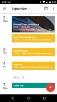
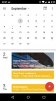
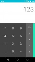
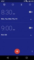
The usual organizing tools are present as well - there is the massively capable Google Calendar, a neat Calculator, and Clock (alarms, world clock, timer, stopwatch). A proper File Manager app is missing though so you'd have to download one off the Play Store.
There is no office editor out of the box. However, Google's highly capable Docs is available for free in Google Play.
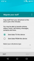
The Moto Migrate app will help you transfer contacts, messages and multimedia from other Android devices or iPhones. The app is easy to use and
In addition to being easy to update, the stock Android build of the new Moto G is also a blank canvas for user customizations. With a plethora of quality launchers, icon packs, and wallpapers available, each owner can tweak the device's UI to their liking.
Reader comments
- Anonymous
- 12 Jan 2021
- 4BP
Does the 3.5 mm jack support a wired hands-free set? Or is it only for stereo audio? I have a hands-free set with 4 segment 3.5 mm jack. Doesn't seem to go in all the way. People on the other end of the line say there's an annoying echo...
- Anonymous
- 08 Jan 2021
- Dk6
While charging, the led light does not blink.
- Tulsidas
- 12 Dec 2020
- 7kf
Please help for my cell preferred sim mobile data on issue
