Moto Z Play review: Playmodo
Playmodo
Unboxing
Motorola doesn't offer anything too fancy regarding packaging and presentation for the Moto Z Play. The handset ships in a rather plain two piece rectangular box. There is not a lot going on on the inside either. The phone tray itself is paper, so is the leaflet box and the compartment for the included accessories.
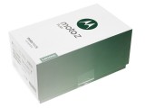
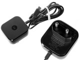
Moto Z Play retail box and Turbo charger
Speaking of the latter, all the essentials seem to be covered, but there is nothing too fancy. Besides a back cover to snap on, you also get a decent headset and a wall outlet. It is compliant with Motorola's Turbo Power quick charging technology, which is great. Rated at 15 wats, it managed to charge our test unit from zero to 32% in 30 minutes.
Hardware
Say what you will about Motorola's styling, but continuity has always been a cornerstone in what many would call its classic or retro design. Round shapes are still the norm, and while there is still an abundance of plastic to be found in the Moto range, the Z family bumps things up a notch, with a metal frame and glass body combination.
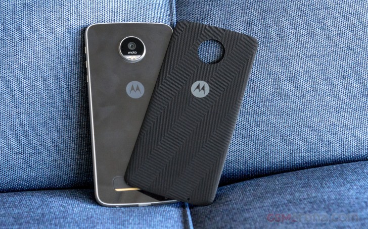
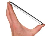
As far as the overall footprint is concerned, the Moto Z Play is unsurprisingly a bit bulkier than its higher-end sibling, but also more compact in many aspects than the 5.5-inch Moto G4 Plus. The exact measurements are 156.4 x 76.4 x 7 mm, which makes the handset just a bit taller than its G4 Plus cousin, but noticeably thinner. This is nowhere near the impressive 5.2mm profile of the regular Moto Z, but on the other hands, is almost identical to the measurements of the Moto Z Force. And just like the latter, the extra volume is put to good use, housing a respectable 3510 mAh battery.
When it comes to weight, the story is pretty much identical. Tipping the scale at 165 grams, the Moto Z Play is definitely in the same weight category as the Moto Z Force. The Moto G4 Plus weighs about 10 grams less, but that is likely the plastic talking.
Carrying over the design language is important for brand recognition, but it's also great that the company has maintained the build quality as well. The Moto Z Play feels rock solid. Well, everything except, perhaps, the Moto Mods magnetic attachment system.
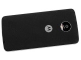
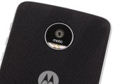
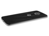
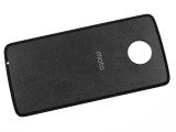
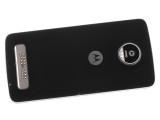
While on topic, we might as well start looking at the handset from the back. Our unit came with a textured back panel, attached in place of an actual, functional Moto Mod. There are a number of these; you can pick them up from Motorola's store and treat them like interchangeable back covers - something Moto fans are well used to.
Unlike back covers with proper plastic attachment mechanisms, these rely on a simple magnet fixture. That does not work well. The fit is not tight, nor snug. There is a clear gap left between the two surfaces. Worse still, since the magnet doesn't hold that well, losing the cover is very easy, especially in a bag or purse environment.
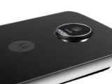
So, the simple magnetic back covers are arguably a bad idea. We guess you could find some consolation in the fact that the accessories do, at least, level out the otherwise quite substantial camera bump.
Of course, you can always remove the cover, which leaves you with a nice flat glass back to enjoy, or rather... worry about. We found the surface in question to be quite susceptible to scratches. We guess, you just have to pick your poison, so to speak. Looking at the exposed golden contact points on the Moto Mods connector, some extra protection might be a good idea.
Speaking of said connector, we can't say much about it, since it is an entirely proprietary solution. What we do know is that the 16 or so contact points are enough to access quite a few internal features and hardware, judging by the complexity of some of the Moto Mods.
Continuing the tour around the Moto Z Play, there is quite a bit to be said about the bezels and the controls they house. It is great that Motorola didn't cheap-out and went for metal frames all around. They feel great and are chamfered in a way, quite reminiscent of something like the Samsung Galaxy S6 - very comfortable to hold.
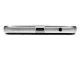
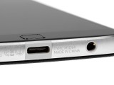
However, we really can't get over the design decision to put a plastic insert around the Type-C port. We are fairly certain it can't possibly be put in place to serve any other purpose than spoil an otherwise excellent appearance. Sure, you might make the point that plastic is harder to scratch than the brushed metal around it, which is likely why the inside of the 3.5mm jack is coated with it. But it is truly an eyesore.
Turning the phone 180 degrees reveals a rather busy top side and another plastic insert used quite possibly as an antenna separator.
It still looks quite ugly though and we can't really imagine why Motorola decided to place the SIM tray on the top, rather than on the left-hand side, which is left completely empty. One definite positive note worth making, however, is that the tray is very cleverly designed. On one side, you have the two Nano-SIM cradles, while the other side houses an independent MicroSD card reader.
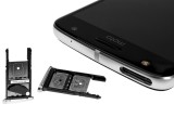
Busy top side and versatile SIM tray
We already said everything about the left side, it is completely empty.
The right-hand side should theoretically be quite busy since it has the volume rockers and power button. However, for some utterly inexplicable reason, Motorola, or rather Lenovo, decided to make these incredibly tiny. At least the power button has some nice texturing, which makes it more tactile.
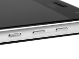
Ridiculously small volume controls and power button
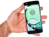
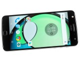
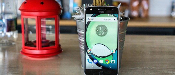
As for the front of the Moto Z Play, it has a nice symmetry going on, with the front-facing LED flash and selfies shooter, flanking the earpiece.
Carved into the glass above the screen is a pretty chunky hole for the earpiece. It's also the loudspeaker, so you can enjoy a front-firing speaker (back or down-firing speakers aren't great for watching videos and occasionally get muffled).
The only other thing worth noting is that, just like on the rest of the Moto Z line, as well as the Moto G4 Plus, the fingerprint reader is not a button, can not be pressed in any way and does not serve a dual-purpose as a home button. We find the latter part particularly annoying since it only comes natural to expect such behavior from the well-defined square sensor.
We also don't particularly get why the main microphone is on the front of the phone, instead of the bottom.
Reader comments
- Andy L
- 16 Mar 2024
- HX1
I bought mine in late 2016, used it as a phone for two years, great solid phone. Build quality is really up there IMO. My wife is still using it to surf social media and the internet while her main phone is charging. So 7 plus years of use, onl...
- Minivanman007
- 27 Dec 2022
- 4%f
Got it back in 2016. It is after Christmas 2022. I took it to have the battery replaced. I hope they can replace it. I can't complain about this phone. The camera is amazing. I don't want a new phone, I want this one.
- Sarfraaz
- 01 Oct 2019
- 6p{
Moto z series is great
