Moto Z Play review: Playmodo
Playmodo
AOSP with a dash of Moto
Software is another area in which Motorola has managed to keep to its roots throughout multiple generations now and despite the multiple changes in management. If a stock Android experience is what you are after and the latest Nexus or should we say Pixel, given the latest developments, isn't to your taste or possibly your spending budget, then Moto's phones are the ones to turn to.
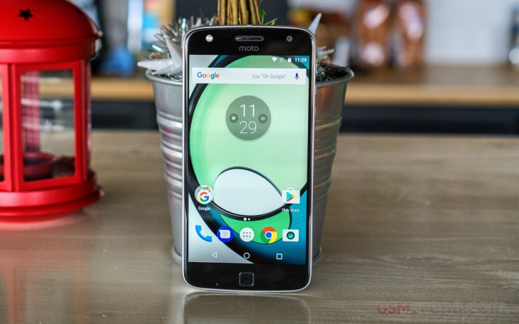
The Moto Z Play does not disappoint in this department either and you get a mostly vanilla ROM, Android 6.0.1 Marshmallow non the less. The software is some of the purest Android this side of the Nexus line and with remarkably little bloatware. We say Nexus as the Google Now launcher is still the norm. Google seems to be keeping the new Pixel styling and remodeled interactions away from AOSP and confined to the Pixel launcher. However, wider availability of said goodies seems to thankfully be on the way. The Gboard keyboard and Google Allo messenger, complete with the Google Assistant are a great testament to that.
However, there is still a minimum amount of custom code to note. The camera app, for one, is tailor made, but it brings a few extra features on top of the usual Google Camera, so we don't mind the upgrade. The rest of the pre-installed apps include Google Play Music, Google Photos, Google Hangouts, you get the idea - all stock Android software. The Google package, to be exact.
There's also the Moto app, which is a simple configuration screen. It can set up the Active Display - turn it on or off, block select apps from spamming and disable it for a given time period (so you can turn it off at night).
It's not an always on display like Samsung and LG offer, but it comes on when a new notification arrives, when you pick the phone up or when you double-tap the screen. Since the Moto Z Play has a few extra sensors over the Moto G4 Plus, unlike the latter, it can also sense your hand approaching the handset and toggle the notification display accordingly.
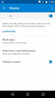
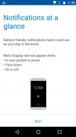
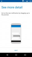
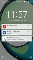
Display options • Moto screen options • Moto screen options • The stock lockscreen
The app also enables the two usual Moto gestures - chop twice to turn on the flashlight (and again to turn it off) and twist your wrists twice to quick launch the camera. There are also a couple of gestures for the ringer - flip for Do Not Disturb and pick up to stop ringing. We already mentioned the "Approach" gesture the Moto Z adds over its less expensive Moto G4 sibling, based on the presence of extra sensors. However, there is also a swipe up gesture to shrink the screen down for single-handed operation. We can only imagine it will be trickling down to other Moto devices as well, since it is a purely software feature.
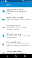
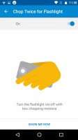
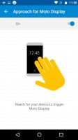
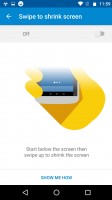
The Moto app lets you tweak the added Moto features
The Moto app also has an assistant component that can listen for your commands all the time, with a custom wake-up phrase, non the less. If you have a pressing desire to experiment with a voice assistant, Moto's solution might not be nearly as sophisticated as the likes of Cortana or Siri, but it is already bundled and requires little fiddling out of the box. So, you might just want to give it a try.
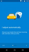
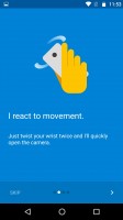

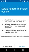
The Moto app is surprisingly feature-rich
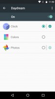
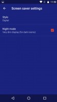
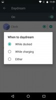
Last, but not least, there is a daydream feature as well. It can be used to display colors, photos and a clock in different styles.
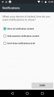
Other than the Moto Screen, the lockscreen is plain Android. This means time and date, notifications and two shortcuts - Camera and Voice search.
Behind the lockscreen is the Google Now launcher. The left pane is your Google Now view with all relevant info cards. If you choose to enable it, that is. To the right are standard homescreens. Swiping up from any interface brings up the Now on tap feature - now more content-aware and smarter than ever.


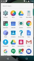
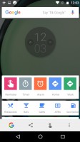
Google Now launcher • Google Now pane • The app drawer • Google Now on tap
The Notification area shows notifications on the first swipe and then Quick toggles upon a second swipe. You can also do a two-finger swipe to get straight to the Quick toggles. This is the vanilla Android setup and it is gaining popularity as many phones stick close to AOSP and even skinned ones like Xperias do not change it.
This includes the brightness slider that lacks an Auto toggle. You have to go into the settings menu if you want to enable/disable automatic brightness.
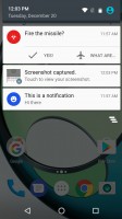
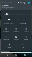
Notification area • Quick toggles
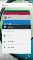
The app switcher is the usual 3D rolodex. Google has been considering adding split-screen multitasking for ages (since Lollipop), but it never gets past the beta stage of the latest Android (it's buried deep somewhere in Nougat, let's see if it survives this time).
The fingerprint reader is a shared feature within the Moto Z family. In terms of appearance, it has many obvious design drawbacks, at least as far as our tastes go and room for functionality improvement. On the plus side, however, it is very snappy and quite accurate, also, always on. So, overall, we can't really complain. Well, the setup interface could have been a bit less patronizing. However, showing it to a friend can yield a few laughs.
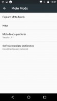
Since NFC is present on the Moto Z Play, Tap and pay is also on board. And last, but not least, it is worth mentioning that Motorola has included a separate interface for managing the Moto Mods. Interestingly enough, the Moto Mods platform seems to be treated as a more or less separate piece of tech, complete with its own version indicator and what appears to be an independent update mechanism.
Reader comments
- Andy L
- 16 Mar 2024
- HX1
I bought mine in late 2016, used it as a phone for two years, great solid phone. Build quality is really up there IMO. My wife is still using it to surf social media and the internet while her main phone is charging. So 7 plus years of use, onl...
- Minivanman007
- 27 Dec 2022
- 4%f
Got it back in 2016. It is after Christmas 2022. I took it to have the battery replaced. I hope they can replace it. I can't complain about this phone. The camera is amazing. I don't want a new phone, I want this one.
- Sarfraaz
- 01 Oct 2019
- 6p{
Moto z series is great
