Motorola DROID RAZR M review: Affordable luxury
Affordable luxury
Android 4.0 Ice Cream Sandwich with a light touch by Motorola
The Motorola DROID RAZR M runs Android 4.0.4 Ice Cream Sandwich, with very light customizations by Motorola. The overall Android experience is very close to the stock Android - starting from the on-screen Android buttons, all the way to the app drawer and its transition effects.
Check out the handset in action below.
The first area the interface which has been customized by Motorola is the lock screen. Pressing on the round unlock button gives you option to access four different features of the device - you can unlock it, or go straight to telephony, text messaging or the camera apps. You can also turn the device's sound on and off from the lock screen.
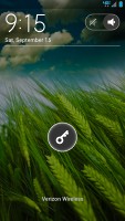
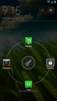
The lock screen has plenty of options
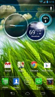
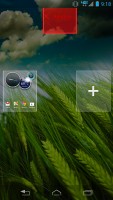
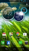
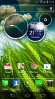
The homescreen consists of side-scrollable panes. Switching between them is seamless, save for the small indicator above the docked icons, which disappears when not needed.
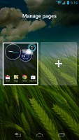
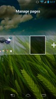
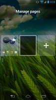
When adding or removing a homescreen pane, you have two options - start with a blank or use a preset one. The preset ones are geared towards specific activities such as social networking, entertainment, etc.
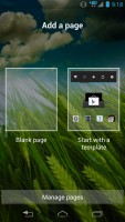
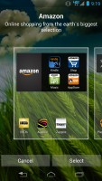
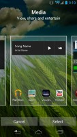
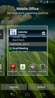
Adding panes to the homescreen
Removing homescreen panes is as easy as swiping them upwards. No surprises here.
In a true Ice Cream Sandwich fashion, long pressing the homescreen gives you the option to change the handset's wallpapers. You can do so for both the lock and the homescreen.

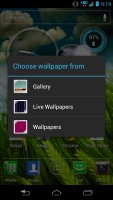

Long pressing the homescreen • some of the preloaded wallpapers
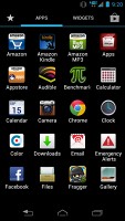
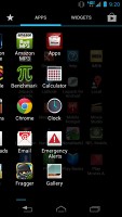
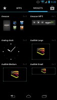
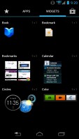
The app drawer has been taken straight from the stock version of Android ICS. It features two tabs - Apps and Widgets - that house side-scrollable pages. If you scroll past the available apps you move into the Widgets tab. There's also a Google Play store shortcut next to the tabs, for quicker access to Android's app repository.
You can create folders in the familiar ICS way. All you have to do is swipe the icon over the one you want to pair it with.
We must note that there aren't many preloaded widgets. However, Motorola's own Circles widget is one of the most comfortable ones we've encountered. It offers you access to the clock, weather in different cities, as well as a battery indicator. Customization is also possible.
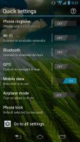
Swiping the device's homescreen to the left reveals a menu with quick settings. From there, you can change the most commonly used connectivity settings such as Wi-Fi, Bluetooth, etc. We found this shortcut particularly handy.
The notification area is taken straight from the stock ICS UI. It shows you icons next to the notification, such as the picture of the person who called or messaged you. There's a Settings shortcut to make up for the fact that you can't go Menu > Settings.

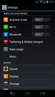
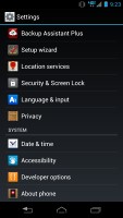
The notification area allows you to enter to phone's settings
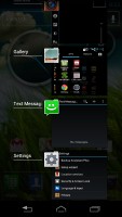
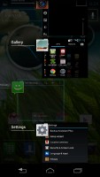
The Recent apps list is stock ICS one - it displays thumbnails of the running application rather than its icon and it's a vertical, scrollable list. You can dismiss apps with a simple swipe to the side.
The overall user interface experience with the Motorola DROID RAZR M is quite pleasant. The UI has been customized lightly, but cleverly. This helps it retain a lot of pure Googleness to it - not a bad thing in our opinion.
Sadly, the DROID RAZR M is yet another example of Verizon Wireless doing its best to ruin a perfectly fine user experience. The amount of preinstalled, non-removable software is completely out of line. With the usual set of Verizon bloatware, you will find a number of non-removable shopping apps such as Amazon, Amazon MP3, and Zappos. We do believe that it is up to the user to decide whether or not he needs those.
Synthetic benchmarks
The Qualcomm Snapdragon S4 chipset of the Motorola DROID RAZR M is the same as the one found in any top shelf device currently on the US market, including the Galaxy S III. With fewer pixels for its GPU to deal with, the DROID RAZR M posted truly impressive benchmark results, matching its competitors on virtually all occasions and even beating them at some.
Surprisingly, the web browser-based based benchmarks weren't quite so good. Motorola made a big deal about Google Chrome being the default browser and how fast it is, but our the RAZR M test results were less than impressive. Maybe Chrome is just unable to perform as well as expected outside of its natural Jelly Bean habitat.
Benchmark Pi
Lower is better
-
Motorola DROID RAZR M
264 -
Motorola Atrix HD
294 -
HTC One S
306 -
HTC One X
338 -
Samsung Galaxy S III
344 -
Motorola RAZR MAXX
402
Linpack
Higher is better
-
HTC One S
210 -
Motorola DROID RAZR M
188.9 -
Motorola Atrix HD
186.4 -
Samsung Galaxy S III
177.1 -
HTC One X
126.1 -
Motorola RAZR MAXX
51.2
Quadrant
Higher is better
-
Samsung Galaxy S III
5365 -
Meizu MX 4-core
5170 -
Motorola DROID RAZR M
5126 -
HTC One X (Tegra 3)
4842 -
LG Optimus 4X HD
4814 -
Motorola Atrix HD
4178
NenaMark 2
Higher is better
-
Motorola DROID RAZR M
61.1 -
HTC One S
60.5 -
Samsung Galaxy S III
58.8 -
Motorola Atrix HD
56.7 -
HTC One X
47.5 -
Motorola RAZR MAXX
36.9
SunSpider
Lower is better
-
Samsung Galaxy S III
1447 -
Motorola Atrix HD
1647 -
HTC One S
1708 -
HTC One X
1757 -
Motorola DROID RAZR M
1861 -
Motorola RAZR MAXX
2136
BrowserMark
Higher is better
-
Samsung Galaxy S III
169811 -
Motorola DROID RAZR M
113620 -
Motorola Atrix HD
107535 -
HTC One S
98435 -
HTC One X
96803 -
Motorola RAZR MAXX
92653
Reader comments
- Baburow
- 11 Sep 2020
- U{A
This phone display is amazing👍😍😍😍 I like it I need a same display phone and 5000 mAh battery🔋 and vol Motorola droid razar M, thank you😊
- Mos.022
- 22 Apr 2016
- CCa
For the first two months was pretty good after it he does some problems. He has a very very bad battery . I see that this phone not for games.This phone for business men. AND THIS IS MY OPINION.☺
- sabir ali
- 23 Nov 2015
- XuT
This phone have been 5.0.1 lollipop upgrade??????
