Motorola Edge 30 Fusion review

Introduction
Motorola has a pretty solid lineup of phones as of late. A few weeks back the mobile phone legend unveiled the X30 Pro and S30 Pro in China. The "30 series", for lack of a better name, has now started releasing globally under slightly different names. And one of the first releases is the Motorola Edge 30 Fusion - the global market variant of the Moto S30 Pro.
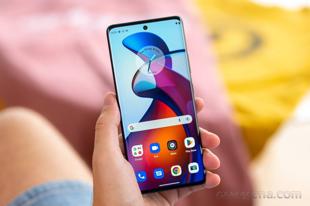
Despite its rather convoluted name, the Edge 30 Fusion is pretty clear in what it offers. On paper, it is nothing short of a well-rounded upper mid-ranger, or perhaps even "budget flagship," if that's more up your alley. It has a great 10-bit, HDR10+, 144Hz OLED display front and center, a powerful Dolby Atmos stereo speaker setup, an ex-flagship Snapdragon 888+ chipset, a sizeable 4,400 mAh battery with 68W charging and a 50MP OIS-enabled main camera, backed up by a 32MP selfie with autofocus.

Motorola Edge 30 Fusion specs at a glance:
- Body: 158.5x71.2x7.5mm, 167g; Glass front, textured back; Splash and dust resistant.
- Display: 6.55" P-OLED, 1B colors, 144Hz, HDR10+, 1080x2400px resolution, 20:9 aspect ratio, 402ppi.
- Chipset: Qualcomm SM8350 Snapdragon 888+ 5G (5 nm): Octa-core (1x2.99 GHz Cortex-X1 & 3x2.42 GHz Cortex-A78 & 4x1.80 GHz Cortex-A55); Adreno 660.
- Memory: 128GB 8GB RAM, 256GB 8GB RAM, 256GB 12GB RAM, 512GB 12GB RAM; UFS 3.1.
- OS/Software: Android 12.
- Rear camera: Wide (main): 50 MP, f/1.8, 1/1.55", 1.0µm, PDAF, OIS; Ultra wide angle: 13 MP, f/2.2, 123-degree, 1.12µm; Depth: 2 MP, f/2.4.
- Front camera: 32 MP, f/2.2, (wide), 1/2.8", AF.
- Video capture: Rear camera: 8K@30fps, 4K@30fps, 1080p@30ps, gyro-EIS.
- Battery: 4400mAh; Fast charging 68W, 50% in 10 min (advertised).
- Misc: Fingerprint reader (under display, optical); NFC; Ready For 3.5 support.
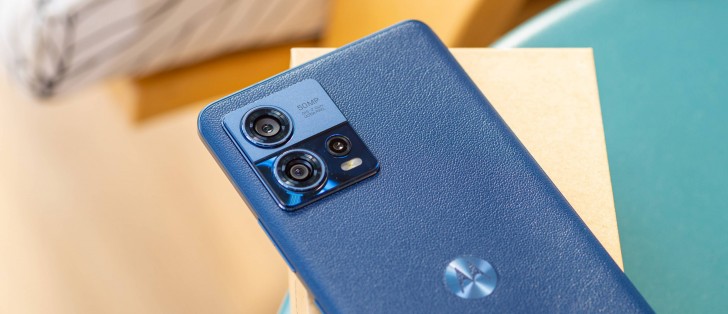
There is a lot to like here, at least on paper. Plus, the Edge 30 Fusion is unquestionably a charmer on the outside. It sports a very elegant exterior, complete with simple yet strong lines, plenty of curves both on the big display and around the back, where the faux leather finish really ties the whole design together. The Edge 30 Fusion looks very classy and dignified, like something you would see hanging out on a boardroom table.
Looking good in person and on paper is only half the battle, though, and even at first glance, the Moto Edge 30 Fusion isn't perfect and has certain omissions here and there. The big question is how well it all comes together. Join us on the following pages as we dive deeper to find out.
Before any of that, though, let's explore the retail package.
Unboxing
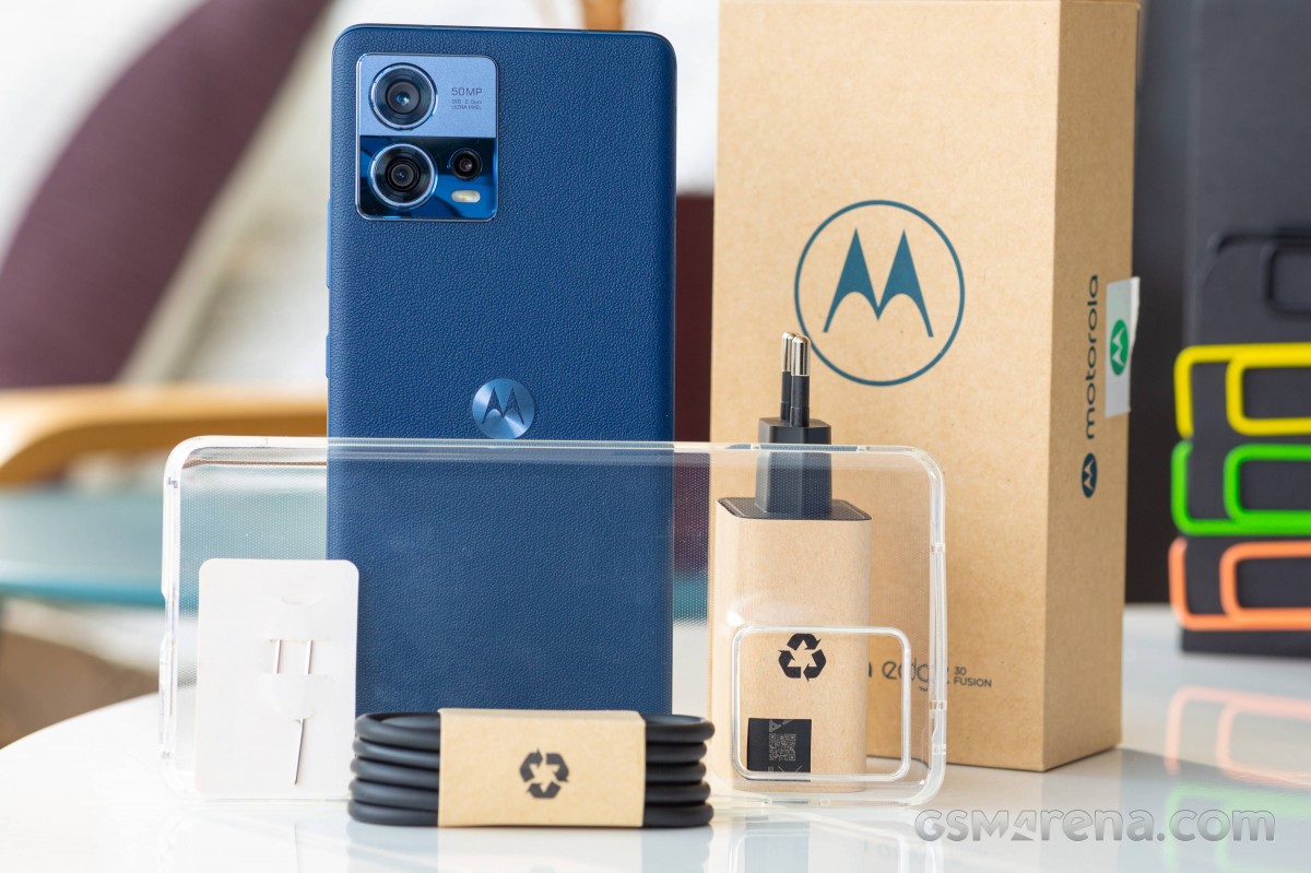
The Motorola Edge 30 Fusion ships in a thick, sturdy two-piece box. It does a great job of securely holding everything in place and protecting it during transit, and that's even in the absence of any plastics in our out. The box is obviously made of recycled materials. Motorola even decided to leave its natural color or shoot for a natural-looking dye to better convey this sense of an environmentally-friendly approach. The words "eco-friendly packaging" are plastered in big lettering on the side of the box, so there is a clear sense of pride in that regard.

The Edge 30 Fusion has a pretty rich retail package. It includes a surprisingly-compact 68W PD charger alongside a Type-C to Type-C USB cable. Also in the box is a nice thick, transparent TPU case so you can start using the phone immediately without any worries. The factory pre-applied plastic screen protector also helps in this regard.
Reader comments
- Hallo hallo
- 06 Feb 2025
- gDa
Great phone even today is very fast. New Android 14 released and fixed all of bugs that bothered this phone. Above that adds a new features and optymalisations. Very nice colorful screen, very fast processor and great software. Cameras also not b...
- Gill
- 25 Apr 2024
- 8jS
iPhone СА НАЙ ОМРАЗНАТА МИ МАРКА ТЕЛЕФОНИ....АРЕ ПИЧ БИЙ КАМШИКА
- Tal
- 23 Mar 2024
- 7kp
Bought this over s21 fe snapdragon, slimmer than poco and redmi, has custom rom development and is not mediatek. With latest update nav bar can be hidden but bluetooth range is less. Overall good phone, does manage heat very well.


