Motorola Moto E (2nd Gen) review: E for Evolved
E for Evolved
Retail package
As other affordable Moto smartphones, the new Moto E comes in a very basic retail box with just a microUSB connectivity cable. Motorola relies on you to have at least one charger plug at your home or you would have to use a USB port on your computer to charge the phone.
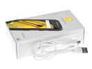
The retail box and its contents
The lack of a headset is a bigger omission, but it may as well be our specific regional version.
Moto E (2nd Gen) 360-degree view
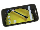
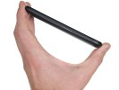
The second-gen Moto E comes with a bigger 4.5" display and thus has a slightly larger footprint. It spreads at 129.9 x 66.8 x 12.3 - this is 5mm taller, 2mm wider than the original Moto E, but the thickness stays the same.
Design and build quality
You'd expect Motorola Moto E 2nd Gen to be visually quite similar to its predecessor and you'd be right. The feeling of holding it in your hand however couldn't be different.
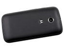
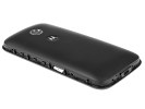
Both are made entirely of matte plastic and don't mind lugging along a thinker than average waistline, but the new Moto E is made of higher quality materials and the back is made of rubbery feeling soft plastic. There is also a new design element - a strip that runs along the sides of the phone, which has a grippy textured pattern.
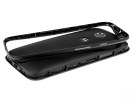
The back panel is not removable but that's not a significant change. On last year's model we could pop open the rear panel, but only to access the SIM and microSD slots - the battery wasn't user replaceable. It isn't now either. To gain access to the card slots, you remove the side strip instead. It's an unusual solution, but quite clever and practical.
The removable frame is also made of rubbery plastic, but it has a textured pattern, which improves the grip tremendously. The tiny piece is very easy to pop off and you can also change it for a strip in another color, which means you can use it to add color accents to your phone. Motorola calls it the Motorola Band and sells the extra colors in sets of three.
The matte plastic isn't as prone to fingerprints and smudges as the glossy materials, but it still gets smudged over time and requires cleaning.
The iconic 'M' logo at the back sits in a slightly depressed circle, just enough for your index fingertip to rest comfortably during a call. This, plus the grippy sides, provide a perfect handling experience for the Moto E.
Controls
The Moto E (2nd Gen) is stripped of any hardware controls at the front - the Android OS is providing on-screen controls instead.
Above the display sits the earpiece, which also doubles as a loudspeaker. Next to it is the secondary VGA camera. The proximity and ambient light sensors are also there.
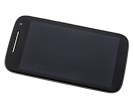

Above the screen - earpiece/loudspeaker, VGA camera and a couple of sensors
The right side of the Moto E houses the textured power key and the volume rocker, both made from silver plastic. There is nothing on the left.
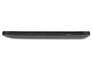
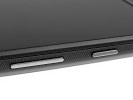
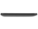
A peek at the right and left sides of the Moto E
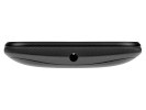
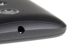
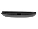
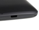
The 3.5mm audio jack is on top of the Moto E, while the bottom has the lonely microUSB slot.
The centered 5MP auto-focus camera lens is at the back accompanied by the Motorola's logo. The secondary microphone for active noise-cancelling and stereo sound during video recording is next to the camera as well.
Finally, the primary microphone is also at the back, placed around the bottom.
Removing the frame, which requires a bit of fingernail work, reveals the microSIM and microSD slots. You can hot-swap both cards anytime.
Reader comments
- Austin Smith
- 12 Mar 2025
- qJ@
Just having fun with this phone but I can’t log in to Google I try to change the date but nothing change Post by iPhone 8 Plus
- MR.PERFECT
- 03 Jun 2018
- uuV
dear all member moto e 2nd gen mobail support are 4g sim
- Anonymous
- 27 Dec 2016
- 4Jv
I don't get it. I keep reading about what a great battery it has and it has got to have the worst battery life on any phone I've ever owned. And how am I suppose to know if that is really the battery they have installed in my phone if I can't even se...
