Motorola Moto X review: Talk to me
Talk to me
Basic retail box
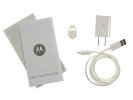
The Moto X ships in a small white box which sports Motorola's brand new logo. Inside it, you will find the phone, a charger, a USB cable, a tool for removing the nanoSIM card, and some booklets, but just like most smartphones in the US - no headphones.
There will be plenty of accessories available for the Motorola Moto X when it launches. Audio accessories by Sol Republic will be available straight from the Moto Maker - they include matching-color headphones and a wireless speaker. Protective cases from several major manufacturers will also be on offer.
Design
When viewed from the front, the Motorola Moto X can easily be mistaken for a Nexus smartphone due to the lack of any sort of branding. Things remain rather conservative on the back too. All you will find there is a small Motorola logo, as well as (in our case) a tiny AT&T globe.


You will be forgiven if you mistake the Moto X for a Nexus smartphone
Of course, it is impossible to talk about the design of the Moto X without paying significant attention to Moto Maker. Moto Maker is an online design studio which allows you to deeply customize the looks of your Moto X. There are two available options for the phone's front, 18 back colors, 7 accent colors and there will be the option to print a message on the phone's back later on.
Moto Maker is one of the main reasons why the Moto X will be assembled in the United States. Motorola has vouched to deliver the fully customized devices to you within four days after the order is placed. Such a feat would have been impossible if the device was assembled in China and needed to be shipped from there for example.
Software-wise, Moto Maker lets you put your own welcome message, preload an exclusive wallpaper, as well as login with your Google account in advance. The last feature is particularly neat, as it means that the Moto X will need practically no setup out of the box.
You will even be able to choose a black or white charger for the device, and opt for the color-matched Sol Republic JAX in-ear headphones we mentioned earlier or protective case.
We managed to spend time with a Moto Maker demo. Having so many color options and the ability to combine them any way you like, is as much fun, as it is overwhelming. You can see how the customization studio works in the screen captures below.


Moto Maker sets the Moto X apart from the competition
Motorola is also testing out wooden back covers for the Moto X. They will be available in the near future, ready to fulfill the dreams of those with a knack for eccentric materials.
The main downside of the Moto Maker is its limited availability. Only AT&T customers will be able to take advantage of it right now, while subscribers of the other US carriers will only get the woven black (like our review unit) and woven white versions of the device. Woven stands for the faux texture on the back of the smartphone.
Build quality
Motorola has produced quite a few smartphones with great built quality and the latest addition to its lineup is no exception. The Moto X is impeccably put together. It consists of two "halves" - a soft-feeling polycarbonate back, and front section which is entirely covered in Corning Gorilla Glass. It feels sturdy and ready to take plenty of daily use and abuse.
The Moto X features water-repellent coating. The latter has been applied even to the electrical boards inside the device, but wasn't enough to secure an IPX7 rating for the smartphone so you still need to be careful.
The Motorola Moto X is fairly compact for a smartphone with a 4.7" display. It stands at 129.3 x 65.3 x 10.4 mm, meaning it's 8mm shorter and 3mm narrower than the HTC One, which has a display of the same size. Of course the HTC flagship has front-mounted stereo speakers and a slimmer waistline to make up for as well as hardware navigation keys rather than on-screen buttons.
The Moto X weight tips the scale at 130 grams, which we found to strike a great balance and pocketability.


Moto X sized up against the HTC One mini
Display
The Moto X comes with a 720p AMOLED screen which is a departure from the current crop of 1080p units available on the device's competitors. Luckily, the screen uses a full RGB matrix, rather than the PenTile units on the previous Motorola smartphones. This means that when looked in isolation Moto X display certainly doesn't feel lesser. The difference can be spotted when placed side by side with today's top-end screens but it's not huge by any standard.


The Moto X's RGB AMOLED display
The product development managers of the Moto X were clear that it wouldn't have been an issue to put a 1080p display unit on the smartphone. Going with the lower resolution option however, helps a lot with the battery life, as well as the GPU performance.


Taking a closer look at the screen
Besides, the screen has excellent image quality, which makes you instantly forget any issues you might have with its resolution (and you probably shouldn't have any). Contrast is as perfect as you've come to expect from an AMOLED screen, colors are nicely punchy and viewing angles are super wide.
The display also offers great tactile feel. It features tapered edges to give a really natural feeling when handled.
Controls
Above the display is where the earpiece, the front-facing camera, as well as the ambient light and proximity sensors reside. A mouthpiece sits alone below the screen.


The view above and below the display of the Moto X
The nano-SIM tray is located on the left of the handset. The volume rocker and the power/lock key are located on the right side.


The left and right of the Moto X
The 3.5mm audio jack is located in the middle of the Moto X's top. One of two dedicated noise-cancelling microphones is sitting by its side. The USB port sits alone at the bottom.


A look at the top and bottom of the device
The F/2.4 lens of the 10MP ClearPixel camera is flanked by a loudspeaker on the back of the Moto X. The single-LED flash sits below it. A Motorola logo, small AT&T globe, and the second noise-cancelling microphone complete the picture.
The Moto X features a 2200mAh battery. It has been custom-shaped to take full advantage of the space inside the device, so it is said to deliver 31% more capacity than a conventional battery. That's what the press materials say anyway - given the over 10mm of thickness and its non-user-accessible nature, the battery capacity certainly isn't all that impressive.
Motorola didn't offer any specific numbers for the battery performance. The product managers did however, specify that the goal with the device was to make it through full 24 hours of use without breaking a sweat.
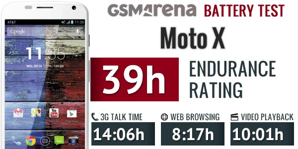
We put the Moto X through our traditional battery test. The device achieved an endurance rating of 39. This means that the Moto will make well beyond the intended 24 hours if used for an hour each of telephony, web browsing, and video playback daily.

As the Moto X posted far from great endurance rating, we ran one more test for the device with Active Notifications and Touchless Control turned off. With the new setup, the Moto X posted a slightly better endurance rating of 44.
Considering the relatively small endurance gain, we would recommend that you leave the Active Notifications and Touchless Control on. Both features add substantially to the Moto X’s appeal, they don’t deserve to be left without a tick in the settings menu.
You can see the full battery performance breakdown of the Moto X in our dedicated post over here.
Handling
The Moto X could very well be the best-handling Android smartphone in its display size category. Motorola has spent a great deal of research on the anatomy of the human palm before they came up with the curved back shape of the Moto X. The end result is a device which feels natural and reassuring to hold.
Furthermore, thanks to the almost complete lack of side bezels, the Moto X can be handled with one hand by everyone with at least averagely-sized hands. This one achievement is arguably one of the most impressive feats of design on the entire device.
Overall, the Moto X deserves nothing but high marks for build quality and ergonomics. We'd be taking a couple of points off the design score due to the lack of expandable storage and non-user-accessible battery, but it still remains pretty good.
The Moto Maker studio should allow even the most pretentious users to have the phone "their way" (as long as their way is AT&T, of course).
Reader comments
- infamoustrappa
- 07 Sep 2022
- HKF
How is this phone any good at all. I'm so pissed with my motox 6g no 5g. Generation can you help me so I can just download some tunes man help
- Lambert
- 14 Dec 2018
- CGH
unless If the update version is available


