Motorola Moto X (2014) review: Have it your way
Have it your way
User interface
The new Moto X boots the latest Android 4.4.4 KitKat. The smartphone offers the exact same launcher as the Nexus 5, so it truly is an upmarket alternative for Android purists. Check it out in action below.
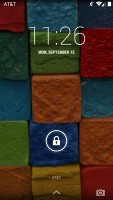
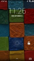
The lockscreen widgets remain unchanged and are full-screen, resizable tiles. One of them is always visible at the top of the main lockscreen, above the padlock icon. The rest are a right swipe away. The widget on the main lockscreen is collapsed to make room for the padlock button, but can be expanded to display additional information.
There are a few stock lockscreen widgets: Messages, Calendar, Gmail, Digital Clock, Google Now and Google+. The camera shortcut, just like before, is a left swipe on the lockscreen.
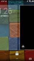
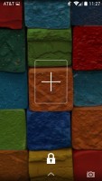
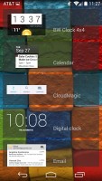
Some of the lockscreen widgets
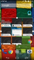
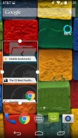
Lockscreen widgets are resizable - tap and drag down to expand and show more content, if available. Tapping and dragging can also reorder lockscreen widgets, so you can choose which one is visible on the main lockscreen. They can also be dragged up to discard.
Google Now is always the leftmost pane on the homescreen. You can't set it as a default homescreen but you can turn it off if you like, just like the BlinkFeed on the HTC One lineup.
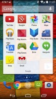
The bottom of the screen is reserved for the three navigation controls: Back, Home and Recent Apps. The dock is customizable and features two shortcut icons on either side of the app drawer key. You can have folders there, each with multiple shortcuts.
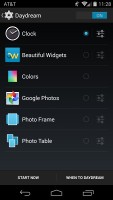
Google Daydream is available too. Once turned on, you can set it up to show photo albums, the latest news from Google Now, the clock, or an animation.
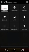
The notification center and Quick toggles are on board too. They're accessible via an icon in the top right corner of the notification area. You get access to key device settings such as brightness, Wi-Fi, Bluetooth, location, mobile networks and Battery. Some toggles are directly accessible shortcuts to their respected functions in the settings menu. The quick settings menu can be accessed by a two-finger swipe down from the top of the screen.
Notifications can be expanded and collapsed with a downward swipe. The top one is expanded by default (if the app that put up the notification supports it, of course).
The homescreen consists of just two panes - Google Now and the default one with a bunch of shortcuts. You can add more once you start putting widgets, shortcuts or folders. You can add as many panes as you want.
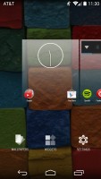
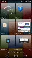
The widgets are no longer part of the app drawer. You can access the widget list only by a tap and hold on an empty space on the homescreen and selecting the dedicated Widgets shortcut. We prefer this way of handling the widgets, because they don't get in the way of the day-to-day work with the app drawer.
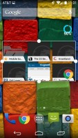
Most of the widgets are resizable in all directions in order to fit into any tight space. To resize a widget, you tap and hold and then release. Four handles will appear on its sides, allowing you to change the widget's size in the direction you want.
Folder functionality functions as expected. A folder is created by dropping an app shortcut on top of another shortcut and can be named by tapping on the "Unnamed folder" label. Opening a folder expands it only as much as needed to show the icons inside.
The folders icons themselves are circular with several individual app shortcuts stacked on top of each other. They are lined up so the first shortcut in the folder will be the only one unobscured - the rest of the icons are nearly impossible to tell apart.

A look at the folder functionality
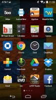
The app drawer consists of 5 rows of icons on side-scrollable pages. The app icons are big and easy to access.
The apps are ordered alphabetically and there's no other sorting option. Placing a shortcut on the homescreen works as you would expect: press and hold to grab it and then position it on the homescreen pane of choice. Two more options appear at the top of the screen while you're dragging - Uninstall (to quickly remove apps) and App info, which opens the application's entry in the Manage applications list.
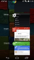
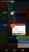
Last but not least, the Recent Apps list has remained virtually unchanged. It would be nice if Google finally adds a kill all/close all option.
Overall, Android 4.4.4 Kit Kat offers polished UI. Coupled with the top of the line chipset, operation is lightning fast all the time.
Reader comments
- Anonymous
- 21 Aug 2018
- 6Qg
Is the smartphone waterproof? Can we root it and get root permission on apps?
- Garjy
- 15 May 2018
- mAT
Best phone I ever had
- leghacy
- 05 Nov 2016
- fsT
When I am making a call I hardly hear what my opponent says and it makes hot when I am playing games and browsing
