Google Calendar gets Material redesign on the web
Starting today, Google Calendar's web presence finally looks like something from 2017, not 2010. The entire web app has been revamped using the company's Material Design guidelines, which means it's now very similar in looks to the Google Calendar mobile apps.
You'll see a modern color palette and a responsive layout that auto-adjusts to your screen size, and some new features are baked in too.
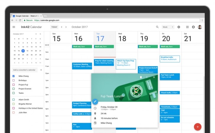
Conference room details are accessible at a glance when booking a room (so you know where it is, how large it is, what equipment it has, that sort of stuff). Rich formatting and hyperlinks can be added to Calendar invites, and you have the option to manage multiple calendars side by side in Day view.
When you hover over the names of meeting participants, you'll see their contact info. A new mechanism is in place to let you view and restore deleted items in one place. Finally, Day, Week, and Month views are more accessible, having improved compatibility with screen readers.
Related

Reader comments
- AnonD-632062
- 18 Oct 2017
- 3J5
Well, gmail in Web still doesn't have Material Design, for better or for worse......


 Apple
Apple Samsung
 Apple
Apple Samsung
 Xiaomi