Google's upcoming Material Design changes revealed in video
Google has been working on a new Material Design for all of its properties. We have seen a glimpse of it in the recent Gmail, Chrome and Google Maps changes, but as you're about to see, those are just the tip of an extremely white iceberg.
The changes surfaced in a video made by designers Adam Grabowski and Nicolo Bianchino for Google. The video has since been pulled from Vimeo where it was originally uploaded but has since been reuploaded by several people on Twitter, one of which we have linked below (and hopefully doesn't get deleted).
Google Material Design pic.twitter.com/10Od0oUmgX
— RΛMIN NΛSIBOV (@RaminNasibov) July 24, 2018
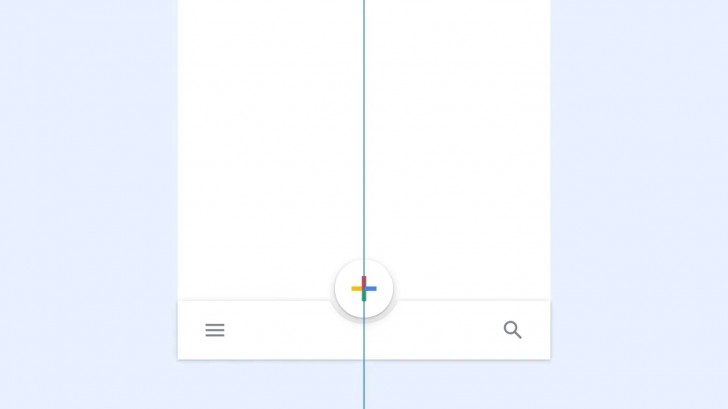
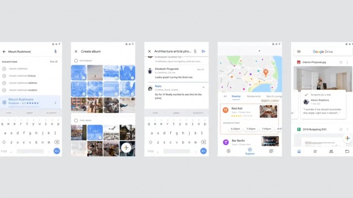
The video goes through a lot very quickly. The first thing we see is that Android's now iconic Floating Action Button has been moved from the bottom right to right in the center in the bottom bar.
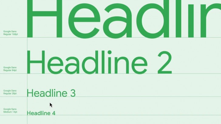
The next thing we see is the new Google Sans typeface, a leaner, cleaner revision of Google's current Product Sans and will replace both Product Sans and Roboto across all Google properties, including the Google logo itself.
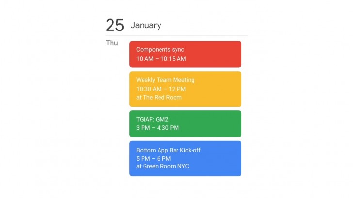
Next we see the four Google logo colors, red, blue, yellow and green feature more prominently in UI design.
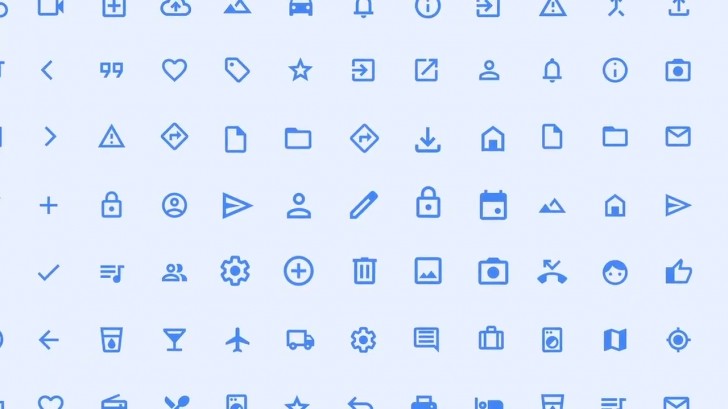
Next we see the iconography shed some weight as their insides get carved out. The new hollowed out icons look lighter with less visual mass and should go with the new leaner typeface better.
There's also one subtle but interesting design change, where the blinking cursor now flashes in the four Google colors instead of a just blue.
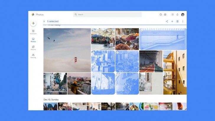
After that we get a glimpse of how the Google apps are going to look following an update. There's a lot to take in here but worth noting is the new centralized FAB that in some apps is still on the right (which is weird), a more prominent bottom bar with some of the controls such as the hamburger menu and search button in some apps moved to the bottom, and a more prominent use of cards in UI.
But perhaps what's most striking is how white the UI is overall. Google has gotten rid of the colored top app bars and status bar in favor of an all white UI. The result is an overwhelmingly white UI, which is probably not the best thing for devices with an OLED display, but there is some hope now that a dark UI may be coming. A dark UI is easier to do now than it was with colored app bars as you basically just invert the screen colors without having to worry about blending with the app bar color.
Of course, what we see here is just limited to Google's apps but these are the guidelines that Google is recommending going forward. Many of these changes are already present on Google's Material Design guidelines website. And things could change a bit before they go live, whenever that is. But for now, this is our best look at what the future looks like for Google products.
Related

Reader comments
- LG Superfan
- 28 Jul 2018
- sS5
How was G6 a flagship killer it? It was way behind 2017 flagships in almost everything it, oneplus 3T was aimed at 2017 flagships and it was equal to them if not better imo 3T was a better phone and about the rest I agree
- Kangal
- 27 Jul 2018
- uCX
LG Nexus 4 - one of the BEST supported Android devices in history LG G2 - one of the MOST competitive devices by LG LG V20 - one of the BEST devices that has a removable battery LG G6 - one of the BEST flagship killers (cheaper than OnePlus 3t ...
- LG Superfan
- 27 Jul 2018
- NbZ
Agreed it was a huge step up and one that made LG a competition but V20 was a no compromise flagship it had everything good battery, competitive camera, 3.5 jack, usb c, removable battery no corners cut it was a complete package
 Huawei
 Samsung
 Apple
Apple Xiaomi
 Samsung