Google Phone app gets redesigned interface, it's all circles now
Google's been redesigning the interface of its software across platforms rounding off sharp corners wherever possible - just look at the address bar of the Chrome browser you're probably reading this on. The push for circles is now finally fully embraced on the company's Phone app for Android, too.
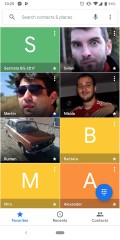
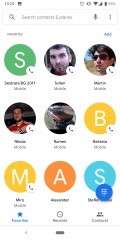
Old vs. New
The Favorites tab of the default dialer app on Pixel phones had two contacts per row until now, while the other tabs had already switched to circles. The latest update brings consistency between the tabs with circles, circles everywhere, and the contacts are now three in a row. We dug through old reviews to find out it was a lot like this on the Nexus 6 running Lollipop in 2014.
As is usually the case, the v27 update may not necessarily be hitting everyone at once - we ourselves had to resort to sideloading it even on the Pixel 3. In any case, it's happening sooner or later.
Related


Reader comments
- EskeRahn
- 11 Dec 2018
- s0x
The whole idea of circular 'icons' and generally flat (lack of) design is just a horrible idea, and that includes being ugly. It would have made sense 25 years ago back at the Win3.1 era to simplify the graphics, for the poor graphics engines of...
- Xypleth
- 10 Dec 2018
- mi}
Poor Google, they do something wrong - everyone is pissed, they do something right - everyone is pissed... Google's design has the major influence on Android development, and it's finally starting to look like something solid and worthwhile. It's...


 Xiaomi
 Samsung
 Apple
Apple Infinix
 Xiaomi