Google Play Books app on Android gets a redesign
Google has finally updated the Android version of the Play Books app with the new Material Theme design.
The app now features a uniform white color theme across the screen, with a redesigned tab bar, smaller thumbnails with rounded corners, new typography and an overall cleaner look.
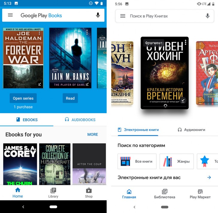
The design of the new app is consistent with the new Material Theme that Google has been propagating throughout all its properties. While the new design decision is generally appealing, the slow manner in which it gets rolled out is really frustrating. Not only is Play Books on Android getting this design months after it was introduced on other Google apps and services, the Android version is also getting the redesign months after the iOS version, which got the update back in September. It would be inconceivable for Apple to have updated some apps to the iOS 7 design first and the rest over the course of the next two years but that's pretty much how Google does things.
And the changes don't even roll out to everyone at once. Even though this report is based on Android Police's findings, my own device is yet to get the redesign even though it's fully updated. It's just things like these that are irksome about Android and specifically about how Google handles things with the updates.
Related


Reader comments
- Anonymous
- 12 Jan 2019
- Kte
Unfortunately Blue is very unfriendly to OLED display (blue cell has shorter life-time than red or green). The new white color may can be inverted to black (with option) and to sepia at night-time.
- AmyThePerson
- 12 Jan 2019
- N54
I like the old one better tbh cause of the blue. All white doesn't look very good. not to mention it drains the battery by a lot!


 Huawei
 Samsung
 Apple
Apple Xiaomi
 Xiaomi