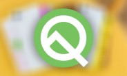
Android Q to be called Android 10 as Google abandons dessert-based names
Google has announced that the next release of Android, codenamed Android Q, will be called Android 10. The company also introduced design changes to the Android logo and the mascot.
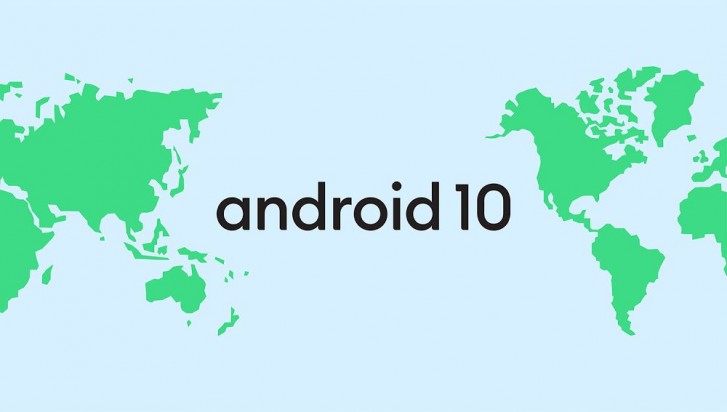
With the release of Android 10, the company is abandoning its use of alphabetical dessert naming scheme for major Android releases. This is being done to make the names more accessible across more markets, as previously not everyone was familiar with the names that Google chose.
The other changes are being done to the Android logo and mascot. The Android robot has been the company mascot since the very first release. Over the years, the robot changed colors from a yellowish-green, to a lemon green and now finally to a bluish green.
Google says the change in color is more than aesthetic and is in line with the company policy to make Android more accessible. The previous green color wasn't visible to those with color blindness, and green-red blindness is the most common type of color blindness. By adding more blue to the green, it improves the visibility for those who are unable to see the color properly.
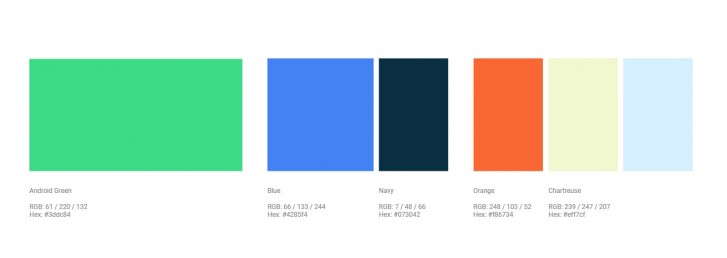
Google also introduced a few other colors that will be used alongside the new Android Green (#3ddc84), which includes Blue (#4285f4), Navy (#073042), Orange (#f86734), Chartreuse (#eff7cf) and an unspecified sky blue shade. These will be used for things like visual assets and packaging and are also designed to be clearly visible to most people while also complementing each other and Google's other brand colors.
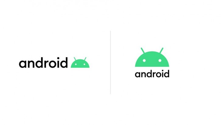
The Android robot logo itself is also changed. The text or the wordmark now has a different font, which is more circular and many of the curvatures match the curvature of the robot itself. The robot head is now part of the Android logo, and will either appear after the Android wordmark or above it, depending upon the context. Google is ditching the rest of the body of the robot and the head is the only part that will now be visible in branding.
The head has also lightly been altered, with the eyes and antenna being repositioned for a friendlier look.
Like the wordmark, the curvature of the Android robot will also reflect in other aspects of the UI design going forward as it is incorporated in the current Material Design guidelines. The colors discussed earlier will also be featured prominently.
You can expect to see these changes in Android 10 when it releases later this year.
Related

Reader comments
- ali
- 26 Aug 2019
- uWC
what if we google pronounce it as (Android10) A10, A11 and so on..
- wyrma
- 26 Aug 2019
- rx7
"This is being done to make the names more accessible across more markets, as previously not everyone was familiar with the names that Google chose." a.k.a. people who couldn't understand engrisho made a fuss despite the software programmed in en...

 Huawei
 Samsung
 Apple
Apple Xiaomi
 Xiaomi