Nokia changes its logo to mark the start of a new era
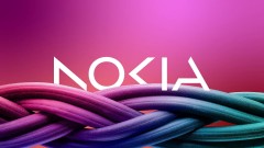
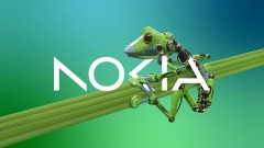
After Pekka Lundmark took over Nokia's telecom equipment arm, the CEO laid out a three-phase plan - reset, accelerate and scale. With the first part of the plan over, Nokia will now focus on accelerating and it's changing its logo for the first time in 60 years to signal the strategy shift.
Nokia is ditching the blue color and it's replacing it with whatever is more appropriate given the situation, meaning no specific color scheme is assigned. Lundmark said that Nokia is no longer just a smartphone company, but a "business technology company".
There was the association to smartphones and nowadays we are a business technology company.
In addition to growing its telecom equipment business, Nokia is going to focus on selling gear to other businesses. Those include private 5G networks and equipment for automated factories, which would position the company as a competitor to Microsoft and Amazon in the field. Lundmark mentioned that Nokia is considering developing and growing in other areas as well.
Related
Reader comments
- Rmak
- 30 Mar 2023
- LaT
KIA also did the same but the new logo Suits to Kia . . Ay Nokia don't it doesn't suits you. . .so many memories are attached with you. . . do not change with the change of season ...
- Dj
- 30 Mar 2023
- fCC
Nokia itself is a wall.. but time changes and it falls. Hope for its comeback .. i trust nokia !
- Miha
- 30 Mar 2023
- 3IJ
This new logo is missing everything.





 Xiaomi
 Samsung
 Realme
 Apple
Apple