Nokia 3 review: Un-Finnished Business
Un-Finnished Business
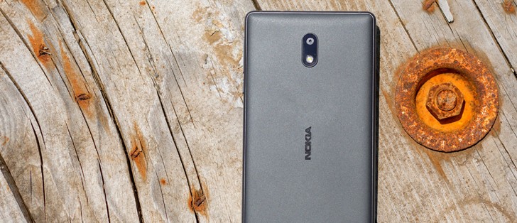
Nougat in blue
Just like the Nokia 6, we reviewed a while back, the Nokia 3 runs near-stock Android. Our review unit boots 7.0, but a 7.1.1 ROM is apparently out there as well. Unlike the Nokia 6 unit, we imported from China, however, this one is an international version. That, of course, means it has Google Play services installed, along with a few Google apps. This has eliminated the need for HMD to include its own versions of many basic applications, essentially making the international version even more "Vanilla-like".
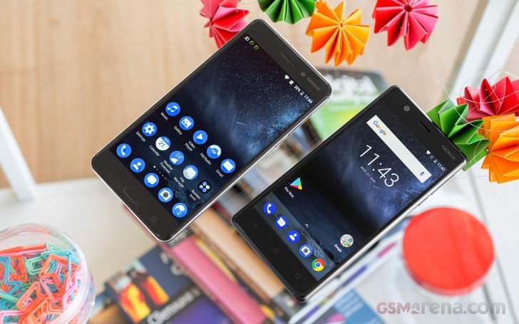
However, we can't exactly drift into any form of Google Pixel comparison here, especially in terms of styling. HMD went all out with its blue Nokia look. It is definitely distinct enough to be easily recognizable and thus good for brand awareness. However, the two-color approach is not universally appealing. It grew on us pretty quickly, but a little bit of variety and color here and there might be a good idea for future iterations.
If there is one thing nobody really misses from the days of featurephones, it's the lack of customization. Sadly, the Nokia 3 is stuck with only one icon pack and overall GUI style with its default launcher.
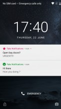
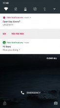
The lockscreen displays the standard Nougat notification cards, complete with grouping, expanded view and direct reply. There is a clock as well, but it lacks the weather widget and further customization that the Nokia 6 had. This is just one of the examples of stripped-down functionality in the Nokia 3 ROM.
There's a camera shortcut in the bottom right, while the bottom left is home to a padlock icon. These can not be changed either. While we're at it, the camera can be launched with a double press of the power button, if you enable the setting.
The homescreen is where the Nokia looks like no other. All of the system icons and pre-installed apps are painted in Nokia blue, and they're all circles. It's really too consistent - we found ourselves scrambling to find the icon we're looking for, because we couldn't tell them apart by shape or color. Of course, once you get used to what's where, it gets easier. There are no themes - the blue color scheme is the one you get and that's it.
On the other hand, all the third-party apps retain their original icons - the launcher doesn't apply any changes to them. That makes them recognizable, but then they look nothing like the built-in ones. We kind of naturally wanted to pile them away on their own separate screen, just to keep things consistent and our OCD in check.
Another major difference we spotted in the Nokia 3 ROM, compared to its bigger sibling, is the lack of choice, regarding an app launcher. This might actually be an International vs Chinese version thing, since the home-screen only approach is very popular in Asian markets. Regardless, the Nokia 3 has an app drawer and it won't let you convince it otherwise. Of course, since there is folder support on the homescreen as well, you can organize everything there and simply forget the Pixel-like swipe up gesture to open the drawer even exists.
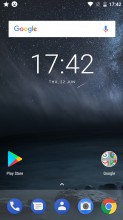
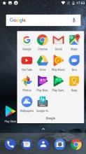
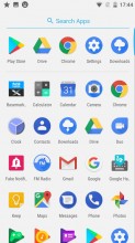
Home screen • Folder view • App drawer
Speaking of gestures, a long press on the home screen toggles edit mode on. You also get access to widgets and wallpapers. The latter can be sourced from the pre-loaded and a little bit obscure Google Wallpapers app. The homescreen setting menu only has a couple of options, but both are interesting.
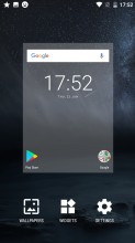
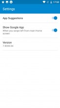
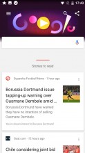
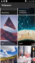
Homescreen editing • Homescreen settings • Google Now panel • Google Wallpapers app
App suggestions is the nifty first row in the app drawer, which is automatically populated with recently used apps. As for the Google App toggle, it is used to enable or disable the Google Now interface, accessible through a left swipe form the homescreen. We wonder if HMD will switch that to Google Assistant at some point in the future.
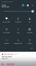
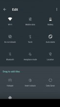
The Nokia 6 had a slightly odd notification shade. The Nokia 3 seems to be pretty stock in this respect. A single pull down gets you four toggles, pull a second time and 8 more appear, plus a brightness slider. And yes, there is Auto brightness, accessible through the settings menu.
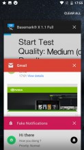
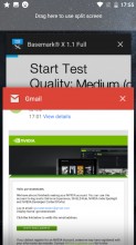
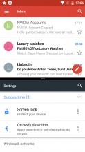
The task switcher is business as usual - the Android rolodex is present here. The 'clear all' button only appears when you scroll all the way to the top - a bit of a nuisance. There is multi-window multitasking (thanks, Nougat), but the screen is always split 50/50 - you can't resize the windows.
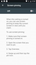
Screen pinning lets you lock the view on one app that you choose - say you want to show someone a few photos, but don't want them poking through your messages. The feature needs to be enabled in settings first.
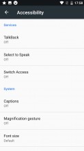
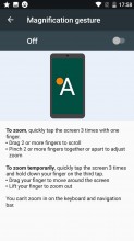
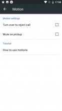
There are a few other gestures you can enable on the Nokia 3. Sadly, unlike on the Nokia 6, here they don't have their own separate settings menu, but are rather scattered about. There are magnification gestures, pick up to mute and turn to reject call, so just the basics. The Nokia 6 has a few extra, missing on its smaller sibling.
Just to round up basic software functionality, most everything comes from Google's default app package. That includes the Phone, Messages and Contacts apps. Chrome for a browser, Calendar, Clock, Keep, Gmail - all great apps that most of us use anyway.
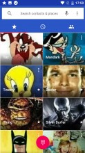
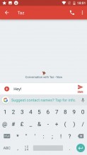
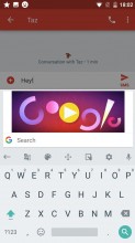
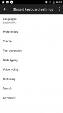
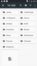
Phone app • Messages app • Google keyboard • keyboard settings • Hidden file manager
Multimedia
However, that also means, you are only left with Google Photos as a photo and video viewer and Drive as a file manager. These are arguably great for accessing their respective cloud services, but a bit of a chore to use as general purpose tools. You do have to pick and install a file manager at the very least to make the Nokia 3 usable.
Photos is bad as a video player
Then again, we can't really say anything bad about Google Play Music. The app has only been improving in recent years. It works great for both offline and online use. And the latter doesn't even require a subscription to Google's paid music service. You can simply upload your own MP3s to the cloud and stream them free of charge, using the platform's powerful adaptive quality streaming technology.
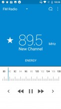
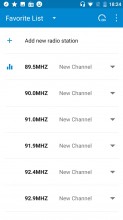
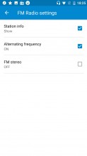
Last, but not least, the Nokia 3 has you covered even when you don't have a Wi-Fi or data connection. The built-in FM radio works great for some oldschool, off-the-grid music. It even has RDS. No recording functionality, though.
Reader comments
- IsHacker
- 22 Aug 2024
- vIb
It's August 2024 and this phone is already 7 years old, but I'm still using it. It still works fine, except for the power button. It wears out quickly and I have already repaired the power button 6-7 times. Also these days, the battery life...
- Babbu Shah
- 06 Apr 2022
- fJC
Its been five years Since I bought this mobile. It is still doing great i bought it in July 2017 and still using it here in april 2022
- Anonymous
- 12 Jun 2021
- nS$
I agree about the camera, below standards even after considering the price range. On the other hand, really sturdy phone, It even survived falling twice in the toilet.
