Nokia 3500 classic review: Classicaly simple
Classically simple
User interface: time-proven quality
Nokia 3500 classic uses the good old Series 40 user interface. It is what we've been seeing in most Nokia non-smartphones for the past few years. The only exception is the lowest-priced handsets, which come with a much more basic user interface.
The S40 platform allows a large number of user-configurable options, albeit with a bit complicated menu structures. Bear in mind that due to the low screen resolution the Nokia 3500 classic user interface is somewhat limited in comparison to its siblings with QVGA displays. The reason for this is quite simple - you cannot fit as many icons on the display. It is nothing that cannot be fixed by some extra scrolling but is still somewhat of a nuisance.
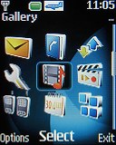
This is how the main menu looks on the small screen
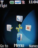
The stand-by display of Nokia 3500 classic has pretty standard looks. It shows the pre-selected wallpaper and the typical status info in the top bar. That includes signal strength, battery status, time, and the icon of the currently active profile (none if General is selected). Beneath the top bar are the operator logo and the date. The bottom bar is reserved for the descriptions of the functions assigned to the confirming center of the D-pad key and to the two selection keys.
A grid displaying the shortcuts attached to the four directions of the D-pad appears in the middle of the screen if active standby is disabled. Those shortcuts can be reassigned if the user prefers so. The same holds true for the shortcuts attached to the two selection keys.
A nice feature of the S40 user interface in general and the Nokia 3500 classic in this case is that the font color can be selected from among 42 different colors.
Nokia 3500 classic also features an active standby mode. It consists of three main parts that can be reordered as the user sees fit. In the default case, the top area is reserved for a shortcut bar, granting instant access to favorite functions indicated by their respective icons. The central area provides instant access to the music player and the built-in radio. At the very bottom are displayed the date and the events from the calendar set for the current day. All of those can be changed among a list of 6 items and you can even leave some of them empty.
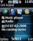
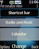
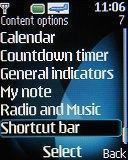
The active stand-by mode bars can be freely reordered
When the active standby mode is on, only the shortcuts attached to the left and right direction keys of the D-pad are available. The reason is the up and down direction keys are used for scrolling the active standby tabs.
In contrast to most other recent S40 devices, Nokia 3500 classic has only two main menu view modes. As you may have guessed those are a standard 3x3 grid and a list showing 4 icons at a time. Another flaw we see is the lack of icon animation in the menu, the sort we've seen in other Nokia handsets. At least, the icons can still be freely re-ordered as the user sees fit.

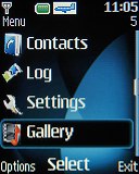
The two available menu view modes
Submenus all appear as simple lists with small thumbnails. In most cases you will be able to see the selected item described in small font, so you will not need to go another menu level down to see what it does. All you need to do in order to read the help is simply hold the icon selected for a few seconds and a pop-up window will appear on the screen. As usual, the menu items are intuitively accessible through keyboard shortcuts.
The menu responds quickly, without lagging or holdups. This was to be expected as this is a S40 device we are talking about. We also didn't encounter any freezes or unexpected restarts of Nokia 3500 classic for the time of our review.
Customization
If you get bored with you Nokia 3500 classic you can refresh it a bit by changing the looks of its interface. The background color of the entire menu, as well as the wallpaper on the display, can be easily modified by applying one of the preinstalled themes. There are only a few of them on Nokia 3500 classic but we bet you can find enough alternatives all over the internet.
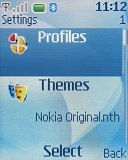
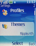
The other two preinstalled themes on Nokia 3500 classic
You can also customize the font size of the interface in messaging, phonebook and web applications. Finally the screen saver of Nokia 3500 classic can be changed, too.
Phonebook of great capacity
The Nokia 3500 classic phonebook is really spacious offering room for up to 2000 contacts. Each of them has a wide variety of fields. Searching a contact is done by gradually typing of the desired name or by simply scrolling through the contacts, which are ordered alphabetically. Bear in mind though that the phone will only search first names instead of looking in the last name too. This is quite inconvenient. The phonebook can display the names from the phone memory, from the SIM card or both simultaneously.
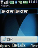
Searching is done by gradual typing of the desired name
There are three available view modes for the phonebook. The standard name mode gives you a simple list of your contacts and fits 6 phonebook entries on the display. The name and number view mode displays only two contacts on one screen with their primary phone numbers below. The final view mode - name and picture also shows two contacts at a time but also displays the caller image. The final two options for the phonebook include font size changing and choosing between the contacts display methods.
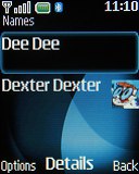
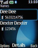
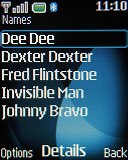
The three available view modes for the phonebook
When editing a contact there is a huge variety of fields at the user's disposal. Nokia 3500 classic can have up to 5 numbers for each contact. In addition you can have fields for email addresses, websites, and postal addresses, etc. First names are separated from last names eliminating problems with synchronization with Outlook. Quite naturally, personal ringtones and call IDs can be attached to each contact.
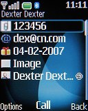
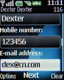
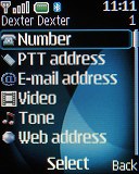
A huge number of fields can be added when editing a contact
Last comes the well known grouping: contacts can be organized in groups and these can consequently be used as call filters. Another application worth our compliments is voice dial; no pre-recording of voice labels is necessary and it is fully speaker independent.
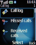
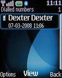
The Call Log of Nokia 3500 classic records your recent communications. It can display Dialed, Received and Missed calls separately, as well as all of them together. Every submenu can hold up to 20 call records with their date, time and duration.
Reader comments
- Anonymous
- 28 Sep 2009
- vaM
i want that fone my class mate have it too....................................................
- Tinoy A Jose
- 05 Jun 2009
- kH@
It's a nice & cute handset.It's main disadvantage is it've only java software support.But most of the java softwares is not working in this phone.It's camera quality is so poor.
- Marv
- 08 Feb 2009
- M@T
hi i have a 3500 but my java aplication dont work? say me u have first that inscribe to data package? what is that? anyone know,thanx
