Nokia 500 review: In search of Anna
In search of Anna
Hanging with Anna, waiting for Belle
The Nokia 500 is said to be getting Symbian Belle, though that should only happen at the end of the year. Symbian Anna it is for the time being - and you would've thought it made perfect sense in an entry level smartphone. That's what we thought at least. But we were left wondering if Symbian Belle could do anything to make things better.
The thing is, the Nokia 500 didn't behave too well. We experienced lags all too often, even in something as simple as scrolling the homescreen panes. Nothing major but we were less than impressed - and we thought that's what a 1GHz phone should do.
Otherwise, the Anna edition does introduce a few changes that make Symbian better than its predecessors. Nokia finally fixed text input (though they didn’t do a perfect job of it), the browser is updated and so are other core Symbian apps. But there are still some issues left to Belle and its successors to address.
Before we get into detail, check out this video for a bit of Symbian Anna in action.
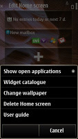
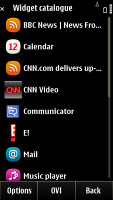
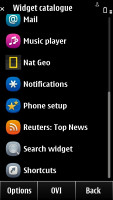
The Symbian Anna homescreen consists of three panes. You are free to fill it up with widgets and reshuffle them as you see fit. You can delete the ones you don’t need but you still can't have more than three.
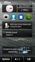
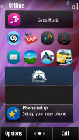
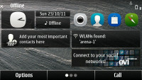
Symbian Anna comes with an improved homescreen • homescreen in landscape mode
The scrolling of homescreen panes is looped so you never need to go back from the last one. Auto-rotation of the homescreen is enabled too. In fact, Nokia take auto-rotation so seriously that even the dialer rotates in landscape. Not that it makes any sense - it doesn't turn into a QWERTYkeyboard or anything.
Symbian Anna brings with it a new style for the icons in the main menu - they are now very rounded squares. It's an aesthetic change mostly, as they are just as easy to hit with your thumb as the old ones.
The main menu structure is unchanged, retaining the hierarchical folder structure. This dates back from much earlier Symbian versions and we were hoping that it would change - to get to your apps, you have to hit the menu key and go into Applications. Modern day smartphones have dozens of apps installed, so easier access to them would have been nice.
You are free to rearrange icons as you see fit so you might go for placing them all in the main folder and get a flat-ish menu system, but you have to do that manually, there's no bulk move option.
You can create custom folders too, which can help you organize your apps. All custom folders look the same however, giving no clue of what's inside. A list view mode is also available but that involves much more scrolling and that’s why we preferred to leave things in grid.
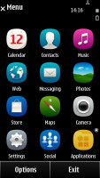
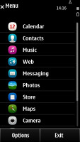
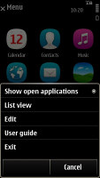
Not much has changed in the main menu
The task manager is identical to the Symbian^3 implementation - it shows screenshots of the running apps, up to three at a time (regardless of screen orientation). You can swipe sideways to browse the apps and you can terminate them with a single click too.
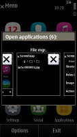
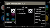
The task manager fits only three apps at a time
A neat feature is the popup available by tapping the top right corner of the screen. It gives you a bigger clock, a shortcut to the connectivity menu, a battery button (charge in % and a shortcut to power saving mode) plus notifications - e.g. missed calls, new messages and others. It just shows the number of events, it won't show you the beginning of a new text message like Android's notification area will. This pop-up menu is available throughout the phone interface and you can also toggle Wi-Fi and USB settings from there.
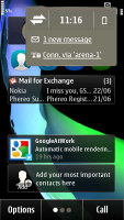
The popup gives quick info on events and some handy shortcuts
One positive change is that there's always a Back virtual key visible, which makes navigating apps simpler.
On the other hand, the Options menu still relies on the menu/submenu structure, which is a relic of the non-touch days of Symbian and is begging for an Android-like solution (menu key that shows a panel with 6-8 buttons for the most common options, maybe a More button if you really want to dig into the settings).
Performance-wise the Nokia 500 should be better than the previous Symbian^3 and Anna models - now that it's got a 1GHz CPU. But although we can’t quite put a finger on what's wrong, the performance is not up to scratch. The phone is just slow to react and after a while you might find yourself annoyed.
Reader comments
- S Khadar basha
- 24 Aug 2018
- U{U
Nokia 500
- AnonD-624377
- 25 Dec 2016
- a33
i hav update to 2016
- Anonymous
- 17 Nov 2015
- ar6
I can not update the software

