Nokia 500 review: In search of Anna
In search of Anna
Web browser: better features, poor handling
The web browser has been a sore weak spot in touch-enabled Symbians but Symbian Anna fixes a lot of the issues.
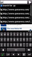
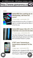
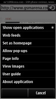
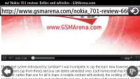
The browser in Symbian Anna has received much needed polish
The Nokia 500 browser has good page rendering and offers some nice features such as different font sizes (5 options), auto fill-in of web forms and a password manager. Panning is relatively smooth but zooming can be a little slow at times, taking a second to redraw the page content after you zoom out.
Some of the nagging issues in the browser were fixed too - you can now open a new tab easily (why it took Nokia this long to implement this we'll never know) and it takes you only one tap to get to the popup menu with the most useful browser options (it used to take two taps, which is one too many).
Along with the popup menu's shortcut on the right of the screen, there's also an always-visible back button on the left. They are quite small and don't cover much of the screen. It used to be that you needed two taps to go back a page too - once to make the back button visible and once to press it.
Back still uses the 3D stack of page thumbnails to let you choose how many steps back you want to go (it's an option that you can turn off if you prefer to go back one step directly).
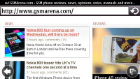
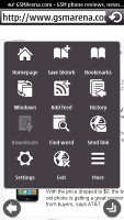
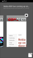
Going landscape • the popup menu • opening new tabs is now possible
Another thing we're really pleased to see is how the QWERTY keyboard integrates with the browser. You can use the portrait QWERTY to start entering an URL and the list suggested sites pops up immediately. The previous screen required going back and forth between screens, which was pretty much unusable.
Double tapping on a chunk of text zooms it in on screen, but again, the text doesn't auto fit to the smaller viewport and you still need to scroll sideways.
With Flash Lite 4.0 support, 360p YouTube videos played in the browser but with both video and sound quite choppy. Flash games wouldn't work.
You may as well choose to switch Flash off to cut down on loading times and save some data traffic.
Web browsing on Nokia 500 was a disappointing experience. It's slow and laggy, whether zooming, panning or scrolling. Despite the Anna optimizations, this didn't feel at all like a 1GHz device.
Organizer omits a document viewer
Symbian has traditions in the Organizer department and the Nokia 500 with Symbian Anna is no exception. Nokia has just tweaked a thing or two.
The calendar has four different view modes - monthly, weekly, daily and a to-do list, which allows you to check all your To-Do entries regardless of their date. There are three types of events available for setting up - Meeting, Anniversary and To-do. Each event has some specific fields of its own, and some of them allow an alarm to be activated at a preset time to act as a reminder.
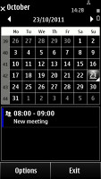
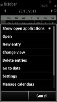
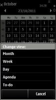
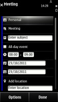
The calendar has seen some further touch optimization
The calculator application is very familiar but it lacks the functionality of some of its competitors. The square root is the most advanced function it handles and this is hardly an achievement. If all you do with it is split the bill at the bar though, you're more than good to go.
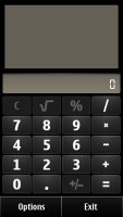
The calculator is hardly the most functional around
The organizer package also includes a dictionary, voice recorder, as well as the Notes application. The good unit converter we’ve come to know from Symbian^1 is strangely gone but you can grab one yourselves from the Ovi store for free. There is a ZIP manager too.
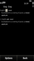
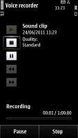
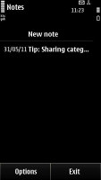
The dictionary, the voice recorder and the notes app continue the organizer marathon • ZIP manager
The alarm application allows you to set up as many alarms as you want, each with its own name, set-off day and repeat pattern. As we already mentioned, thanks to the built-in accelerometer you can also snooze the alarm by simply flipping your phone over.
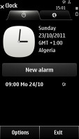
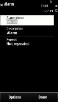
You can set an unlimited number of alarms on the 500
Social networking integration
The Nokia 500 comes with social networking integration, part of which we saw in the phonebook. The Social app however is the nexus for all things social - it supports the two most popular networks, Facebook and Twitter. You can have multiple accounts on each network but only one of each can be active at a time.
The Facebook section offers extensive options with an easy to use, touch-optimized user interface. Posting a status update is simple as is attaching a photo or video (or shooting new ones on the spot) as well as adding geo-tagging information.
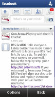
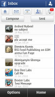
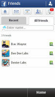
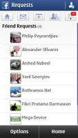
Facebook integration is pretty extensive
Twitter is accessed through a similarly easy interface. There's a handy button to shorten links and you can attach photos and videos to your tweets as well.
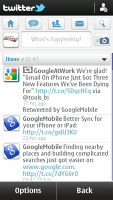
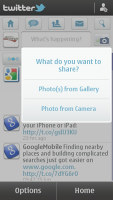

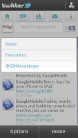
Twitter integration is great too
The text input field for status updates for both Facebook and Twitter covers only the top half of the screen and the portrait QWERTY fits snugly on the bottom half of the screen, which is pretty clever positioning.
A cool feature is the All Activity section that becomes available when you add both Facebook and Twitter accounts. It pools status updates from both networks into a single list. You can also post a status update on both networks simultaneously from here. Unfortunately, there's no option to post only to one of the networks - you have to go to the networks specific section to do that.

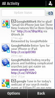
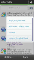
The Social app pools all status updates into the All Activity section
Friend search also becomes available on both networks - it searches both accounts for a given name.
Reader comments
- S Khadar basha
- 24 Aug 2018
- U{U
Nokia 500
- AnonD-624377
- 25 Dec 2016
- a33
i hav update to 2016
- Anonymous
- 17 Nov 2015
- ar6
I can not update the software
