Nokia 6210 Navigator review: On the road again
On the road again
Nice display
The Nokia 6210 Navigator screen supports QVGA resolution and up to 16M colors on a 2.4" diagonal. A Nokia trademark, sunlight legibility is way beyond the reach of other phones, except maybe Apple iPhone's gorgeous display.
The 6210 display has grown by 0.2 inches compared to the original Navigator but it still isn't perfect for in-car navigation. The small fonts of the navigation interface don't provide for a comfortable reading when the phone's placed on the dashboard of the car. Another flaw is the lack of an optional landscape mode in Nokia Maps application, which is very strange given the auto-rotate sensor and the fact Nokia N95 8GB has a landscape mode


Great display, but still on the small side for in-car nav
Calling around
You may rest assured that communication is well taken care of in the Navigator. Reception is crystal clear on both ends of a call and we experienced no reception issues for the time of testing. Thanks to the accelerometer, users can enjoy the turn-to-mute feature in Nokia 6210 Navigator.
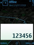
The numbers on the display when dialing are large and easy to see
Here is how Nokia 6210 Navigator stacks against some of the other handsets we've measured in our speakerphone loudness test. It is certainly louder than its predecessor, but still falls behind some of the great performers we've encountered. More info on our test here.
| Speakerphone test | Voice, dB | Ringing | Overal score | |
| Nokia N82 | 70.2 | 61.2 | 65.9 | |
| Nokia 6110 Navigator | 65.9 | 65.8 | 72.9 | Average |
| Nokia N81 | 68.8 | 67.8 | 75.7 | Good |
| Nokia 6210 Navigator | 74.9 | 70.1 | 79.2 | Very Good |
| HTC TyTn II | 76.0 | 75.7 | 82.7 | Excellent |
Steer on Symbian
Nokia 6210 Navigator runs on the Symbian 9.3 OS with Series60 3rd edition UI. Feature Pack 2 is aboard, bringing both visual and performance upgrades.
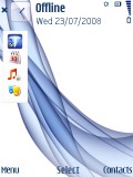
The first thing to notice is the new Active standby screen, which now allows quick access to a lot more features. The standby toolbar can display in vertical tabs with the D-pad used for scrolling. Other than that, its functionality isn't greatly modified.
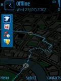
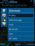
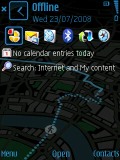
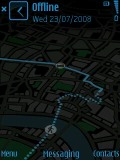
A new layout option for the Active standby mode
Active standby is a convenient way of bringing shortcuts to all favorite applications to your home screen. You can even assign shortcuts to websites of your choice for quicker access. The two soft keys' functions can also be varied as users prefere.
The task manager has also received visual enhancements and is now appearing on every pop-up menu. It is actually placed on top of every list, which can sometimes be too much. In addition, you can still use the well-known shortcut by pressing and holding the menu key.
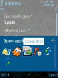
The task manager has been visually enhanced
Finally, the S60 UI Feature Pack 2 brings some graphic improvements as well. Animations are now available when browsing the menus. Fading in and out of the camera viewfinder looks very cool and really is an eye-catching touch to the camera interface.
Although the phone has only 64MB of RAM compared to the 96MB of RAM in the old Navigator, OS performance is unaffected. Memory Full warnings are not something you can expect on the Nokia 6210 Navigator screen.
Navigating the menus is fast with instant response to user commands. The blue circle next to the icon of a running application is a well known Symbian indication reminding users to quit unwanted applications that are still running in the background.

Blue circles appear to indicate applications running in background
Nokia 6210 Navigator has 120MB of built-in memory, which is a decent count. The included 1GB microSD memory card comes in very handy but you can go for an even higher capacity card if you like. Our test showed that Nokia 6210 had no problem handling an 8GB microSD memory card, which is the limit in the official Nokia spec sheet. Accessing applications or files from the memory card is quick and you probably won't notice a big difference compared to accessing content on the phone memory.
Customizations
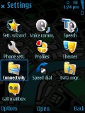
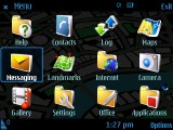
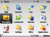
The Nokia 6210 Navigator main menu offers four different view modes. The well known 4 x 3 grid and a simple list go without saying. In addition, you can enable icon animation.
The other two available modes are the 3D V-shape and Horseshoe views. Visually appealing though they might be, those are not really the most user-friendly we've seen. Font sizes are also configurable depending on your preferences.
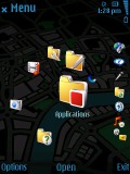
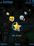
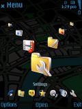
The V-shape and Horseshoe view modes
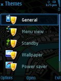
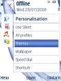
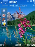
In addition, you can change the currently active theme. There are four preinstalled themes on Nokia 6210 Navigator. The rest is left to the imagination of the user, as many other themes are available for download.
Reader comments
- Anonymous
- 27 Dec 2009
- nw6
It took you 10 minutes? Did you even try pressing it? lol But i agree with the rest, i've had mine for 8 months and it has never worked properly. First the battery, then it just started blocking all the time. I took it to nokia 4 times, for them to...
- Len
- 23 Jul 2009
- NaD
Have you managed to get Rout66 working on your 6210? I had the 6110 before (gps software 10/10) and am extremely disappointed with the 6210 gps software(1/10)
- Buy Hgh
- 16 Apr 2009
- S2K
comment1, http://airsoftgunhelp.com/airsoft/member.php?u=23525&buy_hgh - Buy Hgh, 8982, Buy Hgh, okig, http://www.weblo.com/member/ProVestra/ - Provestra, ujubf, Provestra, xspnxs, http://www.theenvironmentsite.org/forum/members/sleepingbeauty.html -...
