Nokia 6233 review: Discreet business tool
Impressive sounds
We were very pleased with the reception quality of the handset. The voice of the other party was always clear and loud enough.
Listening to the sound of the stereo loudspeakers was a very pleasant experience since they are one of the best that we’ve seen in a mobile phone. They really sound in stereo and there are several tones in the phone that take advantage of the 3D effect technology to full extent allowing for truly enjoyable spatial stereo positioning. Comparing them to the stereo speakers of the Nokia 6270 is not really in their favor but we think that the “stereo”-ness of the sound of Nokia 6270 is complemented by the bigger body which allows for a greater spacing between the two speakers. And after all, the spacing between two stereo speakers is one of the crucial factors for the achieving of the stereo effect.
Having said all that, we are more than happy with the way 6233 sounds – there is a certain presence of a bass element in it which is rarely the case with mobile phone speakers and the sound itself is clear and has no audible distortion whatsoever even at the highest volume level.
Series 40 UI is pretty customizable
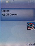
The standard standby screen shows the signal strength, the battery capacity, the date and the clock (digital or analogue), the carrier name, and the active profile (if different than Normal). The two soft keys can be assigned a function according to the user’s preference. A wise choice would be to assign the Go To menu to one of the keys – this menu includes frequently used functions and is totally user configurable. The four ways of the navigation D-pad can also be assigned some functions. You may also want to place a cross with the icons of the assigned functions in the middle of the display – at least in the beginning while you remember them.
The interface can be customized through graphic themes but they don’t really change much – the only things that change are the wallpaper, the menu background and the color scheme.
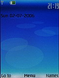
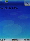
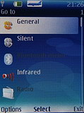
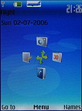
Standby screen with digital and analog clock • Go To menu • shortcut indication
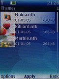
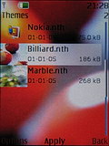
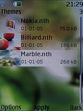
List of available graphic themes
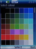
A pleasant fact is that you can choose the colors of the text on the standby screen from a wide array of available colors. Unfortunately, changing the font color is not available throughout the whole menu and when using some graphic themes legibility is not perfect.
The most interesting option as regards the standby screen is the Active stand-by mode, where all favorite applications’ icons, music functions, upcoming events from the calendar, and notes appear on the display – much like the one seen on Symbian phones with the third edition of the S60 Nokia user interface. When you have the Active stand-by mode switched on, pressing UP on the D-pad gives you access to the icon bar and your favorite functions such as the MP3 player, the FM radio or the calendar.
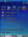
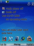
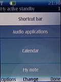
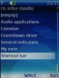
Shortcut bar can be placed where you want it • the active standby screen is totally customizable
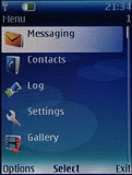
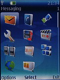
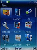
The main menu features a fixed set of items but they can be freely organized in four different ways: as a list, as a 3 x 4 grid matrix, as a 3 x 3 grid matrix with labels, and as horizontal tabs. The second option, a plain table without legends, permits the visualization of 12 icons en bloc and is probably the most space-saving one. Icons can additionally be reordered according to the user’s preference. The icons themselves are well elaborated except that their graphics suffer a hard case of jagged outlines. It must be noted that they resemble a lot the icons used in the third edition of the S60 Nokia user interface.
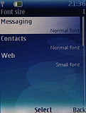
Font size is again subject of configuration. Inside the phonebook there are two font options, while in the message application and the Internet browser you can choose out of three. The largest font is truly large; on the other hand the smallest one permits you to see an entire SMS en bloc.
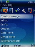
As you can see, Nokia 6233 allows a great deal of user-configurable options and the interface may be greatly suited to the user’s own taste.
The ringing profiles include settings such as type of incoming call alert, ringtone, ringing volume and vibration alert, sounds serving Push to talk, messages, notifications and warning tones and the keypad sounds. A great thing about the profiles is that they offer timed expiration so you won’t forget to turn the sounds of your phone back on after that all-important meeting. You can even set a profile to be turned automatically on once plug in an accessory as the charger, for example. Now the phone offers a dedicated Airplane profile that switches off all active network connections in order to use the phone as a multimedia/radio player only in environments that do not allow cell phones. When the Airplane mode is switched on a large Airplane icon appears on the top of the screen. There is even an option to make the phone ask you every time you turn it on whether you would like the phone started directly into the Airplane profile.
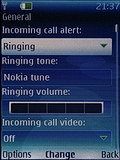
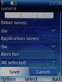
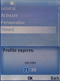
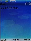
Some of the Profile settings • profile expiration time • Airplane profile icon
A nice innovation to the S40 interface is the possibility to use video recordings as incoming call alert. We got to point out though, that video files do not have the best quality of sound.
Reader comments
- Rakesh kachhawa
- 06 Mar 2021
- 7j{
Nice phone
- Rakesh
- 06 Mar 2021
- YTc
The nice phone
- Macbeth
- 04 Nov 2017
- 3aY
This phone really is a MASSIVE upgrade from it's predecessor (the Nokia 6230 in this case). And that's not something that can be said nowadays (unless you're talking about LG G5 to LG G6 or HTC One M9 to HTC 10).
