Nokia 6303 classic review: Euro hatch territory
Euro hatch territory
Design and construction (continued)
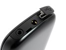
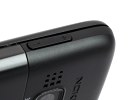
The top side of Nokia 6303 classic is pretty bare, as Nokia decided to cram everything into the bottom this time. The top houses just the power button, which is recessed enough to rule out accidental presses.
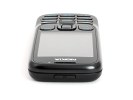
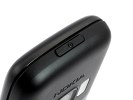
The top side of Nokia 6303 classic
The right and left side of the handset don't have much to show either: the left side is completely empty while the only thing on the right is the volume rocker.

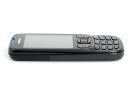
The neat sides of Nokia 6303 classic
The bottom part of the 6303 is where all the connectivity ports are - the microUSB port hidden under a plastic cap, a 3.5mm audio jack, charger plug and the lanyard eyelet. This means that the phone will have to be upside-down in your pocket if you've got the headset plugged in.
We conclude our round- trip of the 6303 classic with the rear. The steel battery cover features a dual LED flash right under the 3-megapixel camera lens. Just next to it is the loudspeaker grill, and an etched Nokia logo. One complaint we have here is that sound does get muffled when the phone is lying on a flat surface.
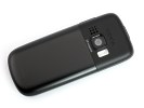
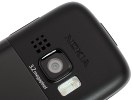
The steel rear: camera lens with LED flash
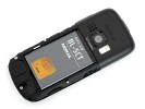
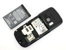
Releasing the battery cover reveals the powerful Li-Ion 1050 mAh (BL-5CT) battery and the SIM compartment.
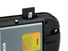
The SIM card compartment is housed under a hinged metal bracket and swapping it in is quick and easy. The microSD card slot is under the battery but worry not, it's accessible from the side of the phone (you will still have to remove the rear cover though).
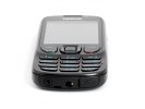
The metal frame scores big for the phone but it's hard to call the 6303 classic a looker. The back and the plasticky keys can't really rival the sophisticated air of high-end handsets. Nonetheless, the phone handles nicely and navigation is quite straightforward. Fingerprints are not a problem either.
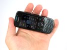
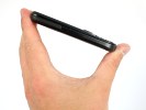
The small Nokia 6303 classic is a joy to handle
User interface
The Nokia 6303 classic employs the Series 40 6th edition user interface. The environment is well familiar, the novelties are a couple of menu icons and a few tweaks here and there. Most additions are under the hood, but we'll cover them after we've gone through the basics.
The standby screen of the Nokia 6303 classic features the pre-selected wallpaper with the usual status readings, such as signal strength, battery status, ringing profile icon and time occupying the top bar.
The center of the navigation key opens the main menu, while the context keys can be assigned a function of your choice. The D-pad directions can be set up as shortcuts - by default, left brings up the new message menu and right the Calendar. The font on the main display can be of any color you desire.
Active standby mode is available. It consists of four sections that can be edited or relocated as users see fit. In the most common case, the top area is reserved for instant access to favorite functions denoted by their respective icons. The second section displays today's events from the calendar.
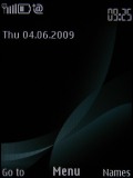
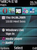
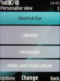
Regular homescreen • Active standby mode • Each section can be user customized
A nice feature is that pressing the end key while the keypad is locked brings up a clock that shows time and date. It's something of a poor man's tap-for-time feature that's usually reserved for more expensive phones.
The icons themselves have been changed and the 3D animation has been dropped. They can also be freely reordered within the grid, should the user find their original order inconvenient.
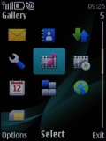
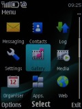
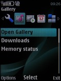
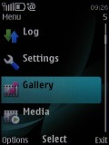
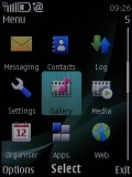
The four main menu views: Grid, grid with labels, tab and list
There were no freezes or unexpected restarts for the time of our review, except Ovi Maps crashing on us once.
There are six predefined ringing profiles on the Nokia 6303 classic. These should be enough to cover virtually any scenario. They can be set to expire at a given time, returning the phone to the previous profile. Flight mode is on hand too, turning off all transceivers and rendering the phone usable without a SIM card inserted.
The only downside of the S40 user interface seems to be the lack of multi-tasking support - something that Sony Ericsson implemented on their feature phones long ago. With S40 you can't just minimize a Java application (such as the Opera browser) and go read a new message.
S40 is already quite a mature platform - now in its 6th edition - but it seems Nokia have no intention of changing it. Perhaps they want multitasking to be exclusive to their smartphones.
What's new in S40 6th edition
The biggest change on the latest version of the S40 UI is the new web browser. Borrowed from their Symbian smartphone elders, the WebKit-based app represents quite a shift in Nokia feature phones so we'll give it the quality time it deserves later on.
One of the changes you might not notice right away: Java apps are now easier to adapt from one manufacturer to another, making it easier for developers to create applications for multiple devices. What that means to the end user is simple - more apps.
A location API has been added as well, which utilizes whatever method the phone has to locate itself. This opens the door for location-aware applications, which have been on the rise with phones like the iPhone and Google's Android, as well as Ngage-enabled handsets.
The Flash Lite player has been updated to version 3 and Flash Lite content can also be used as 'organic' wallpaper. Nothing new, but the more options you have, the better.
Some other things have been changed as well - a little UI polish, MMS ver. 1.3, message support of up to 600KB and better support for WMV and WMA codecs.
Customization
The background color of the entire menu, as well as the wallpaper, can also be easily modified by changing the active theme. The music and radio players can also be skinned by the theme, or you can use the default skin.
There are five themes preinstalled on the Nokia 6303 but downloading new ones takes only a matter of seconds. And of course, as we already mentioned, a Flash Lite background can be used to spice things up.
Reader comments
- santosh jaiswal
- 30 Nov 2015
- vG2
only 1 pro 4 gb external
- grumpy
- 02 Aug 2015
- JiP
As much as I have tried in different ways, I cannot set up emails. Perhaps my Talkmobile monthly contract? Also I can't match names with inbox etc numbers, I have to read the message to make sure I reply to the right person :(
- Anonymous
- 02 May 2015
- t1$
Realy good handset , but not a light that just use for torch light.tnk u see u but not like u.
