Nokia 6600 fold review: Flip and the city
Flip and the city
OLED display - the future is shaping
The main display of Nokia 6600 fold is a 2.13" 16M-color unit of QVGA resolution, using the OLED technology. Picture quality is remarkable, with contrast levels well beyond the reach of any TFT rivals. Colors are of unmatched vibrancy, even though brightness isn't really great.


The OLED display offers amazing picture quality
On the negative side, the sunlight legibility of the OLED unit isn't nearly as good as what we're used to with Nokia handsets, making the phone somewhat hard to use outside in the bright sun.
The hidden external screen has a 1.36"diagonal and a resolution of 128 x 160 pixels. It is also an OLED unit but it's hard to judge quality due to its specific limited graphical nature. For one, all the readings it displays are perfectly legible but then again, none of those involve complicated graphics.
Keypad is really good
We are extremely pleased with the keypad of Nokia 6600 fold. Keys are really large with small but discernible borders between different rows. The middle column has a different finish, so it's another boost to ergonomics. The level of press feedback is more than adequate.


We are really pleased with the keypad
Typing is really great on the 6600 fold and the only complaints we have are with the D-pad. The problem is that its confirming center is smallish and hard to press with larger fingers. Having in mind though that the phone will be mostly used by ladies, this won't probably be that much of an issue.
The backlighting is nice and even, causing no problems using the phone in the dark.

The backlighting is good enough
User interface: neat and quick
Nokia 6600 fold uses the typical feature phone Series 40 5th edition user interface with Feature Pack 1. Except for the newly included Maps application, the interface has undergone no notable changes.
The default screen of Nokia 6600 fold features the selected wallpaper with the usual status readings, such as signal strength, battery status, ringing profile icon and time in the top bar. Beneath the top bar are the operator logo and the date. The bottom bar is reserved for the descriptions of the functions assigned to the center of the navigation key and the two context keys. The center of the navigation key opens the main menu, while the context keys can be assigned a function of your choice. Fonts on the main display can be of any color.
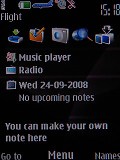
If needed, active standby mode can be activated. It consists of four parts that can be edited or relocated as users see fit. In the default case, the top area is reserved for instant access to favorite functions denoted by their respective icons. The central area provides instant access to the music player. At the very bottom the calendar events appear for the current day. A cool feature is the possibility to add a custom note to the active standby screen.
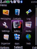
The Main menu icons themselves haven't been changed at all, keeping the well known stylish design with animation of the selected icon. They can also be freely reordered within the grid, should the user find their original alignment inconvenient.
If you keep an icon selected for a short while, you will even see a tool tip describing the functionality of the sub-menu in small font, so you won't need to step further into another menu level. Strange enough, alphanumeric keyboard shortcuts to menu items are not available with the 6600 fold.
There are six preset ringing profiles on Nokia 6600 fold. These should be enough to cover virtually any scenario. There's an added Flight mode, which turns all transceivers off where the use of mobile phones is not allowed. It can be very helpful for using the phone as an MP3 player aboard a plane for example. The best part is that, unlike some of the competing brands, flight mode can be used without a SIM card inserted, which we find really convenient.
There is also a voice aid application which can help you navigate the menus relying on hearing only.
The menu navigation of Nokia 6600 fold is quick, with no lagging or holdups. There were also no traces of system instability such as freezes or unexpected restarts for the time of our review.
The only downside of the S40 user interface seems to be the lack of multi-tasking support - something that Sony Ericsson have implemented on their feature phones long ago. With S40 you can't just minimize a Java application (such as the Opera browser for example) and go read a new message.
With Sony Ericsson phones you can even switch between two running Java applications - (Skype and Google maps are some nice examples here). Nokia isn't there yet with S40, so we guess that puts us on the waiting list for the 6th edition of the interface.
Reader comments
- Deepu das RR pur
- 27 Jan 2018
- YQ{
Very nice Mobile
- Vikas
- 23 Oct 2016
- g}w
So nich
- Jodie
- 08 Dec 2009
- fwk
Loving it hope to get it for Christmas

