Nokia 6700 classic review: Sirocco Lite
Sirocco Lite
Design and construction (continued)
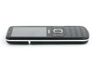
The sides of the Nokia 6700 classic have a lot fewer controls than usual, but compared to the Nokia 6500 classic, they have, in fact, increased in number.
For one you get a camera shutter key and a volume rocker on the right side, while neither of those was available on the handset's predecessor. However the keys are pretty thin and getting used to them is not an easy task. Still, at least the camera key gives off a satisfying click when half pressed, and another one when pushed all the way down. The volume rocker on the other hand has very little going for it.
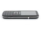
The keys on the right are a bit too thin for our taste
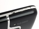
The bottom of the Nokia 6700 classic bears the microUSB jack as well as the Nokia proprietary charger plug and the microphone pinhole. You can also use the microUSB slot for charging if you prefer. Unfortunately, there's no protection on top of the jacks to prevent them from accumulating dust and dirt.
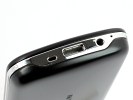
The microUSB jack, the charger plug and the microphone pinhole are at the bottom
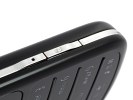
The left side and the top of Nokia 6700 are completely deprived of any functional elements whatsoever. As plain as they get those are certainly the better looking profiles of the device.
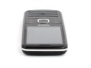
There's not a lot going on on the left side and the top
The back panel of the handset features the 5 megapixel camera, accompanied by one of the tiniest LED flash units we have ever seen. The loudspeaker grill is also here, on the other side of the camera.
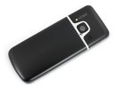
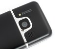
The 5 megapixel camera is the star backstage
The nicely performing camera lens (more on that later in the review) has virtually no protection against scratches. That means you need to be extremely careful when handling it if you want the image quality to stay the same as it was on the day you bought the handset.
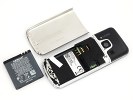
Removing the steel battery cover reveals the microSD card slot, the SIM card slot and, of course the 960 mAh BL-6Q Li-Ion battery. Event though the card slot is down here, it is completely hot-swappable so you can easily access the card without having to restart the handset.
The battery capacity is one of improvements over the Nokia 6500 classic. The 6700 comes with an almost 20 percent larger battery, which can easily give you four days of light-to-moderate usage (20 minutes of telephony a day plus about 40 minutes of using other phone features).
The battery has grown by 20 percent compared to the 6500 classic
The build quality of the Nokia 6700 classic is just great. All the materials used look so durable that the handset looks ready to be your companion for quite a while. If we need to hair-split we should point out that there is a tiny cleft between the glass covering the display and the frame around it, but it's nothing to really worry about.
The Nokia 6700 build quality is pretty impressive
At the end of the hardware review let us just say that the Nokia 6700 classic is one of the nicest phones in the hand that we have seen recently.
The little fella did manage to get under our skin but let's see what goes on under the hood. You can find more about the user interface after the jump.
User interface
The Nokia 6700 classic employs the Series 40 6th edition user interface. The environment is well familiar, and the only novelties are a couple of menu icons and a few tweaks here and there. Most additions are under the hood, but we'll cover them after we've gone through the basics.
S40 user interface updated
The standby screen of the Nokia 6700 classic features the pre-selected wallpaper with the usual status readings such as signal strength, battery status, ringing profile icon and time occupying the top bar.
The center of the navigation key opens the main menu, while the context keys can be assigned to a function of your choice. The D-pad directions can be set up as shortcuts - by default, left brings up the new message menu and right the Calendar. The font on the main display can be any color you choose.
Active standby mode is available. It consists of four sections that can be edited or relocated as users see fit. In the most common case, the top area is reserved for instant access to favorite functions denoted by their respective icons. The second section displays today's events from the calendar.

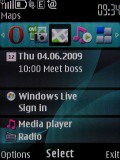
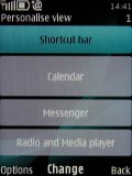
Regular homescreen • Active standby mode • Each section can be user customized
Tap for time, which started out as a fancy feature of high-end phones has made its way to the Nokia 6700 classic. You can choose between an analogue or digital clock and double tapping the phone will show the clock for a couple of seconds. You can enable vibration feedback as well but that only matters if you're holding the phone in your hand. Tap for time is about the only thing that the accelerometer is used for, thing like the browser don't autorotate.

The analog tap-for-time clock
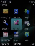
The icons themselves have been changed and the 3D animation has been dropped. They can also be freely reordered within the grid, should the user find their original order inconvenient.
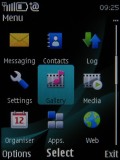
The four main menu views: Grid, grid with labels, tab and list
The interface is quick and responsive. There were no freezes or unexpected restarts for the time of our review.
There are seven predefined ringing profiles on the Nokia 6700 classic, which should be enough to cover virtually any scenario. They can be set to expire at a given time, returning the phone to the previous profile. Flight mode is on hand too, turning off all transceivers and rendering the phone usable without a SIM card inserted.
The only downside of the S40 user interface seems to be the lack of multi-tasking support - something that Sony Ericsson implemented on their feature phones long ago. With S40 you can't just minimize a Java application (such as the Opera browser) and read a new message.
S40 is already quite a mature platform - now in its 6th edition - but it seems Nokia have no intention of changing it. Perhaps they want multitasking to be exclusive to their smartphones.
What's new in S40 6th edition
This is the second S40 6th edition phone we've reviewed (the first being the 6303 classic). We went into more detail in that review but here's the rundown for those who missed it.
The biggest change on the latest version of the S40 UI is the new web browser. Borrowed from their Symbian smartphone elders, the WebKit-based app represents quite a shift in Nokia feature phones so we'll give it the quality time it deserves later on.
Some of the internals have been updated to help with location based services and some things to make porting Java apps to the S40 easier.
The Flash Lite player has been updated to version 3 and Flash Lite content can also be used as 'organic' wallpaper. Nothing new, but the more options you have the better.
Some other things have been changed as well - a little UI polish, MMS ver. 1.3, message support of up to 600KB and better support for WMV and WMA codecs.
Reader comments
- Marwan
- 05 Feb 2021
- mc7
Is there it what's up and Facebook?
- Anonymous
- 17 Nov 2017
- mKJ
One of the disadvantages is that of the iPhone 7
- AnonD-343192
- 25 Apr 2015
- 0B0
super!!!