Nokia 701 review: Belles and whistles
Belles and whistles
Belle-issimo
It’s been a regular one on our list of Cons that Symbian is lagging behind Android and iOS in user experience, but that’s about to change. The key elements in Belle are the new homescreen and menu, the updated native apps and overall polish of the interface.

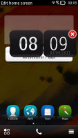
Symbian Belle has a shiny new look
Here’s an extensive video demo of the interface (starring the Nokia 701), so you can get a good feel of Belle before we start.
The widget system introduced by Symbian^3 was incomplete to say the least. Now however, you get up to six homescreens (up from three) and you can delete unneeded ones. Each homescreen has its own individual wallpaper, rather than one for all to share. A notable contrast with Android, the scrolling of homescreen panes is looped so you never need to go back from the last one. Auto-rotation of the homescreen is enabled too.
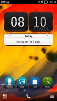
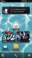

Symbian Belle homescreen in portrait and landscape modes
Widgets themselves have dropped the one-size-fits-all philosophy and now come in up to five sizes. In addition to widgets, you can also put shortcuts on the homescreen – the end of the silly shortcut widgets.
A tap and hold on a widget or shortcut activates edit mode, but only for that widget/shortcut. You can’t touch the others – there’s no mode where you can edit everything at once (which seems a bit inconvenient to us). You can move, delete or (where available) access the settings of the selected one.
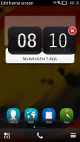
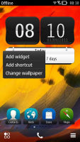
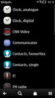
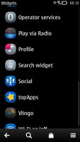
Moving widgets around • Adding a widget to the homescreen
Besides widgets and app shortcuts, you can also add contact shortcuts to the homescreen. To do that you need to go into the Options menu of the contact’s details, but the extra taps are worth it. You end up with one-touch access to the contacts you call most often.
The bottom of the homescreen has three virtual buttons – menu, dialer and homescreen settings. With these buttons, Nokia can go button-free at the front if they want to, just like they did with MeeGo.
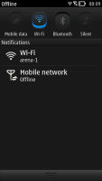
The other big addition to the homescreen is the pull-down status bar at the top of the screen – think Android’s notification area or the similar menu available in iOS 5. This area is where notifications and status info await in line for your attention, but you also get toggles for mobile data, Wi-Fi, Bluetooth and Silent mode.
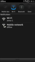
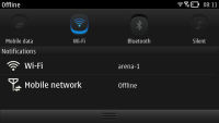
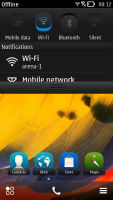
Pull-down menu is always accessible, helpful
This pull-down status bar is available on any screen so you can also quickly change a setting and look up new events.
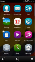
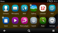
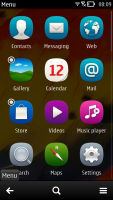
Moving on, the main menu has changed as well – it’s now completely flat, no level upon level of subfolders nonsense any more. Or at least not by default – you could still manually create folders, if you like. You can’t put folders in folders though (not that you’d want to do that anyway).
You sort icons alphabetically or manually, by choosing the Arrange option and moving menu items around. You can’t drop a shortcut in a folder while arranging them though. To do that, you have to press and hold on a shortcut, choose Move to folder and then select the desired folder. There are also Add to homescreen and delete options here.
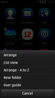
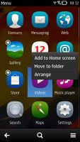
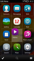
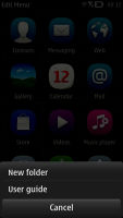
Arranging the menu • Creating a new folder
This arrangement isn’t as convenient as in other OSes and it contrasts with how the homescreen works. On the homescreen you press and hold to move an item, while a tap and hold on a menu item pulls out a menu. To move items around you have to hit the Options key and choose Arrange.
It’s a bit odd how folders on the homescreen work – you can only add a folder to the homescreen by first creating it in the menu. After you've added it to the homescreen, it remains visible in the menu.
Because the main menu is busier than usual - and will only get more crowded as you install extra apps - the search option is a handy addition.
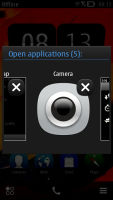
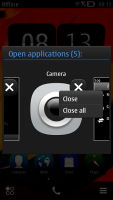
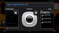
The task manager in Symbian Belle is virtually unchanged – press and hold the Menu key and it pops up. It fits a bunch of side-scrollable thumbnails, one for each of the currently open apps. It’s worth noting that hitting the End key will terminate an app, while pressing the Menu key just goes to the homescreen with the app active in the background.
Reader comments
- Anonymous
- 04 Oct 2015
- 7j{
nice phone
- Remiao
- 07 Jul 2013
- ftV
Mine also fell and sank to the bottom of a Bucket full of water. The phone struck the rim first and went down in three pieces, the bodJy, battery and cover. All I did was to dry out the phone couple it back. Recently about 4 months after had to repla...
- Srf
- 19 Feb 2013
- tY@
Nokia 701
