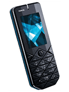
Nokia 7500 Prism
- ?
- Anonymous
- PTp
- 07 Jul 2007
nokians has lost their mind designing this remote control
- a
- arthaget
- PSY
- 07 Jul 2007
I couldnt stand to post a comment.. it's definitely U.G.L.Y
cmon NOKIA.. its that the best ur design dept. could come out with..??
- ?
- Anonymous
- ps}
- 07 Jul 2007
screen isn't flat? LOLz :D Where you've seen not flat screen? Such a stupid comments
- a
- albat
- PcP
- 07 Jul 2007
Ugliest phone ever !
- P
- Paris_Hilton\,,,/(-.
- ib3
- 07 Jul 2007
Not all Nokai Phones are ugly some are ok, but SonyEricsson phones are more well design
- F
- Fazer
- 2SQ
- 07 Jul 2007
Stop creating ugly desing like this,& come on Nokia use your intelligent ideas...
- T
- Trinidad
- M@T
- 07 Jul 2007
I think it's a nice odd design which some people will go for.But need more features.
- ?
- Anonymous
- waU
- 07 Jul 2007
is it a phone or a candy bar? yuk nthn special inside nd ugly outside
- R
- RAVISHANKAR
- PFH
- 07 Jul 2007
all your recent launches are failure in the market. your designs & battery back up is so worst, it is a clear cut indication nokia is losing brand loyalty in the market and slowly vanish from the market as brand itself!
- k
- kevin
- w4p
- 07 Jul 2007
What's wrong with NOKIA what type of phones they are launching.The model no. is 7500 PRISM and i think that this phone is prepared in prison by prisoners
- D
- DH
- ULT
- 07 Jul 2007
yep the screen has three sides,and i think it will easy to get scratch
- M
- Mikey
- UYn
- 07 Jul 2007
What a piece of crap, do they actually expect us to buy these? They should brush up on their market research before going into production with such handsets.Someone's been watching too much Doctor Who...
- ?
- Anonymous
- myb
- 07 Jul 2007
The screen isnt flat. Look at the pic. Because of shape of phone the screen is chisled. Has three sides!!!
- w
- whatfone
- Pxv
- 07 Jul 2007
it might be cheap phone, just like nokia 1112.
- ?
- Anonymous
- RKp
- 07 Jul 2007
Im a fan you NOKIA but you gotta suck on this one dude!??
- ?
- Anonymous
- Yf%
- 07 Jul 2007
looks like they just put some triangles together and called it a phone
- a
- andy
- nD5
- 07 Jul 2007
ok...this sucks !! Nokia, change the design befor you release this phone into the open market !!
- a
- ahmed
- in@
- 07 Jul 2007
Nokia, are you kidding???
- N
- No Good
- pJ6
- 06 Jul 2007
Come on Nokia, what is that all about? It will take much longer to text someone because of the layout of the keys. Some are close, others are apart and the prism design just distracts from focussing on the keyboard. People using this phone will become cross-eyed. >
- h
- haji
- nsD
- 06 Jul 2007
humm'ur cellphones had trible disgin. so u must try 2 get them better
