Nokia 7.1 hands-on review
Design and hardware
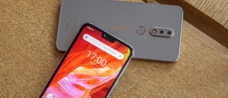
The Nokia 7.1 looks a lot like the Nokia 6.1 Plus mainly due to the 5.84-inch LCD at the front. It's a 1080x2280px screen with a notch cut into it, resulting in a 19:9 aspect ratio.
They call it PureDisplay and it supports HDR 10 natively and that it can even apply upscale to HDR-like quality any SD video in real-time (the benefits of this remain to be tested).
The display has high contrast (1,000,000:1 dynamic contrast ratio), especially for an LCD, which means that blacks are deep and colors are punchy. Nokia promises the panel will be great in bright light thanks to its Adaptive mode (a fancy word for Max Auto Brightness).
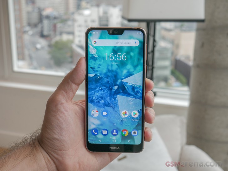
We know most people will dislike the notch, but it does mean that the bezels are a bit thinner (at the expense of symmetry). Stock Android prefers to embrace the notch and not try and hide it, so we suggest you try and do the same, especially if you're interested in the Nokia 7.1.
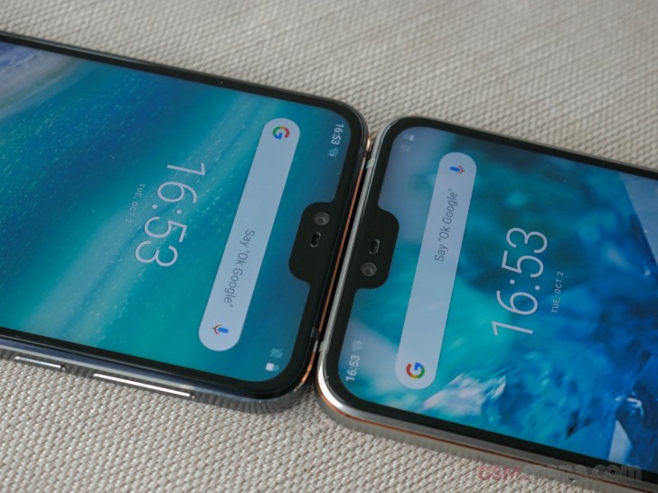
Like its predecessor, the Nokia 7.1 has glass on the front and back with aluminum in the middle. But the build here is much more refined. Both glass panels have a 2.5D curvature so that the phone feels smooth in hand. The front is covered by Gorilla Glass 3.
The aluminum frame is cut out from a solid piece of 6000-series aluminum. Nokia likens it to a die-cast design. The edges of the frame have been beveled for comfort, and a coat of accent paint has been applied to them afterward (copper on the Steel model and Light Blue on the Midnight Blue one).
The accents add to the stylish appearance of the Nokia 7.1 and give it that distinct Nokia look we've become familiar with through the Nokia 7 Plus.
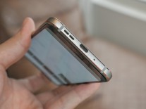
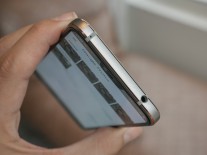
Potential Nokia 7.1 buyers will appreciate the 3.5mm headphone jack. Like its predecessor, the Nokia 7.1 has a USB-C jack.
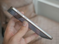
The volume and power buttons are on the right of the phone, and there's a single speaker on the bottom.
Nokia has kept the fingerprint scanner on the back underneath the now dual camera. The rest of the back is left bare. The smooth glass panel can trick you into thinking the Nokia 7.1 has wireless charging, but it doesn't.
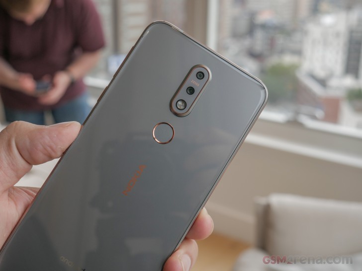
Nokia will be offering the 7.1 in two colors - Steel and Midnight Blue. Both have their own unique appeal, but the Steel version is undoubtedly the eye catcher of the two thanks to the copper accents and the ever-changing grey, which looks cream gold in one light and cold blue in other.
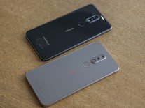
The two colors options of the Nokia 7.1
At a hair under 160g the Nokia 7.1 feels both light and dense. The sturdy aluminum frame adds to the feel of solidity as well.
The Nokia 7.1 has a similar footprint and front design to the Xiaomi Mi A2 Lite but is a more compact and much lighter device, despite the fact that it shares the same 5.84-inch display.
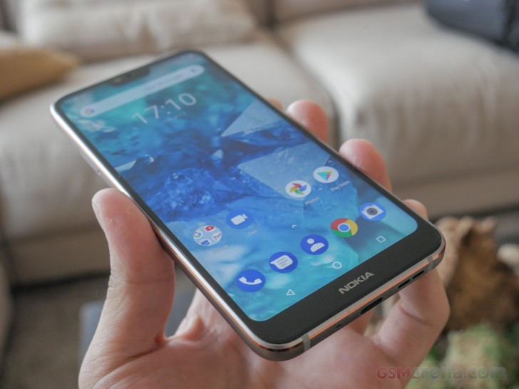
Nokia talked about the quality and integrity of the Nokia 7.1's build, but all you'd need is 5 minutes with the device in your hands to feel it. The Nokia 7.1 is sturdier than its predecessor and represents a bump in quality and build.
Reader comments
- Anonymous
- 16 Nov 2019
- I@a
What is MIA2 means?
- Bazilli
- 10 Jan 2019
- nix
Nope. :(
- Carol
- 27 Dec 2018
- pee
Not even close to that design, and this one has all the rest better. And battery life is actually very good in comparison to a lot of devices at this price.
