Nokia 808 PureView review: Photo Finnish
Photo Finnish
Nokia Belle gets a pack of features
Nokia's smartphone OS, previously known as Symbian, has faded into the background of the smartphone scene, which is a shame since it finally caught up to the competition in terms of features with Belle and now we have Feature Pack 1 to polish it.
And here's Nokia Belle FP1 on video because screenshots don't tell the whole story:
Perhaps the biggest change in FP1 is that the CPU is clocked at 1.3GHz, which should be a good enough speed boost. There are new widgets too, as well as Dolby-enhanced sound, some Microsoft Apps along with updates to the browser and Nokia Maps.
So, you get up to six homescreens and you can delete unneeded ones. Each homescreen has its own individual wallpaper, rather than one for all to share. A notable contrast with vanilla Android, the scrolling of homescreen panes is looped so you never need to go back from the last one. Auto-rotation of the homescreen is enabled too.
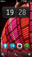
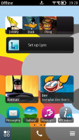
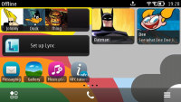
Nokia Belle homescreen in portrait and landscape modes
Widgets come in up to five sizes. In addition, you can also put shortcuts and contacts on the homescreen.
FP1 brings with it a number of new widgets. For example, you now get 3G, Offline, Bluetooth and Mobile Data on/off toggles in addition to the Wi-Fi on/off toggle you got with Belle. There's also a Mobile data tracker that is great for those on limited plans.
There's also a couple of new clock widgets, a additional calendar widget, two music player widgets, Facebook and Twitter widgets, a DLNA server widget, Microsoft Apps widget, and a couple of weather widgets among others.
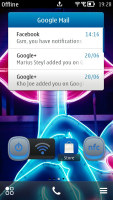
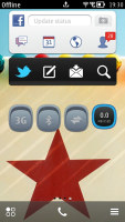
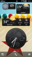
Some of the new widgets that come with Feature Pack 1
A tap and hold on a widget or shortcut activates edit mode, but only for that widget/shortcut. You can't touch the others - there's no mode where you can edit everything at once (which seems a bit inconvenient). You can move, delete or (where available) access the settings of the selected one.
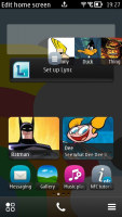
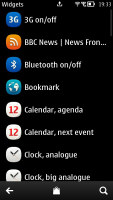
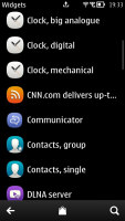
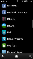
Moving widgets around • Adding a widget to the homescreen
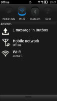
The pull-down status bar at the top of the screen is where notifications and status info wait for your attention, but you also get toggles for mobile data, Wi-Fi, Bluetooth and Silent mode.
This pull-down status bar is available on any screen so you can also quickly change a setting and look up new events.

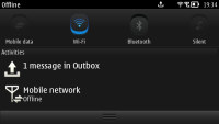
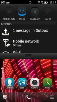
Pull-down menu is always accessible, helpful
The bottom of the homescreen has three virtual buttons - menu, dialer and homescreen settings.
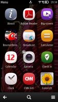
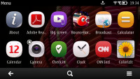
Moving on, the main menu is now completely flat, at least by default - you could still manually create folders, if you like. You can't put folders within folders though (not that you'd want to do that anyway).
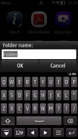
To help you navigate the crowded app drawer, there's a search feature, plus you can sort icons both alphabetically and manually. You can't drop a shortcut in a folder while arranging them though. To do that, you have to press and hold on a shortcut, choose Move to folder and then select the desired folder. There are also Add to homescreen and delete options here.
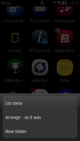
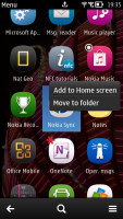
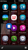
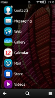
Arranging the menu • Creating a new folder • List view is available too
The way you move things around in Symbian isn't as streamlined and intuitive as it is in competing OSes and Feature Pack 1 has done nothing to change that. Also, the only way to add a folder to the homescreen is to first create it in the app drawer, which is less than ideal.
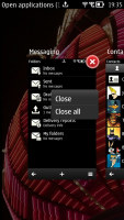
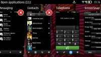
The task manager in Nokia Belle FP1 has changed though. It's still called out by pressing and holding the Menu key, but it now shows screenshots of the actual apps rather than their icons. You can barely fit two apps when the UI is in vertical orientation and four in landscape. The red X's lets you close apps that are no longer needed.
The lightweight Symbian has always been a snappy OS even on limited (by today's standards) resources. The bump to 1.3GHz (older Belle phones ran at 1GHz tops) enables buttery smooth animations and transitions.
With the Nokia 808 PureView you really don't notice you're running on a single-core processor. The app store battle is lost for the platform and in today's market, the apps are the main driving force behind smartphone sales.
We may be sad to see Symbian headed the way of the dodo bird, but the 808 PureView could be the grand sendoff an OS with such rich history deserves.
Reader comments
- Darth Caesium
- 04 Nov 2024
- BiP
Nope. That sensor is actually Quad Bayer, not Nona Bayer. It's the Samsung ISOCELL HMX sensor.
- KMnO4
- 19 Aug 2024
- xjH
27? 12 if anything, since it is a nonapixel, monochromatic pixels.
- Amrch
- 27 Feb 2023
- JI9
Good ol' Xiaomi Mi Note 10 easily outperforms Nokia (or at least on par) with Lumia. And it is 108mp sensor too. It combines four pixels into one giving you 27mpix (rare sight these days). Mi 10 flagship series does this too. It's just mino...
