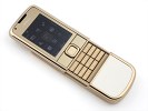
Nokia 8800 Gold Arte review: Born with a silver spoon
Born with a silver spoon
The OLED display has excellent picture quality but smallish size
Nokia 8800 Gold Arte is equipped with a 2" 16M-color OLED display with QVGA resolution, like the one on its predecessors. OLED has significantly better contrast and brightness and the black is truly black.
There are two things that we didn't like about the display. The first is the sunlight legibility - it is very poor, making the phone hard to use outside.
And the second bit that disappointed us - Nokia have put a 2.6" OLED screen on the N85, so why is the Gold Arte limited to a miserly 2"? Cost can't be the problem, nor technical limitations.
Keypad is rather good
The keypad of Nokia 8800 Gold Arte is much to our liking, with decently-sized keys and terraced layout. Typing would've been perfect save for the inadequate room for the top row of buttons - it's just too cramped up against the ridge below the softkeys. If you bear in mind that this isn't really designed as a texter's phone, then the keyboard is quite good.
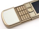
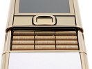
The keypad gives little reasons for complaints
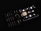
The backlighting of the phone is also top notch: strong and even, it makes the phone look as good in the dark as in bright daylight. The light sweeps smoothly from top to bottom, putting on a nice little show.
There's one little problem with the keyboard - from certain angles the key symbols are hard to read but its nothing to trouble you too much.
User interface: nothing we haven't seen
If you expected miracles from Nokia 8800 Gold Arte's software department you will probably end up disappointed. It is absolutely identical to the original Arte and that's why this software part of the review might be familiar to you if you have been keeping track.
The standby screen displays the pre-selected wallpaper plus signal strength, battery status and time in the top bar. Beneath the top bar are the operator logo and the date. The bottom bar is reserved for the labels of the functions assigned to the center of the navigation key and the two context keys. The center of the navigation key opens the main menu, while the context keys can be assigned a function of your choice. The font on the main display can be of any color.
You can also turn active standby on. It consists of several parts that can be edited or relocated to suit the user's preferences. In the most common case, the top area is reserved for instant access to favorite functions indicated by their respective icons. The central area provides instant access to the music player.
At the very bottom events from the calendar are displayed for the current day. A cool feature here, that even Nokia smartphones do not have, is the possibility to add a note to the active stand-by. The two soft keys' functionality can also be altered if necessary.
The main menu in Nokia 8800 Gold Arte can be visualized in four different ways: a grid of icons with or without captions, a list of items, and tabs. While each of them has its pros and cons our personal choice remains the typical grid view with icons. If you prefer to have more icons appear on screen, you can go for the grid view without text.
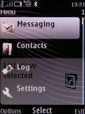
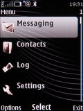
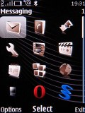
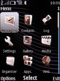
The four different main menu view modes
The icons of the main menu can be freely reordered to suit the user's taste. An interesting thing to note here is that the Opera Mini browser, the calculator and the WidSets application can be found directly in the main menu. They are also featured in the applications folder so, basically, you can access them from wherever you want. Probably these three were considered important enough to place in the main menu for quicker access.
The submenus follow no consistent pattern. Some items have captions, others do not. In certain cases, you will even be able to see the selected item described in small font, so you will not need to go down any further in the menu. As usual, the menu items are intuitively accessible through keypad shortcuts.
The color background of the entire menu, as well as the wallpaper on the display, can be easily modified by applying one of the pre-installed themes.
The menu responds quickly, without lag or holdups. This is the case with basically any S40 device nowadays and we wouldn't expect any less from the Gold Arte. Also, there were no halts or unexpected restarts during the time of our review.
Wide variety of themes
Heavy on looks throughout, the Nokia 8800 Gold Arte comes with seven preinstalled themes. All of them fit the ethos of the handset with their conservative styling. There are of course many additional themes available for download online. There are even some that produce sounds on certain events, such as opening or closing the slider.
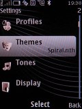
One of the fine preinstalled themes on Nokia 8800 Gold Arte
There are as many as five predefined ringing profiles on Nokia 8800 Gold Arte, plus a Flight mode that turns off all transceivers on the device. That number should be enough to have you covered in practically any circumstances. The flight mode can turn out very convenient if you decide to use your phone as an MP3 player and it can be used without a SIM card inserted.
Reader comments
- AnonD-126974
- 13 Dec 2016
- NXR
Superb, simply superb
- Martinez
- 05 Oct 2010
- vIm
Well, it’s amazing. The miracle has been done. Hat’s off. Well done, as we know that “hard work always pays off”, after a long struggle with sincere effort it’s done. ============================== Martinez Sell Your Gold For Cash
- Anonymous
- 20 Feb 2010
- PAp
this phone is just for the rich. there is no big difference with other phones and beside samsung has phones which has more features. this phone sucks !!!!~~~~
