Nokia Asha 300 review: King of ordinary
King of ordinary
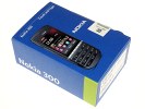
Unboxing the Asha 300
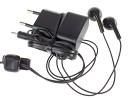
The Asha 300 packaging comes with very little in the way of value-adding accessories: an AC adapter, a single-piece headset and a manual is all you get. If you want to take advantage of the USB On-the-go charge feature, you would have to provide your own microUSB cable. There's no memory card either - the Asha 303 had 2GB of extra storage.
Nokia Asha 300 360-degree spin
At 112.8 x 49.5 x 12.7 mm, the Asha 300 is significantly lighter and more compact than the QWERTY-enabled Asha 303. In fact, at 85g, it weighs considerably less than the steel-clad Nokia C3-01.
Design and build quality
The all-plastic body is reminiscent of the archaic Nokia bar phones of the last millennium, and we’re sure that it would fare better in an impact test than your average smartphone. But make no mistake, we’re a far cry away from the “Oops, I dropped my phone, is the floor OK?” question the Nokia 3720 classic may have invoked.
Case in point, the battery cover feels cheap and flimsy compared to the rest of the phone, and in fact bends slightly whenever pressure is applied, producing audible squeaks. The phone feels almost too light in hand.
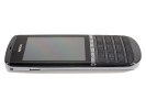
The Nokia Asha 300 takes its design cues from both the C3-01 and the C5..The 300’s curvaceous lower end and the all-plastic build reminds us of the C2-01 too. We hate to say it, but the Asha 300 is nowhere near the solid elegance of the C3-01. The simplicity of its design and the compact size are its biggest assets. The oversized screen (compared to the keypad), makes interacting with the touch interface reasonably easy.
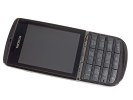
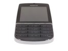
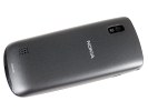
The curvaceous bottom and flimsy back panel
The 2.4" resistive TFT touchscreen is a tad smaller than the 303’s, but has the same QVGA resolution. At ~167 ppi the 300 has a slightly better pixel density of the two, but like its older brother, the image quality is nothing to get excited about.
Screen reflectiveness is another major detriment, and makes viewing the screen difficult outdoors despite the above-average brightness.
| Display test | 50% brightness | 100% brightness | ||||
| Black, cd/m2 | White, cd/m2 | Black, cd/m2 | White, cd/m2 | |||
| Nokia Asha 300 | - | - | - | 0.49 | 399 | 856 |
| Nokia Asha 303 | - | - | - | 0.76 | 377 | 498 |
| HTC Explorer | 0.26 | 201 | 763 | 0.47 | 358 | 755 |
| Nokia N9 | 0 | 349 | ∞ | 0 | 596 | ∞ |
| Nokia Lumia 800 | 0 | 108 | ∞ | 0 | 369 | ∞ |
| Nokia Lumia 710 | 0.39 | 426 | 1085 | 0.62 | 692 | 1115 |
| Nokia 701 | 0.64 | 619 | 964 | 1.12 | 1022 | 905 |
While 2.4” may seem small for a touchscreen, keep in mind that this is not your average smartphone—the S40 does not require much real estate to function effectively. The haptic feedback is a nice surprise. Each tap on the screen is coupled with a slight vibration, which seems to happen right under your finger assuring great tactile feedback. On a more general note however, the resistive screen requires slightly more pressure to interact with.
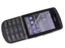
The 2.4-inch display is enough to get the job done
The “chromed” call keys above the keypad are coupled with a hardware messaging button, which opens a shortcut to either text messaging or conversations.
These keys, along with the keypad itself, are all adequately sized and strike a good balance between firmness and response to make pressing them feel natural. The backlight is sharp and solid.
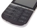
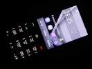
The keypad and call buttons • the white backlight
On the front, you’ll find the earpiece and microphone integrated into the keypad.
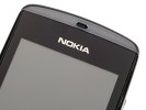
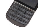
The earpiece above the Nokia logo • The mic-hole in the 7 key
The left side of the Asha 300 features a lanyard eyelet as well as a small crevice for pulling the battery cover open (which we’ll get to in a bit).
The right side has the volume rocker and a lock key. Both of these are significantly stiffer than the keys on the front and extremely difficult to press—oftentimes requiring the tip of your nail for precision due to their small size. Why Nokia decided to make them so difficult to press is beyond us, especially considering the lock key is used a lot. It is a small blessing that you can use red End button on the front to wake the phone. Trying to adjust the volume rocker while in a call is also a nuisance.
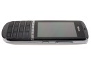
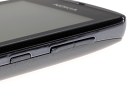
The difficult-to-press lock and volume rocker keys
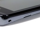
Charging the device is done from the top, either through the microUSB port, or the dedicated charging socket. It also has a 3.5mm audio jack.
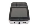
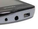
The charging socket, 3.5mm audio jack, and microUSB port, respectively
The back of the Asha 300 features one of the few advantages it has over the Asha 303, namely the 5 MP camera.
It also has a small loudspeaker grille at the bottom.
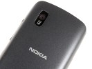

The 5 megapixel camera lens and small loudspeaker grille
Accessing the battery of the Asha 300 is where the poor quality of the plastic back panel becomes apparent. The removal process entails using the nail crevice on the left side to pry the back cover off, while trying not to snap the small plastic brackets holding the cover in place. We would have more confidence in this process if the plastic were of higher quality, or at least if it didn’t involve small tabs that could break after repeated removal.
Once the cover is off, the microSD slot and battery compartment are revealed. The 1110 mAh BL-4U Li-Ion battery boasts almost 600 hours of standby and a little over 4 hours of talk time on 3G networks. Nokia claim up to 28 hours of continuous music playback too. As expected, to access the SIM card you need to remove the battery.
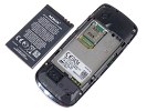
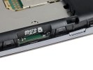
The battery and underlying SIM compartment • The microSD card slot
The basic package of the Nokia 300 is exactly that: basic. It features only a charging cable and earphones as additional accessories—no microSD card or USB cable. In most cases this should be more than adequate but we've seen Nokia do better with the build and finish, even in this price range. As opposed to the Asha 303, the build quality feels distinctly inferior, and comparisons to the steel-clad C3-01 would be nothing short of embarrassing. On a positive note, the Asha 300 is ergonomically comfortable to handle.
The 2.4” QVGA display is not spectacular, but is more than adequate to meet the needs of the Touch and Type interface. We're back to a resistive screen, following S40's brief venture into capacitive with the Asha 303. It makes sense to us - a bigger capacitive screen for the messenger and a regular resistive unit for the low-end Asha 300. It is still reasonably responsive and easy to use.
Aesthetically, the Asha 300 is a step back from two older Touch and Type phones that we genuinely liked. It obviously is going to compete in different markets and it does cost less than both the X3-02 and the C3-01. Ultimately, it's a different budget and different priorities. And if users are willing to forgive the low-cost exterior, are there any compromises to expect with the software? Stay with us as we take a look at the refreshed Touch and Type S40 user interface.
Reader comments
- DastarYasin
- 14 Jul 2015
- a3Y
Hi,I come from Iran,Tehran,my phone is nokia asha300.that no support opera mini,so that without express browser,pleaze help me.
- Anonymous
- 21 Sep 2014
- NmZ
Nokia asha 300 security
- Quintin
- 11 May 2014
- f0v
Just got the asha 502 with full touch screen.miss my asha 300.will swop back anytime,but lost my old phone.new touch screen not for me
