Nokia Asha 303 review: Type smarter
Type smarter
Touch and Type S40 UI
The Nokia Asha 303 runs on the touch-enabled iteration of the Series 40 software. We already met with this version while reviewing the C2-02 and C2-03, so if you too have met with one of them, you probably know pretty much anything about the S40 ticking inside the new Asha 303.
The touch-enabled version of the S40 platform brings only skin-deep changes like the refreshed icons, a la Symbian-Anna. And a few usability improvements, like the homescreen swipes.
Here is the Asha 303 on video, to give you an idea of what the touch-enabled S40 user interface looks like:
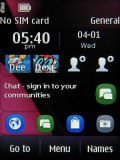
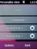
Active standby mode (or Home screen mode, as Nokia call it here) is available as usual. It divides the screen into four sections, each of which is effectively a widget. The top row of the screen is reserved for status indicators (time, signal, etc.).
By default, the clock is on top, followed by Social (Facebook, Twitter and Flickr integration) and two Shortcut bars at the bottom, each of which grants instant access to four favorite functions or apps.
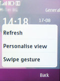
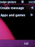
There are two swipe gestures available on the homescreen. A left or right swipe can be set to launch an app (both native and Java) or change the phone profile. By default, a left swipe opens the message composer and a right swipe opens the Java apps and games folder.
There‘s no D-pad on the Nokia Asha 303 but the soft keys are there. Only virtual this time – they’re at the bottom of the screen, and there’s a virtual Menu key between them. The soft keys are user-configurable – you can assign a shortcut of choice to each of them.
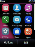
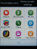
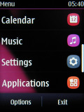
The main menu has only two views – Grid and List. The grid layout is handy for offering numpad shortcuts.
The familiar Go To shortcut is available and it's yet another way to add shortcuts to the homescreen. It’s the kind of quick menu we’ve seen on many S40 handsets but touchscreen makes so much difference. It offers quick access to nine shortcuts.
The lockscreen on the Nokia Asha 303 pretty standard – a clock and a tap-to-unlock key.
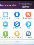
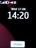
Go To is a handy quick launcher • The lockscreen
One thing missing is an accelerometer. Unlike some of its S40 non-touch siblings, the Nokia Asha 303 leaves out features like tap-for-time and turn-to-mute. As for screen auto rotation, it’s not badly missed we think, given the screen size. Some might still find it a nuisance though – having to manually set display orientation where it matters: in the image gallery and the video player.
The biggest omission as usual is multitasking - we gave up hope that Nokia will add that a long time ago. This leads to bottlenecks though they are rare.
You can't leave it running in the background. You have to go through that every time you want to do something with the app, except check the latest notification (notifications do come in the background and only the last one is displayed).
Reader comments
- Sam khan
- 19 Jan 2017
- 6Pd
I need Nokia Asha 303
- Prince Manuel
- 05 Dec 2015
- Nw%
I am using a nokia C3 prototype and it works extremely well but the only problem I have with it is that it automatically deducts my airtime in a form of sms sent. I called my network provider customer care and I was told it sent some info back to the...
