Nokia Asha 305 review: Smarter 2gether
Smarter 2gether
Introduction
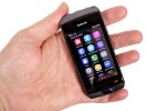
The Nokia Asha 305 is easily one of the cheapest phones with two SIMs and a touchscreen, the closest Android being almost twice as expensive. Price may be the biggest advantage this phone has over the competition but you'd better be prepared for more than a few surprises.
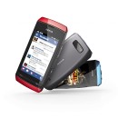
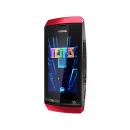
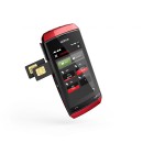
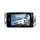
Nokia Asha 305 official photos
With the new Asha touch interface, an updated browser and access to the Nokia store, the Asha 305 promises a near smartphone-like experience. And that's on top of the dual-SIM capabilities, including a hot-swappable SIM slot and a dedicated SIM management app that lets you configure how calling, texting and data are juggled between cards.
Key features
- Dual-band GSM, GPRS, EDGE
- Dual SIM dual stand-by, SIM hot-swap
- S40-based Asha touch interface
- 3" WQVGA resistive touchscreen, ~155 pixel density
- Multi-touch in the gallery and Nokia Maps
- Display auto-rotation
- Nokia Browser 2.0
- Nokia store and 40 EA games for free
- 2 MP camera
- microSD card support (up to 32 GB)
- Complimentary 2 GB microSD card in the box
- Bluetooth v2.1
- Standard microUSB port, charging
- 1100 mAh Li-Ion battery
- Excellent loudspeaker performance
Main disadvantages
- Interface slows down at times, due to low RAM
- Poor screen quality
- Resistive touchscreen feels awkward
- Fixed-focus camera
- QCIF video recording
- No smart dialing
A package like the Asha 305 is built on the not so solid ground of compromise. You get a low-resolution resistive screen and the still camera and camcorder are of the lowest quality. Yet, even the resistive screen can do a multi-touch trick: the so-called multipoint touch enables pinch zooming in the gallery.
The actual touchscreen experience is on a level unseen before in S40 - soft keys are almost completely out of the equation. Of course you'll have to bear with occasional lags and poor response on the resistive unit. On the other hand, the pull-down notifications and quick settings, along with the advanced side-scrollable homescreen make this feel a lot more convenient and user-friendly.
Even little things like screen auto-rotation and a landscape QWERTY keyboard make a lot of difference compared to last time we saw a full-touch S40 on the Nokia C2-03.
There will be more on the interface coming up, but not before we've had a proper look at the hardware. We start with unboxing on the next page.
Reader comments
- DR.S.SARKAR
- 11 Sep 2017
- rJ8
My best choice & No-1 choice
- balan
- 28 May 2016
- KSg
how to connect wifi . is there any option or not.please aware me
- Anonymous
- 10 May 2015
- uQ{
My good mobil
