Nokia Asha 305 review: Smarter 2gether
Smarter 2gether
MeeGo-like Series 40 user interface
This is not the first time we see a fully touch-operated S40 interface but the latest iteration, called Asha Touch, is a massive improvement. The Symbian-like icons and the homescreen swipes are no news really but the changes run deeper than that and the whole ideology has shifted towards a more thumbable and user-friendly interface and a simple, flat menu structure.

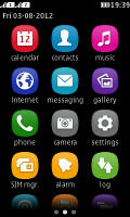

The lockscreen and the three homescreens
All the action happens on the touchscreen. There're very few hardware keys and none of them is directly involved in navigating the interface - except the End key that can close apps and bring you to the homescreen.
There's no actual homescreen to begin with. Or rather, it's an arrangement of three side-scrollable homescreens in… wait for it… MeeGo fashion. The default one is the app launcher - the new Asha Touch gets straight to business.
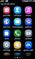
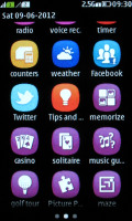
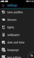
The app launcher • Settings menu
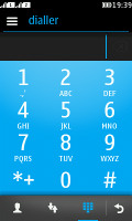
A swipe to the left will take you to the dialer. In fact, this screen can be customized to show either the music player or the radio but having the dialer always a swipe away makes sense. The third homescreen is what was previously known as Active Standby. It's now a pane to fill with shortcuts to frequently used apps or contacts. A tap and hold on that screen triggers Edit mode, so you can choose shortcuts and contacts to add. As usual, the time and date are displayed too, which in turn serve as shortcuts to the alarm app and the calendar.

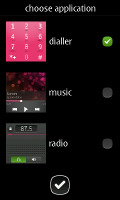


The dialer and its replacement options • You can add shortcuts and contacts on the Active Standby screen
The status bar is visible on top of any of the three screens and you can either tap to expand it or pull it down. It displays notifications of missed events and quick toggles for sound profiles and mobile data. Below you get shortcuts to the music player, the phone and messaging apps.
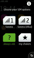
The top of this notification area of sorts is reserved to SIM management. The dual-SIM Asha 305 has a full-blown SIM manager, as seen on other Nokia phones but the tapping on the two SIM icons in the notification area displays a screen with four big and thumbable buttons for quick SIM optionsNotifications are displayed on the lockscreen too. Swiping on a notification will take you to the relevant app.

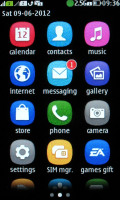
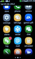
Lockscreen notifications • Notifications in the App Launcher
A tiny number icon on the Messaging icon in the app launcher shows the text messages you have received but not yet read. There are similar new email notifications.
In case of a missed call, which requires your attention, the notification area drops down a bit to briefly display the number and then pulls back up, leaving a small handle as a reminder, which you can pull to see who's been calling you.
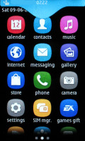
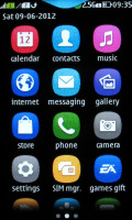
The notification area behavior when you miss a call or have a new message
These are minor but nice touches to a completely revamped interface, which is surprisingly feature rich, yet beautifully simple. Soft keys are nowhere in sight - every app or screen you open has just a tiny back key instead.
Honestly, the Asha touch interface was a major surprise. Of course, the low-res resistive screen does it no favor but we cannot say we don't like how things are done. It's smartphone-like experience indeed, though it's obviously short of the most important ingredient - multitasking.
The speed and performance are unimpressive but overall it's the way things look on the dim low-res screen that's the biggest letdown.
Reader comments
- DR.S.SARKAR
- 11 Sep 2017
- rJ8
My best choice & No-1 choice
- balan
- 28 May 2016
- KSg
how to connect wifi . is there any option or not.please aware me
- Anonymous
- 10 May 2015
- uQ{
My good mobil


