Nokia Asha 306 review: Smartphone Ash-pirations
Smartphone Ash-pirations
S40 thinks it's MeeGo
We have decent experience with the new Asha Touch variation of the Series 40 software and we like what Nokia has done with its best-selling platform. The software takes a lot of design cues from its Symbian (or "Nokia OS" if you will) and MeeGo brothers, and as such the user interface structure is based on the MeeGo one.
All interactions are touch-based, except for the red receiver key which is a handy way to bring out the homescreen or close an app. Here's the Asha 306 in action:
The lockscreen offers a big clock with the date underneath. A familiar sideways swipe unlocks the phone. Before you do that, you must first wake up the screen, of course. To do that you need to press the hardware lock key; double tap like on the Nokia N9 doesn't work.
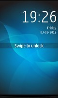
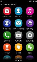
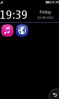
The lockscreen and the three homescreens
Beyond the lockscreen is an arrangement of three side-scrollable homescreens in MeeGo fashion. The default one is the app launcher - the new Asha Touch gets straight to business.
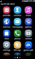
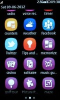
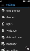
The app launcher • Settings menu
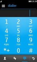
A swipe to the left will take you to the dialer. In fact, this screen can be customized to show either the music player or the radio, but having the dialer always a swipe away is probably the most useful of the three.
The third homescreen is what was previously known as Active Standby. It's now a pane to fill with shortcuts to frequently used apps or contacts. A tap and hold on that screen triggers Edit mode, so you can choose shortcuts and contacts to add.
As usual, the time and date are displayed too, which in turn serve as shortcuts to the alarm app and the calendar. There are no other widgets available here unfortunately, e.g. a music player widget.

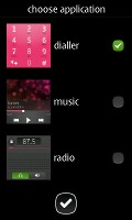


The dialer and its replacement options • You can add shortcuts and contacts on the Active Standby screen
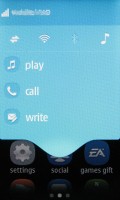
The status bar is visible on top of any of the three screens and you can either tap to expand it or pull it down. It displays notifications of missed events and quick toggles for mobile data, Wi-Fi, Bluetooth and sound profiles.
Below you get shortcuts to the music player, the phone and messaging apps. While S40 Asha Touch doesn't really do multitasking, those three apps are almost always available to you, even inside Java apps (the only exception is full screen apps). You can change the track, send a message, make a call and go back to where you left your app.
Notifications are displayed on the lockscreen too. A convenient shortcut is swiping a notification, which will take you to the relevant app.
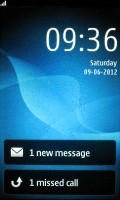
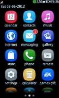
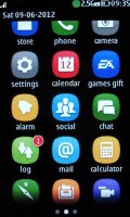
Lockscreen notifications • Notifications in the App Launcher
A tiny number icon on the Messaging icon in the app launcher shows the text messages you have received but not yet read. There are similar new email notifications.
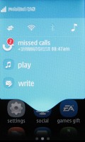
In case of a missed call that requires your attention, the notification area drops down a bit to briefly display the number and then pulls back up. It leaves a small handle as a reminder, which you can pull to see who's been calling you.
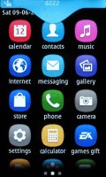
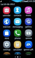
The notification area behavior when you miss a call or receive a new message
These are minor but nice touches to a completely revamped interface, which is surprisingly feature-rich, yet beautifully simple. Soft keys are nowhere in sight - every app or screen you open has just a tiny back key instead.
We don't miss multitasking, which will never be a part of S40. The Asha 306 comes with all the essential functions as native apps, so they can receive notifications in the background, and the call/text/music functionality is always accessible. It's the most common use case - especially considering there aren't that many third-party apps to switch between (e.g. you're not going to use a third-party music player).
The Asha 306 uses the same hardware as the 305 and that doesn't quite have the processor power to run the complex UI as smooth as we would have liked. There's noticeable lag as you scroll through the interface.
To be fair, part of what ruins the experience is the resistive touch, which requires a stronger push to register a touch than a capacitive screen does and we often ended up hitting all sorts of icons unintentionally when we lightened the pressure of our fingers on the screen.
Reader comments
- izoz
- 29 May 2016
- NYq
my phone cant save pics,downloads ,and even hard to recieve apps
- JOHN MUPWAYA
- 16 Dec 2015
- fu%
i need to download operator system 306 nokia
- Noxie
- 13 May 2015
- NmZ
It like i have no phone cnt download everything
