Nokia Asha 308 review: The tweener
The tweener
Unboxing the Asha 308
The Asha 308 has everything you may need inside the retail box to get started: the traditional Nokia A/C charger (although the phone charges off USB too), a short microUSB cable and a single-piece headset.
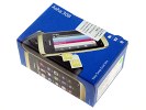
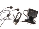
The Nokia Asha 308 retail package
Inside the phone you'll also find a 2GB microSD card.
Nokia Asha 308 306-degree view
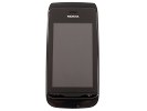
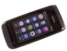
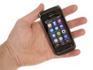
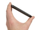
At 109.9 x 54 x 13 mm, The Nokia Asha 308 is almost exactly the size as the Asha 305, and weighs just 6g more, tipping the scales at 104g. The handset is small though by no means slim, and the back is gently curved for a comfortable fit in hand.
Design, build quality and controls
The Nokia Asha 308 has the typical styling of the series, but it's better than the Asha 305 in a number of important ways. The capacitive screen is one of them, though it's not something you'd notice right away. What we mean is the image quality isn't superior in any way - the response to user commands is.
One thing we instantly appreciated is the sensible finish - nothing fancy but we're happy we're not treated to the cheap gloss of the Asha 305 again. And there's something quite subtle like the shape of the call keys beneath the screen. The two controls are nicely sculpted for great touch orientation.
There is the typical flaw of course of cheap phone design - plenty of unused space around the 3" display. Even for a handset with actual hardware buttons, there's too much screen bezel, especially at the top. The space above the screen is usually reserved for a camera and sensors, of which the Nokia Asha 308 has none.
The display of the Asha 308 hasn't grown in either size or resolution but it's a capacitive unit with vastly superior response. The lightest taps are registered and scrolling is impressively smooth. Things like that would be instantly appreciated by users who may have been let down by the sluggish jerkiness of resistive touch. Double the amount of RAM is certainly of help here too.
The image quality on the other hand remains virtually unchanged. Contrast is average, but sharpness is rather low. Viewing angles are pretty poor as well, but then again that's about as good as it gets in this price range.
| Display test | 50% brightness | 100% brightness | ||||
| Black, cd/m2 | White, cd/m2 | Black, cd/m2 | White, cd/m2 | |||
| Nokia Asha 308 | - | - | - | 0.34 | 320 | 938 |
| Nokia Asha 305 | - | - | - | 0.33 | 320 | 955 |
| Sony Xperia go | 0.30 | 282 | 928 | 0.63 | 541 | 859 |
| HTC One X | 0.15 | 200 | 1375 | 0.39 | 550 | 1410 |
| Sony Xperia U | 0.35 | 287 | 831 | 0.55 | 515 | 930 |
| Samsung Galaxy Pocket | 0.31 | 238 | 774 | 0.62 | 468 | 753 |
| Samsung Galaxy Y | 0.40 | 247 | 624 | 0.72 | 471 | 625 |
And here come the Asha 308 score from our display sunlight legibility test. It actually did quite well, beating some way more expensive composition. That polarization filter that Nokia installed is obviously doing a marvelous job.
Contrast ratio
-
Nokia 808 PureView
4.698 -
Apple iPhone 5
3.997 -
Samsung I9300 Galaxy S III
3.419 -
Samsung Omnia W
3.301 -
Samsung Galaxy S
3.155 -
Samsung Ativ S
3.129 -
Nokia N9
3.069 -
Samsung Galaxy Note
2.970 -
Samsung Galaxy Premier
2.958 -
HTC One S
2.901 -
Samsung Galaxy S II
2.832 -
Huawei Ascend P1
2.655 -
Nokia Lumia 900
2.562 -
Apple iPhone 4S
2.269 -
Nokia Lumia 820
2.193 -
HTC One X
2.158 -
Nokia N8
2.144 -
Nokia Lumia 920
2.107 -
Apple iPhone 4
2.016 -
Sony Ericsson Xperia ray
1.955 -
Nexus 4
1.926 -
Nokia Asha 308
1.911 -
HTC Desire X
1.878 -
HTC Windows Phone 8X
1.873 -
Sony Xperia U
1.758 -
LG Optimus G
1.753 -
LG Optimus 4X HD
1.691 -
HTC One V
1.685 -
LG Optimus Vu
1.680 -
HTC Desire V
1.646 -
LG Optimus 3D
1.542 -
Nokia Asha 302
1.537 -
Nokia Lumia 610
1.432 -
Gigabyte GSmart G1355
1.361 -
Sony Xperia miro
1.324 -
HTC Desire C
1.300 -
LG Optimus L7
1.269 -
Meizu MX
1.221 -
Samsung Galaxy Pocket
1.180 -
Sony Xperia tipo
1.166 -
Samsung Galaxy mini 2
1.114
The only thing to note above the screen is the earpiece - there's no proximity or ambient light sensor.
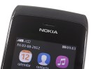
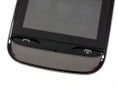
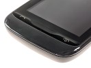
Above and underneath the screen views
Underneath the screen you'll find the mouthpiece on the thin strip of plastic that accommodates the call. The end key will exit any currently running app and take you back to the homescreen. On a long-press it serves as a power button too. The nice shape of the keys helps touch orientation but they have a rather low stroke with inadequate press feedback.
The right side of the Asha 308 accommodates the volume rocker and the lock button. The slit for removing the back panel is just below the lock key.
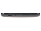
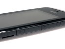
The right side of Nokia Asha 308
The left side has the microSD card slot and the secondary SIM compartment. Both are sealed with plastic lids and are hot-swappable. The lanyard eyelet is near the bottom.
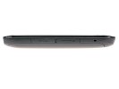
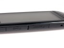
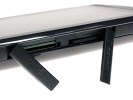
microSD and SIM compartment on the left
The top is where the connectivity ports are. The microUSB port in the middle can be used for charging. On the sides you get the 3.5 mm audio jack and the standard charging port.
The bottom is completely bare.
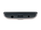
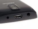
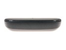
The top and bottom of the Asha 308
The back panel of the Asha 308 is entirely made of plastic, a subtle pattern visible through a coat of glaze. The 2MP camera lens is centrally placed at the top and the loudspeaker grille is in the bottom right corner.
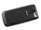
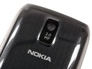
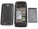
Rear view of the Asha 308 and a peak under the battery cover
A 1110 mAh Li-Ion battery powers the phone and inside the battery compartment is the primary SIM slot.
The Asha 308 is probably the best-looking member of the Asha Touch family. There's nothing fancy of course in terms of finish but the phone is well-built and doesn't get carried away with the gloss. Overall, it's a simple package with a grown-up, sensible design. The user experience is much better than on a resistive screen, and the phone feels much snappier. Users will certainly appreciate the hot-swappable extra SIM and memory card slot .
Reader comments
- Anonymous
- 24 Oct 2023
- XVC
Can i buy it.
- raj
- 15 Jan 2016
- KA6
a very good set.satisfying features.touch.is awsume/smartlessexpensive
- Gani
- 18 Mar 2014
- rKN
308 not sopott the pdf format
