Nokia Asha 501 review: The candy store kid
The candy store kid
Updated Asha Touch takes after MeeGo
Nokia's Asha Touch user interface has been known to heavily borrow from MeeGo, but the new Asha generation has really lost any decency - who can blame them really, it's a debt that will never have to be repaid.
To Nokia's credit, it has done a pretty good job of porting stuff to the lesser hardware. We're as happy with the new interface as we are with the fresh styling of the handset. Scrolling and, rarely, swiping do feel a bit choppy but other than that it's a good-looking interface with a modern feel to it - a significant improvement over the Ashas of old.
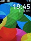
Of course, the styling of the icons has barely changed but wallpapers are a welcome addition that gives some punch to the interface - along with much needed depth. When you scroll or swipe, the background responds too.
Getting rid of the hardware call buttons is another step towards a decisively modern look. The single hardware control is the Back key, and it is only really needed when you need to go a level up from a submenu. For everything else, swipes and taps will do. A double tap will wake the phone up, swiping an app off the screen will close it. We told you, the whole thing is modeled after MeeGo.
Here's the usual video demo to get us started.
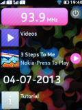
The lockscreen doesn't have any active shortcuts to directly launch apps but it will display notifications for missed calls, incoming messages or calendar events. These will take you right to the relevant app, be it the dialer, calendar or messaging. A tiny number icon on the Messaging icon in the app launcher shows the text messages you have received but not yet read. That works for email too.
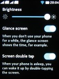
A double tap will nudge the phone out of standby and display the lockscreen - you need to enable the option in the settings.
In the preceding Asha Touch version, the interface was built around a three-homescreen setup: the app launcher, the phone app (or Radio, or Music Player) and a pane to fill with app shortcuts or favorite contacts. There're only two homescreens now - the app launcher and the so-called Fastlane. It's a similar setup to what Windows Phone does with the Tile screen and All Apps.
The Fastlane keeps track of all your recent activity, opened apps go there, along with contacts you've called, calendar events (birthdays, to-dos) and social network posts and goings-on. Not all apps are available in the Fastlane - the Settings, Browser and Camera, among others, didn't appear in the recently opened list - Alarms, Facebook and Gallery do.
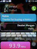
The music player will appear in the Fastlane only if you've played a track - that makes sense really. What you get is a line with the track name, a tap on which will take you to the Music Player app. Alternatively, a tiny play/pause button next to the track name, will simply resume or pause playback without going into the app itself.
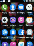
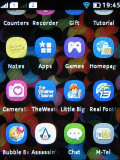
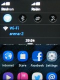
The app launcher is a 4 x 4 grid, up from 3 x 4. All the apps you install reside here and you can rearrange them as you see fit but you cannot create folders. A tap and hold inside the app launcher triggers edit mode, where you can delete apps.
You can tap to expand the status bar or pull it down to show notifications for missed events and quick toggles for sound profiles, Wi-Fi, Bluetooth and mobile data. The two SIM cards have their icons in the notification area with the network ID and the custom names you gave each.
In case of a missed call, which requires your attention, the notification area drops down a bit to briefly display the number and then pulls back up, leaving a small handle as a reminder, which you can pull to see who's been calling you.
To close an app you just need to swipe it away from either end of the screen and you'll be back to the app launcher screen. You can also close apps by holding the Back button but for some apps you'll get a prompt to confirm you want to close.
Some apps give you a context menu, which is accessible via a swipe from the bottom.
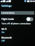
The settings menu is a vertically scrollable list of settings, which is easy enough to navigate. The first options are connections, which lists Flight mode, Wi-Fi, Bluetooth and the SIM menu.
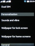
The next menu handles Personalization - it lists the options for sounds and wallpapers. Glance screen is an option for the lockscreen, which displays a permanent clock.
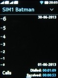
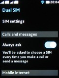
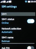
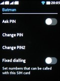
From the SIM menu you can enable Mobile data, check out the counters for calls and data. You can also choose a new name for either SIM, select Fixed dialing, change PIN and Network selection.
The interface runs reasonably fast and is easy enough to navigate but could've been smoother - scrolling animations could certainly use a higher framerate. Once you get a feel for the swipe navigation there's really no way to go wrong.
Even if you open an app by mistake it's only a swipe from either edge of the screen to exit and get back to first base. The notification area comes in handy for toggling quick settings like Wi-Fi or Bluetooth and spares you the need to open up the settings menu. Recently opened apps are just a swipe away in the Fastlane.
Reader comments
- Derryckiey
- 24 Jun 2020
- fu%
Why am i not having access to whatsapp?
- Yogesh
- 01 May 2020
- rJM
Stote app and gift app and what's app and nimbuzz etc app not working
- adi
- 04 Nov 2017
- wdJ
its satisfies my requirements, ithink this is a best phone,thanks nokia for giving such a smart phone and it also has awesome colours, it looks very cute,because we can change its mods,i think we should encourage this software as it is the first smar...
