Nokia C3-01 Touch and Type review: The missing link
The missing link
S40 is getting there…slowly
The Nokia C3-01 runs the Series 40 6th edition software – we’re returning to a familiar environment and if you already met the X3-02 Touch and Type you should know pretty much everything there is to know about it. The few things that are different from the regular non-touch S40 are the thumb-optimized icons and system fonts. Other than that, it is almost the same as any other S40 handset out there.
Here is a demo video of the Nokia C3-01 user interface.
The vast reach of Nokia means that many people have at some point used an S40 device. But old glory aside, S40 still has important features missing and things that need polishing – even in the touch edition.
Anyway, familiarity is not a bad thing. Plus, the UI is simple and fairly intuitive so you can get going right away, you don’t need any special help or instructions to use the Nokia C3-01.
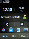
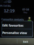
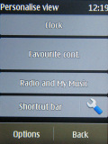
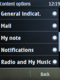
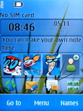
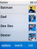
Active standby mode (or Home screen mode, as Nokia call it here) is available as usual. It divides the screen into four sections that can be edited as users see fit (by tap and hold on any section). By default, the clock is on top, followed by Favorite contacts, then Music player and radio and the Shortcut bar at the bottom, which grants instant access to four favorite functions or apps.
You can customize that – rearrange things and add or replace shortcuts.
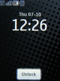
A brand new feature on S40 Touch Edition is the lockscreen. It’s pretty standard – a clock and tap-to-unlock key. A handy function is that pressing the end key while the keypad is locked, brings up a clock that shows the time and date.
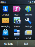
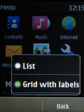
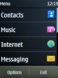
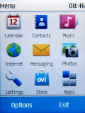
The main menu has only two views – Grid and List. The grid layout is handy for offering numpad shortcuts.
Multitasking support is still missing on S40.
There‘s no D-pad on the Nokia C3-01 but the soft keys are there. Only virtual this time – they’re at the bottom of the screen, and there’s a virtual Menu key between them. The soft keys are user-configurable – you can assign a shortcut of choice to each of them. We do think though, at least one of them is best left with Go To. It’s the kind of quick menu we’ve seen on many S40 handsets but touchscreen makes so much difference.
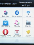
Go To is a handy quick launcher
On the C3-01 you get a 3 x 3 grid of virtual buttons serving as shortcuts to frequently used functions or apps. It’s a quick launcher of sorts that makes a lot of sense. The whole thing is fully customizable – you can set a shortcut to virtually any item in the interface. And it makes sure you don’t repeat an item that’s already in the grid. Nicely done.
Another thing to note as missing is an accelerometer. Unlike some of its S40 non-touch siblings, the Nokia C3-01 leaves out features like tap-for-time and turn-to-mute. As for screen auto rotation, it’s not badly missed we think, given the screen size. Some might still find it a nuisance though – having to manually set display orientation where it matters: in the camera viewfinder, image gallery and the video player.
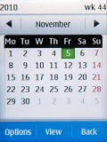
Nokia C3-01 runs the same software as the X3-02, but you may notice that some of the phones (perhaps it depends on the region) are set on different themes. Besides the dark color theme, such as the one on the screenshots, there is the standard blue theme typical for most of the S60 devices.
Reader comments
- Williamrhymn
- 12 Feb 2024
- atv
learn this here now galaxy swapper v2
- VictorSuisk
- 09 Oct 2023
- S43
click here for info https://ko1.onlinevideoconverter.pro/10df/download-video-instagram
- CharlesHit
- 26 Aug 2023
- yJt
see this NewYork Vacancy eBit Technology
