Nokia C6 review: A playful character
A playful character
User interface
The Nokia C6 runs S60 5th edition and our test unit comes with the 10.0.024 firmware release. You must have seen plenty of Symbian in touchscreen action and nothing here should come as a big surprise.
Here is our unboxing and user interface video. If you want to skip the retail package exploration, the UI demo starts at 00:50.
We are glad to note that kinetic scrolling keeps on getting better. It is available almost throughout the user interface – from file and web browsers through gallery to contacts and even the main menu. Finger scrolling has been improved as well.
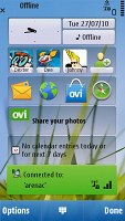
Until now widgets were limited to Nseries, but the C6 is kind enough to bring them on board. A widget-enabled homescreen mimics the good old Active Standby but instead of slots you now get nicely thumbable blocks. However, if you were hoping for thumb-scrollable multiple homescreen panes, you are again out of luck, even though the competition has had these for a long time.
S60 5th is in essence a direct translation of D-pad and soft-key action into touch. Although it has its benefits, the result is hardly the most fluent and intuitive touchscreen interface there is. Scrolling and accessing items across the interface is nothing like other touch platforms we've tried. On the other hand, soft-keys work just fine and enhance usability compared to other touch phones.
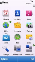

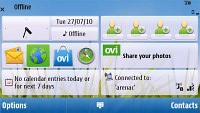
The S60 5th homescreen and menu
So, the user experience with S60 5th is a mixed bag and what you think of it will entirely depend on your background. If you know your way around S60, you'll be quite at home with the C6 interface. But if you come from an alternative touchscreen platform you'll find yourself climbing a fairly steep learning curve.
Opening an item in any of the listed submenus requires not one, but two presses - one to select, and another one to confirm the action. Now that's something that you don't normally see in other touch phones.
You get used to it with time, but the main issue here is that the interface logic is different when you deal with icons instead of lists.When the opened menu uses icons to represent items as opposed to lists, then a single click usually does the job.
At least kinetic scrolling will make you feel way more comfortable than those first 5800 XpressMusic users.
Homescreen and main menu
The main menu structure leaves no doubt you're on Symbian turf. Icons are set in a 3 x 4 grid or a list that you can freely reorder. Screen orientation can be set to change automatically thanks to the accelerometer.
The homescreen layout of the C6 is typical Symbian and looks exactly the same as it did on the Nokia N97 mini.
A single press on the clock starts the clock application (with an option for setting up an alarm) while tapping on the date launches the calendar application.
Another tap, this time on the Profile button, leads you to the profile options where you can edit the currently active profile or change it (which does make using the the Power key for that purpose redundant).
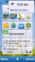
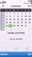
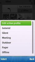
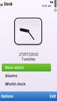
Calendar, profiles and clock just a touch away
You can also access the connectivity menu from here by tapping around the battery status indicator, which is one of the ways to initiate a WLAN search. It is not as quick as having the WLAN Wizard as a homescreen widget.
Now, let's take a closer look at the widgets. The space underneath the status icons and the clock can fit up to 5 widgets at a time. A sideways finger sweep will hide or display them.
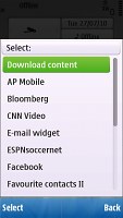
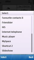
There are plenty of widgets to choose from – there are tools like the WLAN wizard, music player controls, calendar, email, etc. There’s a widget for favorite contacts and a shortcut widget. You can have two of each at a time. The other widgets are linked to various sites and services: Facebook, MySpace, Bloomberg, CNN video and quite a few more.
The Ovi Store comes in handy when you get bored of the preinstalled widgets, but will cover that in more length later.
Arranging widgets is easy and fun. You can remove some of them, add others, change their order (just drag and drop). If all 5 slots have been taken, you have to remove one or more widgets to make room.
On the Contacts bar each contact is represented by the contact photo and their first name. Up to four favorite contacts can be displayed at a time and the list isn’t scrollable left or right.
Selecting a contact from the Contact bar brings up a screen with buttons to start a voice or video call, compose a text message or E-mail.
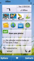
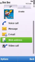
The Contacts bar • viewing a contact from the Contacts bar
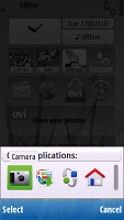
The Shortcuts bar is ready to accommodate shortcuts to your favorite apps or web sites. You can even have two Favorite Contacts widgets and two Shortcut widgets displayed on the homescreen (if you happen to need them).
The Nokia C6 features a task manager which is launched by a press-and-hold on the menu key. The task manager itself is identical to what you get on Symbian S60 3.2 devices. Much like in the previous version of the UI, it appears on top of every pop-up menu. To close running applications use the hardware backspace key or press and hold the app's icon to display two virtual buttons: Open and Exit.
The dedicated hardware switch on the right-hand side of the device will lock / unlock the phone. The lockscreen has a virtual swipe-to-unlock button .
Reader comments
- AnonD-697016
- 02 Sep 2017
- 6sE
I love this model camera only 5 mp but very nice photography.we hope,in the market we found again c6 nokia.
- tiru
- 22 Jul 2015
- ITm
nokia c6 mobile is vry bad and tuch is damage shortly and slow mobile and vry ......... so good camera and vry bad tuch
- Anonymous
- 19 Dec 2013
- J7E
Exactly Dude :/
