Nokia E5 review: Textbook texter
Textbook texter
Symbian is pleased to serve
The Nokia E5 is powered by Symbian 9.3 and runs on the S60 3rd edition user interface with Feature Pack 2.
The E5 uses the so-called Active Standby homescreen. It is available in several different flavors so you can prioritize the set of shortcuts you need on the screen.


Basic standby mode • Vertical icon bar • Horizontal icon bar • Active standby
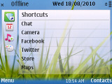
The Basic layout just shows you the wallpaper (and the usual status indicators of course) and you can assign shortcuts to the D-pad directions. The Vertical icon bar layout has four tabs - shortcuts, calendar, music player and personalization and it doesn't hide much of the wallpaper.
The other three layouts are more elaborate. They offer several rows of “homescreen applications” (e.g. upcoming events from the calendar, received emails and so on) along with shortcuts.
The Horizontal icon bar is the most basic of the three. You get a row of six customizable shortcuts at the top of the screen, below are email, calendar, Ovi Chat and WLAN notifications (they also act as shortcuts to their respective apps).
When the music player (or the radio) is on, a new row is displayed with the track info.
The Active layout is the good old Active Standby that was on the Nokia E71/E72 and others. It looks like the Horizontal layout, but tucks in an analog clock on the left of the screen and lets you customize what rows to appear under the shortcut toolbar.
There are 15 different options to choose from (e.g. missed calls, voice mail, to-dos and so on). You could turn them all on, but only five are visible at any time and you can’t scroll up and down to see the rest.
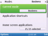
Typical E-series, there the Business and Personal modes for this layout. They allow you to quickly switch between two sets of shortcuts and homescreen apps – one with business apps at hand, the other, say, with Twitter and Facebook shortcuts.


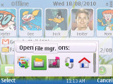
The Contacts bar • viewing a contact from the Contacts bar
The other option is the Contact bar layout, which has been available on Nokia handsets for quite a while too. It puts a row of favorite contacts on top three homescreen applications - Calendar, WLAN wizard, Ovi Contacts – along with the usual six customizable shortcuts (this time at the bottom).
The Favorite contacts are placed on top, each represented by the contact photo and their first name. Four contacts are visible at a time and you can scroll left and right for the rest. The music player traditionally has a tab for the homescreen – but because the space is limited, it usually ends up replacing the Calendar tab.
There’s one final layout – the Talking theme. It enhances accessibility by reading out loud the option you’ve selected.
As with all Symbian phones, there is a built-in voice recognition system. It does a good job, being fully speaker-independent.
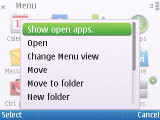
The Symbian task manager appears on every pop-up menu. It's actually placed on top of every list, which can be a little irritating at times, considering you can still invoke it with the well-known shortcut of pressing and holding the Menu key (the one with the House pictogram).


The Nokia E5 is a good multitasker
The Nokia E5 is powered by a 600MHz CPU with 256MB RAM, which is plenty for a Symbian smartphone. The UI is speedy and the battery lasts quite a while between charges, the only lags we noticed concern some transition effects when going through the menus.
Reader comments
- gowtham.k
- 01 Apr 2020
- U@3
this phone support youtube and whats app
- tharu
- 26 Aug 2018
- IWS
thats a good phone but, iwant a symbian bell to this phone
- salmanarefin
- 19 Apr 2015
- HsL
Nokia e5 is bettet thn c5 03