Nokia E6 review: The E spirit
The E spirit
Symbian Anna brings new icons and refreshed homescreen
The Nokia E6 and X7 are the first devices to have Symbian Anna out of the box. The new release takes the OS to the next level with a more user-friendly and contemporary user interface, an improved web browser, new split-screen for text input and a better homescreen.
Starting with the homescreen, Anna is showing its fresh coat of polish and a new feature here or there. The homescreen of the E6 consists of five panes, which you can fill up with various widgets (and shortcuts) and reshuffle as you see fit. You can add or delete panes but you don’t get more than five.
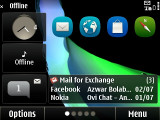
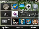
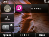
Symbian Anna comes with a new homescreen
The homescreen scrolling has been vastly improved - the panes move with your finger, not after you've done the swipe as it was in Symbian^3.
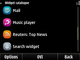
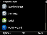
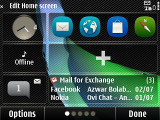
The widget catalogue • re-ordering widgets
Here is a demo video of the Symbian Anna running on Nokia E6:
The menu is mostly unchanged, retaining the hierarchical folder structure, but the icons are new - they are now rounded squares. It's an aesthetic change mostlyYou are free to rearrange icons as you see fit so you might go for placing them all in the main folder and get a flat-ish menu system. You can create custom folders too, which can help you organize your apps. A list view mode is also available but that involves much more scrolling and that’s why we preferred to leave things in grid.
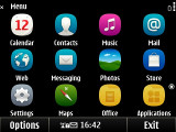
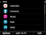
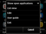
Not much has changed in the main menu
The task manager shows screenshots of the running apps, instead of just icons. You also need only a single click to kill them. The downside is the task manager manages to only fit three apps on the screen and you often have to scroll to the one you want.
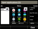
The refreshed Task manager • only three apps at a time fit on the screen
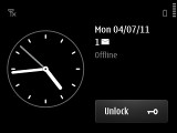
A neat feature is the popup available by tapping the top right corner of the screen. It gives you a bigger clock, a shortcut to the connectivity menu, a button for battery info (charge in % and "Activate power saving" shortcut) plus notifications: e.g. missed calls, new messages and others. It just shows the number of events, it won't show you the beginning of a new text message like Android's notification area will.
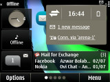
The popup gives quick info on events and some handy shortcuts
You can also toggle Wi-Fi and USB connectivity settings from here.
The slide naturally locks or unlocks the screen but if you hold it down you'll turn on the flashlight. The same action will turn it off.
The Nokia E6 handles very well but Symbian Anna brings no bump in performance compared to Symbian^3, the Anna release is more of a feature, rather than a performance update. Although heavy multi-taskers will frown at the 256MB of RAM we didn’t get any “Out of memory” errors even with a couple of RAM-intensive apps running in the background.
Symbian Anna is definitely a step in the right direction, but we're afraid the competition has zoomed far ahead. While Apple and Google are trying to outdo each other with all sorts of user interface innovation, Symbian has just caught up with a few years ago.
One positive change is that there's always a Back virtual key visible, which makes navigating apps simpler.
On the other hand, the Options menu still relies on the menu/submenu structure, which is a relic of the non-touch days of Symbian and is begging to be changed to an Android-like solution (menu key that shows a panel with 6-8 buttons for the most common options, maybe a More button if you really want to dig into the settings).
Reader comments
- Anonymous
- 28 Aug 2022
- rZu
Who has this phone, I want to buy
- Anonymous
- 30 Dec 2021
- Nug
You tell the true
- Anonymous
- 06 Aug 2014
- n9B
I had the same problem with Blackberry 9900, but never with E6. Backup your phone and reload the software...
