Nokia E7 review: Open for business
Open for business
The Symbian^3 user interface
Symbian^3 is a much needed Spring-cleaning and polishing of the Symbian touch interface. Most of that has been left behind and the Symbian that the Nokia E7 uses is pretty touch-centric. Text input with a virtual keyboard is still a pain, but the E7 has a great physical keyboard so that’s not a big issue.
Update, 24.08.2011: We installed Symbian Anna - check out our impressions over here.
We put the Nokia E7 through its paces on video and here it is:.
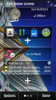
Changes in Symbian^3 are both visual and functional and the homescreen is the most evident change. It consists of three panes, which you can fill up with widgets and reshuffle as you see fit. You can delete panes you don’t need but you can’t add more than three.
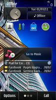
Symbian^3 comes with a new homescreen
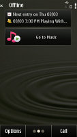
You might notice that the homescreen panes start scrolling only after you have completed your swipe across the screen but that’s how it was designed to be and not some lag. Some of the widgets are side-scrollable and the phone waits to see if you want to use them or skip to the next screen.
We’re hearing that Nokia is working on an update for the Symbian^3 interface, so things might get even better soon.
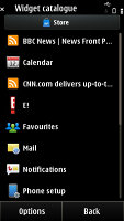
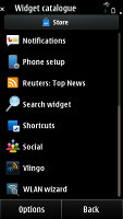
The widget catalogue • re-ordering widgets
Anyway, if you want immediate response you can scroll them by tapping the three dot symbol at the bottom of the screen.
The main menu structure is unchanged, retaining the hierarchical folder structure. This comes in contrast to Android, and mostly iOS, where you get a flat menu structure with all icons located on scrollable screens.
Now you are free to rearrange icons as you see fit so you might go for placing them all in the main folder and get a flat-ish menu system from Symbian^3 too. A list view mode is also available but that involves much more scrolling and that’s why we preferred to leave things in grid.
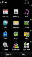
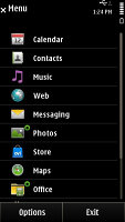
Not much has changed in the main menu
The task manager shows screenshots of the running apps, instead of just icons. You also need only a single click to kill them this time. As a downside, the task manager manages to fit only three apps on the screen and you often have to scroll to the one you want.
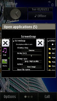
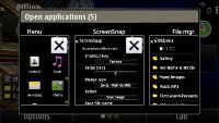
The refreshed Task manager • only three apps at a time fit on the screen
The slide can be set to lock the screen or just go back to the homescreen when you close it and to open an app (e.g. the message editor) when you open it.
The performance of the Symbian has also been taken up a notch with the ^3 version. The Nokia E7 feels snappy most of the time, with lags noticeable only when dealing with heavy apps or when there are a lot of apps running in the background.
And even though heavy multi-taskers will frown at the 256MB of RAM, the only time we got an “Out of memory” error was when browsing a heavy web page with Flash on it (and we’re inclined to blame it on the plug-in).
Unfortunately, creaking old bits of software (like the browser) are not befitting a modern platform.
Finally, we have to point out that Symbian^3 is less inclined to skimp on the eye-candy as opposed to its predecessors. There are icons bumping and revolving, menus being opened with a zoom in and out effects and the occasional fading in and out.
That’s again not quite up with the best, but considering that after some time too much effects become a nuisance we won’t be taking too many points away here.
Reader comments
- Anonymous
- 23 Apr 2025
- mFd
How to set up internet so as I can use you tube
- Usinss
- 12 Mar 2025
- pwZ
Best phone i ewer used. it supported USB mouse, keyboard. Was one of the first phones, which supported Waze. Qwerty keyboard was perfect for ssh tunneling in to servers. no nonsense gestures required. Just pres ctr+w or Shift ; to exit vim etc. Pinni...
- Usman
- 22 Apr 2024
- mFd
I want to buy this phone