Nokia E72 review: The business of messaging
Business of messaging
Small display fits the style
Nokia E72 features a 2.36" 16M-color QVGA display. It's the same size as the screens of E71 and E63. And size is hardly an issue here, even from an upgrader's point of view. The resolution though is a different matter. A slightly more pixel-dense screen would've certainly made as big a difference as any of the otherwise valuable additions (better CPU, optical trackpad, 3.5 mm jack just to name a few). We've seen Nokia do it for S40 (6260 slide) and it's high time perhaps they considered the competition of BlackBerry screens more seriously.
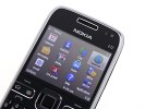
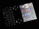
Eseries are stuck at QVGA giving BlackBerries a bit of an edge
The screen performance is still great, with excellent contrast and vivid image. Sunlight legibility is not an issue for Nokia E72 display ranking it among the best of its class.
Keyboard is key
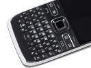
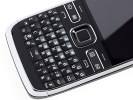
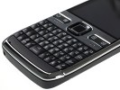
The Nokia E72 QWERTY keyboard is an almost complete replica of what we had with the E63, some changes notable compared to the E71. Despite the few minor tweaks, the overall usability is intact. The space bar on the E72 is smaller, leaving room for two extra keys. One of them is particularly useful: the Symbol button will toggle Bluetooth on and off upon a long press.
As before, pressing and holding the space bar in standby powers up the LED so you can use your handset a flashlight. That's a nice little perk and it even overrides the keyboard lock.
Maybe you shouldn't expect regular desktop typing speed and you'll certainly have to look at the keypad but you can achieve pretty decent results with the E72. If you are into typing lots of messages you are sure to get used to it quickly and start speeding your way through texts.
The controls above the keypad have the more recent Eseries styling along the lines of the E52 and E55. The logic is the same though - two selection keys, Call and End buttons, the menu key and the three so-called one-touch keys. One-touch keys can be set as shortcuts to any application you like, never mind the icons on them might suggest otherwise. Furthermore, you can assign two applications per key, making use of the press and press-and-hold function on all of them.
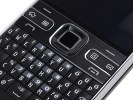
This time instead of the solid one-touch keys on the E71 sunk amid slightly raised call buttons and soft keys, we have the opposite layout. The call/softkey deck is flat, using one shared plate, while the four program keys are raised and U-shaped, which makes them very thumb-friendly and minimizes wrong presses.
The keyboard backlighting is impressive to make the phone no problem to handle in the dark. You can set the LED around the D-pad to notify of missed events like incoming messages or missed calls. There is also a breathing light option - slow blinks in standby when the screen is off.
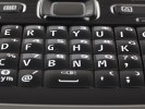
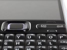
The controls above the keypad are a joy to use
The big news is the trackpad functionality of the D-pad. In pure directional pad terms, the E72 is doing well - the D-pad is small but very tactile and allows very comfortable vertical and horizontal scrolling and selection. The optical trackpad in the middle is a bit let down by the size of the button. It works just fine, but the raised directional ridge does limit the available space for thumb sweeps. This seems to affect horizontal scrolling worse than vertical navigation. It's easy to feel the difference on the BlackBerry Bold 9700 trackpad: it's virtually the same size but does much better in terms of speed and response.
The E72 trackpad, which Nokia call optical Navi key, has three sensitivity settings: low, medium and high. High is what nearly gave us the response we were looking for, though horizontal scrolling remained somewhat problematic. The lower sensitivity settings we found just about useless. The trackpad is haptic enabled too, gentle vibrations marking every thumb sweep.
The trackpad however is amazingly useful in camera mode. Mind you, we're talking a phone without an actual shutter key. Placing your finger on the trackpad activates the autofocus and locks it, and then a full press down captures the image.
It works like a charm, and gives the user a lot more control over the shot than say, virtual shutter keys on touch phones. And this is incomparably better than the ridiculous two-key focus/capture routine on the E71.
User interface: S60 3rd edition does not surprise
Nokia E72 runs on Symbian 9.3 OS with the Series60 3rd Edition user interface. It has Feature Pack 2 like the E52, E55 and the E75 side-slider.
More importantly though, the Nokia E72 is powered by the same 600 MHz CPU as the E55. In Symbian terms, that's a lot, not even Nokia's current flagship - the N97 - can match it.
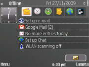
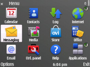
Nokia E72 runs on Symbian S60 3.2
The phone's main menu has two view modes: a 4 x 3 grid of icons and a list. The E72 comes with the new S60 icons for a pinch of 5th edition (touch) styling. However, with the E72 you cannot opt for having animated icons like on some other Nokia phones. This is probably just another way of reiterating the business focus of the phone. At least the font size is widely configurable depending on your preferences.
The optical trackpad is a nice addition and can make navigating the menus even smoother. Unfortunately, the imposing frame of the square D-pad doesn't favor thumb sweeping.

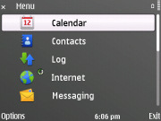
The main menu has two view modes
The active stand-by mode goes without saying on the Nokia E72. This is a convenient way to add shortcuts to all your favorite applications on the homescreen. You can even assign shortcuts to websites of your choice for quicker access.
In addition you can bring up to fourteen different kinds of notifications on the homescreen: email boxes and voice mail, through calendar and to-dos, to the currently running track in the Music player and FM radio. Choosing how many of those fourteen items to use is completely up to you.

Basic homescreen, active stand-by or talking theme
Each of the one-touch keys (messaging and calendar) below the display can be customized to access any feature (actually two per key) of choice. The two soft keys functions are user-configurable too.
Another handy feature of recent Eseries handsets allows you to toggle between two different phone setups - the so-called Mode Switcher. Each of them can be customized with its own theme and homescreen applications for maximum usability. This way you can have both a leisure and a business profile and switch between them with a single click.
The built-in memory is 250MB, which is a decent amount. The included 4GB microSD memory card comes in very handy for extending it, but higher capacity cards up to 16GB are supported as well.
As we managed to confirm, Nokia E72 has no problem handling a 16GB microSD card. Accessing applications or any other files on the memory card is quick and you probably won't notice any difference compared to accessing data in the phone memory.
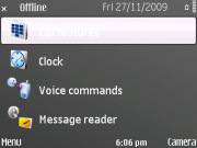
As with any Symbian phone, there is a built-in voice recognition system. It is launched by the dedicated key on the right side of the E72 and does a good job. It's fully speaker-independent and recognizes a very high percentage of the user commands.
And finally, there's a nice security feature known as Remote Lock. If your Nokia E72 gets stolen or lost, you simply send a coded SMS message to remotely lock the phone. After three unsuccessful attempts to unlock it, it wipes itself clean of all personal or sensitive info. You might not get your Nokia E72 back, but at least nobody will get your personal data either.
Reader comments
- Anonymous
- 20 Jan 2023
- Nu7
It's a keyboard problem.loosen it up and clean the keyboard pad and it will be corrected.
- Main
- 26 Dec 2022
- mFd
Does it stream videos
- Pawan Dev
- 03 Oct 2019
- YTj
Yas nokia72
