Nokia Lumia 1020 review: View from the top
View from the top
Unboxing the Nokia Lumia 1020
The Nokia Lumia 1020's retail package is the standard blue box that the company has been using for its recent models. The upside is that it really highlights the phone, often in a bold color that has become a signature feature of the Lumia line.
Other than that you get the standard set of accessories - a charger with a detachable microUSB cable, a SIM ejector tool, some printed manuals and a single-piece, in-ear headset.
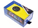
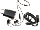
The Lumia 1020 in Nokia's recognizable box • box contents
Nokia Lumia 1020 360-degree spin
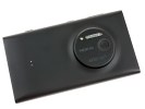
The Nokia Lumia 1020 has a virtually identical body to the Lumia 920 (within fractions of a millimeter), with one big exception - the hump for the camera module. Spatial dimensions weren't 920's big problem, it was the weight, but Nokia had put its flagship on a strict diet and it's now some good 27g lighter.
It now weighs less than 160g, which is acceptable, considering a lot of that weight has went in to secure that lauded "tough as a brick" durability that Nokias are known for. To put everything in concrete numbers, the Lumia 1020 measures 130.4 x 71.4 x 10.4 and weighs 158g.
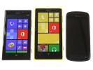
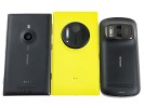
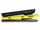
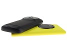
Nokia Lumia 1020 sized up against the 808 PureView and the Lumia 925
More impressively, the camera hump is smaller than it was on the Nokia 808 PureView. True, the new sensor is a little over a third smaller than the old one, but various camera improvements (BSI sensor design, OIS, wider aperture) should more than make up for the reduction in sensor size. We'll decipher the acronyms and camera terminology later on.
Design and handling
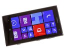
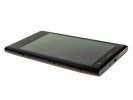
Looking at the front of the Lumia 1020, the smartphone is almost identical to its Lumia 920 predecessor and pretty close to the first-gen Lumia 900. The only giveaway is the fact that the bulging camera module makes it sit at an angle when placed on a table or other level surface.
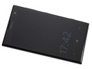
The build and finish quality are certainly among the best in business, although we have to admit the design isn't as impressive as almost a year ago, when the Lumia 920 launched. But even if it's a little played out now, the unibody feels impressively sturdy and with the color being inherent to the material and not simply painted on, it will certainly last a for quite a while and scratches will be harder to spot.
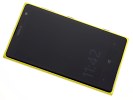
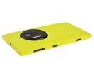
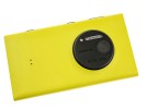
The design is a bit worn out now, but the build quality and finish are supreme
At its launch, the smartphone will be available in three color versions - the yellow one is the so-called lead color, meaning that it stars in most promo materials, but there's also a black and a white version. There's a fourth version - red - but that's exclusive to AT&T in the US for now.
Colors have become an important talking point recently - the launch of the colorful iPhone 5c must've given Nokia an extra measure of pride for having pioneered that feature.
All that's well and good, but a camera hump is not great for ergonomics and pocketability. The camera is in the upper half of the body, making it top-heavy. The polycarbonate is good to the touch, but not the most grippy and getting used to the weight balance may take a week or so - dropping your shiny (and pricy) phone would be heartbreaking.
You get used to it soon, but even after that, the camera hump will still be in your pocket. If we had to look on the bright side, we'd say that the Lumia 1020 is more pocketable than most digital cameras out there - certainly all that can challenge it in terms of image quality.
Even so, you have to look at the 8.5mm thick Xperia Z1 with a bit of envy - especially, knowing it has managed to sneak in a 20MP camera in this thin profile. Yes, the Z1 does have its own set of issues, too, but design-wise it's as mouth-watering as mobile tech gets these days.
It's a matter of balance and Nokia tipped the scales towards "Best camera" and away from "Slim" or "Compact." An understandable choice, considering the Lumia 925 and the 928 are very similar phones except without the camera hump at the cost of, well, the camera.
Display
The Nokia Lumia 1020 comes with the same PureMotionHD+ AMOLED display as the Lumia 925. There's Gorilla Glass 3 protection on top, to keep scratches away and provide extra impact resistance. The company chose to move away from LCD panels for its flagships after the Lumia 920.
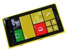
The PureMotionHD+ AMOLED screen is pretty nice
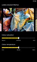
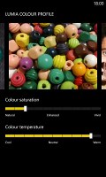
AMOLED panels have the advantage to be slimmer, with more vibrant colors and far superior contrast due to the naturally deep blacks. Nokia has even supplied the Lumia 1020 will a cool color profile app that lets you tune the saturation and color balance to your liking. If oversaturated colors aren't your thing you can go tune them down to more realistic levels and if you like that effect you can go all the way up.
The Nokia Lumia 1020's touchscreen also responds to gloves, which might come in handy when operating the flagship in the winter (Nokia is a Finnish company after all and winter in Europe doesn't come much colder than in Finland).
As far as image quality is concerned, the Lumia 1020 display performs excellently. It has good brightness levels for an AMOLED screen (it's on par with the Samsung Galaxy S4) not far behind the Lumia 920. Going from LCD to AMOLED was worth it, especially considering the excellent viewing angles and the deep blacks typical for the technology.
| Display test | 50% brightness | 100% brightness | ||||
| Black, cd/m2 | White, cd/m2 | Black, cd/m2 | White, cd/m2 | |||
| Nokia Lumia 1020 | 0 | 172 | ∞ | 0 | 398 | ∞ |
| Nokia Lumia 920 | - | - | - | 0.48 | 513 | 1065 |
| HTC One | 0.13 | 205 | 1580 | 0.42 | 647 | 1541 |
| Samsung Galaxy S4 | 0 | 201 | ∞ | 0 | 404 | ∞ |
| Apple iPhone 5 | 0.13 | 200 | 1490 | 0.48 | 640 | 1320 |
Sunlight legibility is where the Lumia 1020 disappoints. It's on par with the Lumia 920 (not bad for a slightly dimmer screen), but the 808 PureView is still the king in this category after all this time, but even more telling is the fact that even the old Nokia N8 has a slightly better screen in direct sunlight. Meanwhile, the Apple and Samsung flagships are crowding the top.
For a phone that's so heavily focused on photography, it needs to provide a great viewfinder to frame your shots. The screen is good enough, but it should have been better.
Sunlight contrast ratio
-
Nokia 808 PureView
4.698 -
Apple iPhone 5
3.997 -
Samsung I9300 Galaxy S III
3.419 -
Samsung Galaxy S4
3.352 -
Samsung Omnia W
3.301 -
Samsung Galaxy S
3.155 -
Nokia N9
3.069 -
Samsung Galaxy Note
2.970 -
HTC One S
2.901 -
Samsung Galaxy S II
2.832 -
Samsung Galaxy S II Plus
2.801 -
Huawei Ascend P1
2.655 -
Nokia Lumia 900
2.562 -
HTC One
2.504 -
Sony Xperia Z
2.462 -
Samsung Galaxy S III mini
2.422 -
Motorola RAZR i
2.366 -
Samsung Galaxy Note II
2.307 -
Apple iPhone 4S
2.269 -
HTC One X
2.158 -
Nokia N8
2.144 -
Nokia Lumia 1020
2.103 -
Oppo Find 5
2.088 -
BlackBerry Z10
2.051 -
Apple iPhone 4
2.016 -
Sony Ericsson Xperia ray
1.955 -
Samsung Galaxy Camera
1.938 -
HTC Butterfly
1.873 -
Sony Xperia V
1.792 -
Sony Xperia U
1.758 -
LG Optimus 4X HD
1.691 -
HTC One V
1.685 -
LG Optimus Vu
1.680 -
HTC Desire V
1.646 -
LG Optimus G Pro
1.552 -
LG Optimus 3D
1.542 -
Nokia Asha 302
1.537 -
Nokia Lumia 610
1.432 -
Gigabyte GSmart G1355
1.361 -
HTC Desire C
1.300 -
LG Optimus L7
1.269 -
LG Optimus L9
1.227 -
Meizu MX
1.221 -
Sony Xperia E dual
1.203 -
Samsung Galaxy Pocket
1.180 -
Sony Xperia tipo
1.166 -
Samsung Galaxy mini 2
1.114
Then there's the resolution - a hard limit set by the OS, similar to the iPhone situation. Actually, 768 x 1280 pixels still adds to 332 ppi, which qualifies for the Retina label. Except for one thing - it has a PenTile matrix.
This means that it has two sub-pixels per pixels, and that reduces the perceived sharpness on some occasions. Windows Phone is quite adept at hiding PenTile matrixes. It's certainly not too irritating and you probably won't even feel the difference until you put the Lumia 1020 next to an Android flagship, but it's there.
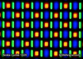
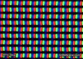
Nokia Lumia 1020 screen under a microscope vs. the HTC One screen
Reader comments
- kino
- 26 Nov 2020
- NcB
dont
- xraimox
- 21 Apr 2020
- Fvj
yeah there is it does cost a little but i just got one so i can use this old beast
- YUKI93
- 04 Jan 2020
- IWc
There's still no comparison between the Xperia 1 and 1020. But there is one between P30 Pro and 1020: https://www.youtube.com/watch?v=jYVU2PYi2Ys
